mirror of
1
Fork 0
Commit Graph

4062 Commits

Author SHA1 Message Date
yp05327 b5c26fa825
Add markdown preview to Submit Review Textarea (#24672)
Before:

![image](https://github.com/go-gitea/gitea/assets/18380374/2909352c-b2ab-4d77-b410-9f08c2f5a154)

After:

![image](https://github.com/go-gitea/gitea/assets/18380374/9448fa75-e29b-4f95-a30f-03c73c083a83)

---------

Co-authored-by: wxiaoguang <wxiaoguang@gmail.com>
Co-authored-by: Giteabot <teabot@gitea.io>
2023-05-12 10:53:41 +00:00
silverwind a96c73f979
Remove svg.svg class, restore .rss-icon (#24667)
Fix regression from https://github.com/go-gitea/gitea/pull/24476 where
the `svg.svg` class misaligns SVG icons across the site and streched
buttons unintentionally in vertical height.

Before (button 30.3px):
<img width="157" alt="Screenshot 2023-05-11 at 22 09 42"
src="https://github.com/go-gitea/gitea/assets/115237/0fd137ab-ab52-4cf8-afca-c45776d526d0">

After (button 30px):
<img width="160" alt="Screenshot 2023-05-11 at 22 09 59"
src="https://github.com/go-gitea/gitea/assets/115237/4b741f4b-0fd2-4fae-9bee-16a7deb098e8">

[vertical-align:
middle](https://developer.mozilla.org/en-US/docs/Web/CSS/vertical-align)
is not suitable to align icons to text because

> Aligns the middle of the element with the baseline plus half the
x-height of the parent.

Example of `vertical-align: middle` from MDN:

<img width="232" alt="Screenshot 2023-05-11 at 22 29 28"
src="https://github.com/go-gitea/gitea/assets/115237/179fb756-85a1-4cab-8219-1a4958f333e2">

So I think the
[existing](365bb77a54/web_src/css/svg.css (L3))
`vertical-align: text-top` is generally still the best bet:

<img width="241" alt="Screenshot 2023-05-11 at 22 34 24"
src="https://github.com/go-gitea/gitea/assets/115237/0cd6edf5-12c0-4bdb-8771-a900f5ba2d35">

Co-authored-by: Giteabot <teabot@gitea.io>
2023-05-12 10:23:53 +00:00
yp05327 49808136c5
Display owner of a runner as a tooltip instead of static text (#24377)
Before:

![image](https://user-images.githubusercontent.com/18380374/234779250-8bbd325c-190e-4a30-ac3e-766498d17df5.png)

After:

![image](https://user-images.githubusercontent.com/18380374/234779094-e232ecba-d9f4-4d62-a702-6d5e4a522782.png)

![image](https://user-images.githubusercontent.com/18380374/234779120-0293af17-a566-4b69-b454-af4e95844e3b.png)

---------

Co-authored-by: silverwind <me@silverwind.io>
Co-authored-by: Giteabot <teabot@gitea.io>
Co-authored-by: wxiaoguang <wxiaoguang@gmail.com>
Co-authored-by: Lunny Xiao <xiaolunwen@gmail.com>
2023-05-12 08:43:27 +00:00
yp05327 bc719f549e
Update pin and add pin-slash (#24669)
Continue #23531
Thanks for the update in https://github.com/primer/octicons/issues/940,
@CameronFoxly

![image](https://github.com/go-gitea/gitea/assets/18380374/bc512b20-b656-4bd7-8e70-3a2b7eca9d65)

![image](https://github.com/go-gitea/gitea/assets/18380374/a3863267-6a7a-48d5-8157-9f361fec3fed)
2023-05-12 14:38:59 +08:00
silverwind 8251b317f7
Improve empty notifications display (#24668)
- Add icon and padding to empty notification list, center it
- Add icon to header
- Remove border below header

#### Before
<img width="1250" alt="Screenshot 2023-05-11 at 23 34 53"
src="https://github.com/go-gitea/gitea/assets/115237/7c1990a1-e48d-40e5-8762-462d8c3ac0ea">

#### After
			
<img width="1249" alt="Screenshot 2023-05-12 at 00 24 02"
src="https://github.com/go-gitea/gitea/assets/115237/e0bcdf81-8468-4047-b92c-6625f00a22aa">
2023-05-12 12:06:23 +08:00
Lunny Xiao 365bb77a54
Fix issues list page multiple selection update milestones (#24660)
Fix #24651
2023-05-11 21:19:42 +08:00
wxiaoguang f6e029e6c7
Make repo migration cancelable and fix various bugs (#24605)
Replace #12917

Close #24601
Close #12845


![image](https://github.com/go-gitea/gitea/assets/2114189/39378118-064d-40fb-8396-4579ebf33917)


![image](https://github.com/go-gitea/gitea/assets/2114189/faf37418-191c-46a6-90a8-353141e00e2d)


![image](https://github.com/go-gitea/gitea/assets/2114189/fdc8ee4d-125f-4737-9990-89bcdf9eb388)


![image](https://github.com/go-gitea/gitea/assets/2114189/9a3bd2c2-fe20-4011-81f0-990ed869d139)

---------

Co-authored-by: Yarden Shoham <git@yardenshoham.com>
Co-authored-by: silverwind <me@silverwind.io>
Co-authored-by: Giteabot <teabot@gitea.io>
2023-05-11 08:25:46 +00:00
wxiaoguang 58dfaf3a75
Improve queue & process & stacktrace (#24636)
Although some features are mixed together in this PR, this PR is not
that large, and these features are all related.

Actually there are more than 70 lines are for a toy "test queue", so
this PR is quite simple.

Major features:

1. Allow site admin to clear a queue (remove all items in a queue)
* Because there is no transaction, the "unique queue" could be corrupted
in rare cases, that's unfixable.
* eg: the item is in the "set" but not in the "list", so the item would
never be able to be pushed into the queue.
* Now site admin could simply clear the queue, then everything becomes
correct, the lost items could be re-pushed into queue by future
operations.
3. Split the "admin/monitor" to separate pages
4. Allow to download diagnosis report
* In history, there were many users reporting that Gitea queue gets
stuck, or Gitea's CPU is 100%
    * With diagnosis report, maintainers could know what happens clearly

The diagnosis report sample:
[gitea-diagnosis-20230510-192913.zip](https://github.com/go-gitea/gitea/files/11441346/gitea-diagnosis-20230510-192913.zip)
, use "go tool pprof profile.dat" to view the report.


Screenshots:
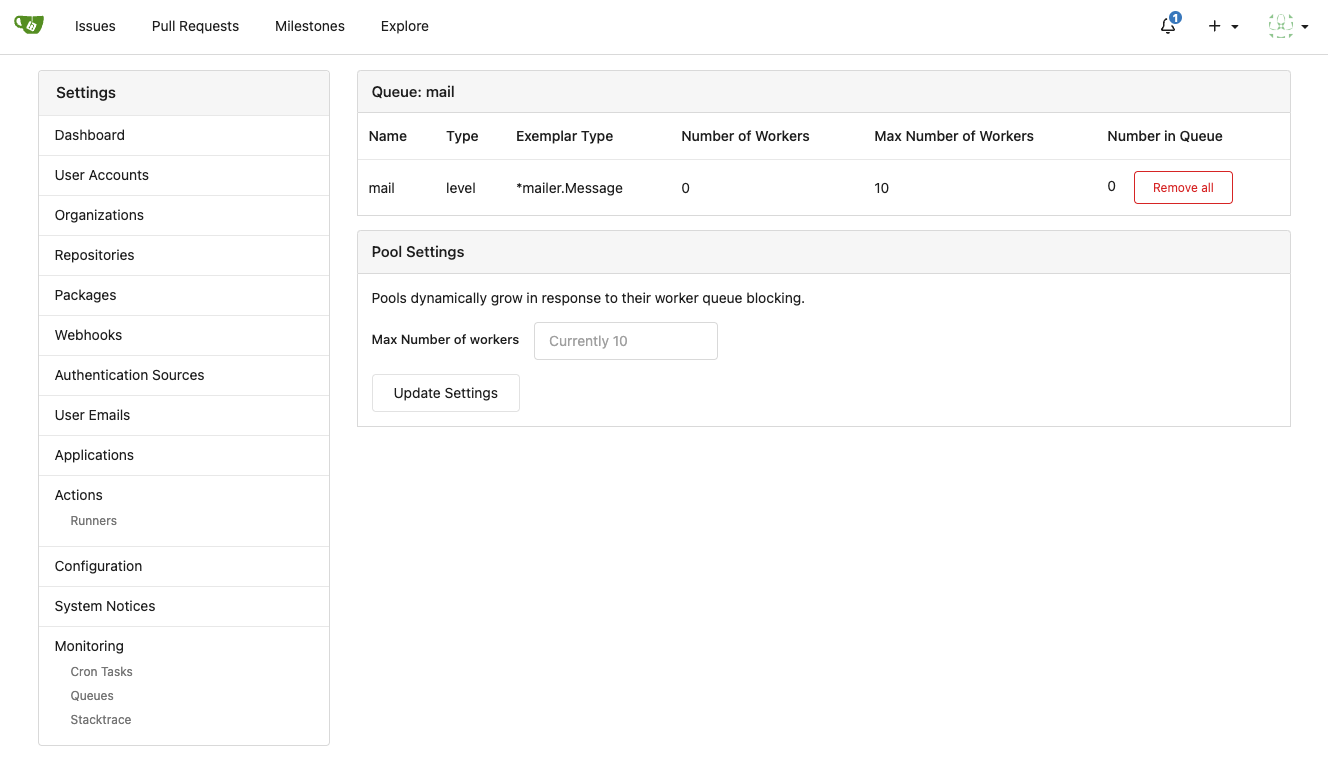

![image](https://github.com/go-gitea/gitea/assets/2114189/320659b4-2eda-4def-8dc0-5ea08d578063)


![image](https://github.com/go-gitea/gitea/assets/2114189/c5c46fae-9dc0-44ca-8cd3-57beedc5035e)


![image](https://github.com/go-gitea/gitea/assets/2114189/6168a811-42a1-4e64-a263-0617a6c8c4fe)

---------

Co-authored-by: Jason Song <i@wolfogre.com>
Co-authored-by: Giteabot <teabot@gitea.io>
2023-05-11 07:45:47 +00:00
silverwind 67db6b6976
RSS icon fixes (#24476)
Fix regression from https://github.com/go-gitea/gitea/pull/24471 where
CSS rules for `.icon.grey` were removed which were in use by the RSS
icons.

Gave them their own class instead, removed a wrapper and also fixed
vertical alignment on them. Additionally, did a few related fixes on the
org header for alignment.

Fixes: https://github.com/go-gitea/gitea/issues/24584

<img width="196" alt="Screenshot 2023-05-01 at 22 39 40"
src="https://user-images.githubusercontent.com/115237/235528228-959e2385-c1d2-4d5c-baec-e3784d459653.png">
<img width="216" alt="Screenshot 2023-05-01 at 22 44 20"
src="https://user-images.githubusercontent.com/115237/235528231-95cbff86-5672-48eb-b214-8bdcefa1612c.png">
<img width="120" alt="Screenshot 2023-05-01 at 22 56 36"
src="https://user-images.githubusercontent.com/115237/235529844-b94ab554-3259-4d0c-b040-82aed7d1a111.png">


<img width="372" alt="Screenshot 2023-05-01 at 22 54 25"
src="https://user-images.githubusercontent.com/115237/235529744-1a9c201b-5692-4122-9765-2f201a322a9e.png">
<img width="477" alt="Screenshot 2023-05-01 at 22 55 28"
src="https://user-images.githubusercontent.com/115237/235529748-62188554-9927-42ef-bc94-7052bce266e2.png">

---------

Co-authored-by: wxiaoguang <wxiaoguang@gmail.com>
2023-05-10 22:27:02 +00:00
silverwind f7ede92f82
Notification list enhancements, fix striped tables on dark theme (#24639)
- Make code block rendering via backticks work
- Remove link color unless hovered
- Remove table stripes and fix stripes rendering on dark theme for other
tables
- Introduce new `button-link` class discussed previously for buttons
that look and act like links and apply it to the two right-side buttons
- Reduce box padding by 8px on each side
- Fix "Mark all read" button margin-right
- brighten `--color-markup-code-block` on arc-green

### Before
<img width="1216" alt="Screenshot 2023-05-10 at 20 00 30"
src="https://github.com/go-gitea/gitea/assets/115237/66da9ec2-dd09-4ef0-8f1d-1822a18b6b43">
<img width="1211" alt="Screenshot 2023-05-10 at 20 00 48"
src="https://github.com/go-gitea/gitea/assets/115237/f48e30a2-9a00-4723-93aa-79b97ca0ba0c">

### After
<img width="1222" alt="Screenshot 2023-05-10 at 20 09 59"
src="https://github.com/go-gitea/gitea/assets/115237/c956e0d0-b3d9-42a4-a3ed-f0431c22bf3f">
<img width="1218" alt="Screenshot 2023-05-10 at 20 05 34"
src="https://github.com/go-gitea/gitea/assets/115237/f72c1628-3961-4c28-9263-07cdf7531316">
2023-05-10 21:59:58 +00:00
wxiaoguang 23ae939ef3
Improve "goto issue by number" button (#24577)
Follow #24479


![image](https://user-images.githubusercontent.com/2114189/236694114-c5cb42ff-456d-465a-bcb9-89ed5959d346.png)


![image](https://user-images.githubusercontent.com/2114189/236694119-052e689c-6264-4468-9ab3-0e5c97521bec.png)


![image](https://user-images.githubusercontent.com/2114189/236694139-f8940765-42ce-462d-b49e-50a416cc6f85.png)


![image](https://user-images.githubusercontent.com/2114189/236694154-6d8a000c-9ef3-4d07-af1c-59b0cf8f4d33.png)


![image](https://user-images.githubusercontent.com/2114189/236694166-3bc3e585-7955-44aa-af34-b33ae91e132f.png)

---------

Co-authored-by: silverwind <me@silverwind.io>
Co-authored-by: Giteabot <teabot@gitea.io>
2023-05-10 15:50:58 +00:00
silverwind ae0fa64ef6
Review fixes and enhancements (#24526)
- Fix regression with icons wrapping from
https://github.com/go-gitea/gitea/pull/24459
- Fix box misalignment on small screen
- Fix avatar misalignment on review comment
- Fix incorrect underline hover effect on review icons
- Move status icon to left side in review box
- Enhance review icon colors, add helper function for it
- Add missing inline avatars in review comments
- Tweak icon sizes because some octicons have inconsistent sizing

### Before
<img width="655" alt="Screenshot 2023-05-04 at 20 50 28"
src="https://user-images.githubusercontent.com/115237/236301230-92325507-6e03-47ac-bfb4-c9ddde310571.png">
<img width="260" alt="Screenshot 2023-05-04 at 20 50 42"
src="https://user-images.githubusercontent.com/115237/236301236-0dfa50e7-b8fc-4179-ae68-d872bc90f1f3.png">

### After
<img width="498" alt="Screenshot 2023-05-04 at 20 55 08"
src="https://user-images.githubusercontent.com/115237/236301810-23862c2c-c0a9-43a4-a3eb-ee611c14a7f4.png">
<img width="219" alt="Screenshot 2023-05-04 at 20 55 16"
src="https://user-images.githubusercontent.com/115237/236301817-d0de02ea-6ab5-43e1-9183-6b3848b72995.png">

---------

Co-authored-by: Giteabot <teabot@gitea.io>
2023-05-10 09:16:44 +00:00
Hester Gong 8bbbf7e6b8
Remove fluid on compare diff page (#24627)
As discuessed in
https://github.com/go-gitea/gitea/pull/24598/files#r1189290462

After:

Diff Page
<img width="1426" alt="Screen Shot 2023-05-10 at 10 44 48"
src="https://github.com/go-gitea/gitea/assets/17645053/bc1a5f78-ec17-4ac2-8390-081a5fc059d1">

New PR Page
<img width="1428" alt="Screen Shot 2023-05-10 at 10 45 17"
src="https://github.com/go-gitea/gitea/assets/17645053/ce94a28e-39d5-4534-9e78-c0edd4c7a339">

<img width="1432" alt="Screen Shot 2023-05-10 at 10 45 27"
src="https://github.com/go-gitea/gitea/assets/17645053/047809e1-abb2-4c16-ae62-63b71094c1c7">
2023-05-10 08:46:17 +00:00
oliverpool 8030614386
fix: release page for empty or non-existing target (#24470)
Fixes #24145

To solve the bug, I added a "computed" `TargetBehind` field to the
`Release` model, which indicates the target branch of a release.
This is particularly useful if the target branch was deleted in the
meantime (or is empty).

I also did a micro-optimization in `calReleaseNumCommitsBehind`. Instead
of checking that a branch exists and then call `GetBranchCommit`, I
immediately call `GetBranchCommit` and handle the `git.ErrNotExist`
error.

This optimization is covered by the added unit test.
2023-05-10 11:43:55 +08:00
Matthew Walowski 5930ab5fdf
Filter get single commit (#24613)
Pretty much the same thing as #24568 but for getting a single commit
instead of getting a list of commits
2023-05-10 09:34:07 +08:00
Yarden Shoham 9a0652f0b2
Attach a tooltip to the action status icon (#24614)
To clearly communicate the current state of the action

![image](https://github.com/go-gitea/gitea/assets/20454870/5d6de6b9-f34f-417d-b08e-fcd1b99b3079)
![image](https://github.com/go-gitea/gitea/assets/20454870/b976676a-4525-43e7-866f-8933be1a5dfd)
![image](https://github.com/go-gitea/gitea/assets/20454870/2e0a55fe-658f-4242-83de-b857a8b55f31)
![image](https://github.com/go-gitea/gitea/assets/20454870/6b42bcd1-c499-41ac-8419-1c4e60085d47)
![image](https://github.com/go-gitea/gitea/assets/20454870/363fcff8-fe61-4363-a04b-2db93cfc4fa3)
![image](https://github.com/go-gitea/gitea/assets/20454870/f8f59b68-93de-4f31-b9b0-24d94990d1d0)

---------

Signed-off-by: Yarden Shoham <git@yardenshoham.com>
2023-05-09 21:39:16 +02:00
来自村里的小螃蟹 cd9a13ebb4
Create a branch directly from commit on the create branch API (#22956)
#### Added
- API: Create a branch directly from commit on the create branch API
- Added `old_ref_name` parameter to allow creating a new branch from a
specific commit, tag, or branch.
- Deprecated `old_branch_name` parameter in favor of the new
`old_ref_name` parameter.

---------

Co-authored-by: silverwind <me@silverwind.io>
Co-authored-by: Lunny Xiao <xiaolunwen@gmail.com>
2023-05-09 18:22:32 +08:00
Nicholas Pease c090f87a8d
Add Gitea Profile Readmes (#23260)
Implements displaying a README.md file present in a users ```.profile```
repository on the users profile page. If no such repository/file is
present, the user's profile page remains unchanged.

Example of user with ```.profile/README.md```

![image](https://user-images.githubusercontent.com/34464552/222757202-5d53ac62-60d9-432f-b9e3-2537ffa91041.png)

Example of user without ```.profile/README.md```

![image](https://user-images.githubusercontent.com/34464552/222759972-576e058b-acd4-47ac-be33-38a7cb58cc81.png)

This pull request closes the feature request in #12233 

Special thanks to @techknowlogick for the help in the Gitea discord!

---------

Co-authored-by: techknowlogick <techknowlogick@gitea.io>
Co-authored-by: Yarden Shoham <hrsi88@gmail.com>
Co-authored-by: Lunny Xiao <xiaolunwen@gmail.com>
Co-authored-by: yp05327 <576951401@qq.com>
Co-authored-by: Yarden Shoham <git@yardenshoham.com>
2023-05-09 05:57:24 +00:00
wxiaoguang b6fc2cdf82
Make diff view full width again (#24598)
Regression of #24459 , [the related
line](https://github.com/go-gitea/gitea/pull/24459/files#diff-f255004de8d715ff40852710390429bf2a06e7e33a4e3f8ad568af636557ac71L8)

The PR file diff view needs to be full-screen width.
2023-05-09 05:21:03 +00:00
yp05327 2ee72d011f
Add permission check for moving issue action in project view page (#24589)
Fix #22954
Only users who have write permission can move issues in the project view page.
2023-05-09 00:50:16 -04:00
Matthew Walowski 1dd83dbb91
Filters for GetAllCommits (#24568)
The `GetAllCommits` endpoint can be pretty slow, especially in repos
with a lot of commits. The issue is that it spends a lot of time
calculating information that may not be useful/needed by the user.

The `stat` param was previously added in #21337 to address this, by
allowing the user to disable the calculating stats for each commit. But
this has two issues:
1. The name `stat` is rather misleading, because disabling `stat`
disables the Stat **and** Files. This should be separated out into two
different params, because getting a list of affected files is much less
expensive than calculating the stats
2. There's still other costly information provided that the user may not
need, such as `Verification`

This PR, adds two parameters to the endpoint, `files` and `verification`
to allow the user to explicitly disable this information when listing
commits. The default behavior is true.
2023-05-09 09:06:05 +08:00
Yarden Shoham 46e97986f5
Attach a tooltip to the action control button (#24595)
The first time I saw the big red X button I thought something failed but
apparently, it was just a "Cancel" button

# Before

![image](https://user-images.githubusercontent.com/20454870/236889564-3729926a-cfb3-4e47-a8ed-51389c4f193f.png)

![image](https://user-images.githubusercontent.com/20454870/236886259-b0ab0d55-28c3-41f5-8709-8cfc6819423f.png)

![image](https://user-images.githubusercontent.com/20454870/236886081-b7a97f01-6108-4c18-9adb-11cbafd8c19c.png)

# After

![image](https://user-images.githubusercontent.com/20454870/236889690-d1dfd74d-ad7d-4571-b712-69f0dc630c6e.png)

![image](https://user-images.githubusercontent.com/20454870/236885823-0734216d-b450-4a43-bfe3-e88525a8822a.png)

![image](https://user-images.githubusercontent.com/20454870/236903320-3b415619-8aff-4e5d-994e-6faa671990db.png)

---------

Signed-off-by: Yarden Shoham <git@yardenshoham.com>
Co-authored-by: Giteabot <teabot@gitea.io>
Co-authored-by: silverwind <me@silverwind.io>
2023-05-08 23:59:59 +00:00
yp05327 c4303efc23
Support markdown editor for issue template (#24400)
Fixes #24398

Task:
- [x] Reusing "textarea" like GitHub seems more friendly to users.
- [x] ^V image pasting and file uploading handling.

<details><summary>screenshots</summary>


![image](https://user-images.githubusercontent.com/18380374/235418877-00090552-ebda-411c-8e39-b47246bc8746.png)

![image](https://user-images.githubusercontent.com/18380374/235419073-dc33cad7-7626-4bce-9161-eb205c7384b5.png)
Display only one markdown editor:

![image](https://user-images.githubusercontent.com/18380374/235419098-ee21386d-2b2d-432e-bdb2-18646cc031e7.png)
Support file upload and ^V image pasting

![image](https://user-images.githubusercontent.com/18380374/235419364-7b390fa4-da56-437d-b55e-3847fbc049e7.png)

</details>

---------

Co-authored-by: wxiaoguang <wxiaoguang@gmail.com>
Co-authored-by: silverwind <me@silverwind.io>
2023-05-08 22:22:52 +00:00
wxiaoguang 6f9c278559
Rewrite queue (#24505)
# ⚠️ Breaking

Many deprecated queue config options are removed (actually, they should
have been removed in 1.18/1.19).

If you see the fatal message when starting Gitea: "Please update your
app.ini to remove deprecated config options", please follow the error
messages to remove these options from your app.ini.

Example:

```
2023/05/06 19:39:22 [E] Removed queue option: `[indexer].ISSUE_INDEXER_QUEUE_TYPE`. Use new options in `[queue.issue_indexer]`
2023/05/06 19:39:22 [E] Removed queue option: `[indexer].UPDATE_BUFFER_LEN`. Use new options in `[queue.issue_indexer]`
2023/05/06 19:39:22 [F] Please update your app.ini to remove deprecated config options
```

Many options in `[queue]` are are dropped, including:
`WRAP_IF_NECESSARY`, `MAX_ATTEMPTS`, `TIMEOUT`, `WORKERS`,
`BLOCK_TIMEOUT`, `BOOST_TIMEOUT`, `BOOST_WORKERS`, they can be removed
from app.ini.

# The problem

The old queue package has some legacy problems:

* complexity: I doubt few people could tell how it works.
* maintainability: Too many channels and mutex/cond are mixed together,
too many different structs/interfaces depends each other.
* stability: due to the complexity & maintainability, sometimes there
are strange bugs and difficult to debug, and some code doesn't have test
(indeed some code is difficult to test because a lot of things are mixed
together).
* general applicability: although it is called "queue", its behavior is
not a well-known queue.
* scalability: it doesn't seem easy to make it work with a cluster
without breaking its behaviors.

It came from some very old code to "avoid breaking", however, its
technical debt is too heavy now. It's a good time to introduce a better
"queue" package.

# The new queue package

It keeps using old config and concept as much as possible.

* It only contains two major kinds of concepts:
    * The "base queue": channel, levelqueue, redis
* They have the same abstraction, the same interface, and they are
tested by the same testing code.
* The "WokerPoolQueue", it uses the "base queue" to provide "worker
pool" function, calls the "handler" to process the data in the base
queue.
* The new code doesn't do "PushBack"
* Think about a queue with many workers, the "PushBack" can't guarantee
the order for re-queued unhandled items, so in new code it just does
"normal push"
* The new code doesn't do "pause/resume"
* The "pause/resume" was designed to handle some handler's failure: eg:
document indexer (elasticsearch) is down
* If a queue is paused for long time, either the producers blocks or the
new items are dropped.
* The new code doesn't do such "pause/resume" trick, it's not a common
queue's behavior and it doesn't help much.
* If there are unhandled items, the "push" function just blocks for a
few seconds and then re-queue them and retry.
* The new code doesn't do "worker booster"
* Gitea's queue's handlers are light functions, the cost is only the
go-routine, so it doesn't make sense to "boost" them.
* The new code only use "max worker number" to limit the concurrent
workers.
* The new "Push" never blocks forever
* Instead of creating more and more blocking goroutines, return an error
is more friendly to the server and to the end user.

There are more details in code comments: eg: the "Flush" problem, the
strange "code.index" hanging problem, the "immediate" queue problem.

Almost ready for review.

TODO:

* [x] add some necessary comments during review
* [x] add some more tests if necessary
* [x] update documents and config options
* [x] test max worker / active worker
* [x] re-run the CI tasks to see whether any test is flaky
* [x] improve the `handleOldLengthConfiguration` to provide more
friendly messages
* [x] fine tune default config values (eg: length?)

## Code coverage:
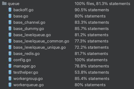
![image](https://user-images.githubusercontent.com/2114189/236620635-55576955-f95d-4810-b12f-879026a3afdf.png)
2023-05-08 19:49:59 +08:00
Tyrone Yeh 1144b1d129
Add goto issue id function (#24479)
for
https://github.com/go-gitea/gitea/issues/4109#issuecomment-1527104992

Supports format:
`#1234`
`Org/Repo#1234`

---------

Co-authored-by: techknowlogick <techknowlogick@gitea.io>
2023-05-07 23:44:16 +08:00
wxiaoguang 56ae853ca0
Simplify template helper functions (#24570)
To avoid bloating the template helper functions, some functions could be
provided by type methods.

And the new code `data-line-type="{{.GetHTMLDiffLineType}}"` reads
better than `data-line-type="{{DiffLineTypeToStr .GetType}}"`


After the fix, screenshots (the same as before):

<details>


![image](https://user-images.githubusercontent.com/2114189/236657918-20ce01e0-1192-443e-aeb4-6b3fe1aa2102.png)


![image](https://user-images.githubusercontent.com/2114189/236657950-ee19727f-a1fc-4133-afc7-e5d1a8c1783f.png)

</details>
2023-05-07 09:49:46 +00:00
Hester Gong 97b70a0cd4
Add org visibility label to non-organization's dashboard (#24558) 2023-05-07 08:33:43 +08:00
Yarden Shoham 46679554d0
Change `add_on` translation to `added_on` and include placeholder for the date (#24562)
- Very similar to #24550

The correct thing to do is to translate the entire phrase into a single
string. The previous translation assumed all languages have a space
between the "added on" and the date (and that "added on" comes before
the date).

Some languages, like Hebrew, have no space between the "added on" and
the date. For example:
```ini
added_on=נוסף ב-%s
```
("added" becomes נוסף, "on" is ב and when paired with a date we use a
dash to connect ב with the date)

---------

Signed-off-by: Yarden Shoham <git@yardenshoham.com>
Co-authored-by: delvh <dev.lh@web.de>
2023-05-06 21:11:27 +08:00
Yarden Shoham 95e2e3aa30
Change `valid_until` translation to `valid_until_date` and include placeholder for the date (#24563)
- Similar to #24550
- Similar to #24562 

The correct thing to do is to translate the entire phrase into a single
string. The previous translation assumed all languages have a space
between the "valid until" and the date (and that "valid until" comes
before the date).

Signed-off-by: Yarden Shoham <git@yardenshoham.com>
2023-05-06 12:37:02 +00:00
Zettat123 bc888e5f92
Fix incorrect user visibility (#24557)
Fix #24555
2023-05-06 10:54:26 +00:00
Yarden Shoham 291c868046
Change `join_on` translation to `joined_on` and include placeholder for the date (#24550)
The correct thing to do is to translate the entire phrase into a single
string. The previous translation assumed all languages have a space
between the "joined on" and the date (and that "joined on" comes before
the date).

Some languages, like Hebrew, have no space between the "joined on" and
the date. For example:
```ini
joined_on=נרשם ב-%s
```
("joined" becomes נרשם, "on" is ב and when paired with a date we use a
dash to connect ב with the date)
2023-05-06 18:10:30 +08:00
Lunny Xiao e5a8ebc0ed
Require at least one unit to be enabled (#24189)
Don't remember why the previous decision that `Code` and `Release` are
non-disable units globally. Since now every unit include `Code` could be
disabled, maybe we should have a new rule that the repo should have at
least one unit. So any unit could be disabled.

Fixes #20960
Fixes #7525

---------

Co-authored-by: delvh <dev.lh@web.de>
Co-authored-by: yp05327 <576951401@qq.com>
2023-05-06 17:39:06 +08:00
KN4CK3R 05209f0d1d
Add RPM registry (#23380)
Fixes #20751

This PR adds a RPM package registry. You can follow [this
tutorial](https://opensource.com/article/18/9/how-build-rpm-packages) to
build a *.rpm package for testing.

This functionality is similar to the Debian registry (#22854) and
therefore shares some methods. I marked this PR as blocked because it
should be merged after #22854.


![grafik](https://user-images.githubusercontent.com/1666336/223806549-d8784fd9-9d79-46a2-9ae2-f038594f636a.png)
2023-05-05 20:33:37 +00:00
Gary Moon b8c19e7a11
Update LDAP filters to include both username and email address (#24547)
Since the login form label for user_name unconditionally displays
`Username or Email Address` for the `user_name` field, bring matching
LDAP filters to more prominence in the documentation/placeholders.

Signed-off-by: Gary Moon <gary@garymoon.net>
2023-05-05 14:18:53 -04:00
Kyle D 09dd4b42c7
Temporarily disable PATs until next release (#24527)
This might be a bit contentious, but I think we should try to limit the
impact of deprecating scoped PATs with the rewrite proposed here we're
working on for v1.20: https://github.com/go-gitea/gitea/issues/24501

We should have a PR opened shortly to re-scope the routes.
2023-05-05 11:41:44 -04:00
Lunny Xiao f17a4358f4
Fix mirrors repository disapeared on user dashboard (#24520)
Fix regression from #23405
2023-05-05 16:41:21 +08:00
Lunny Xiao 3ee7f27341
Revert "Prevent a user with a different email from accepting the team invite" (#24531)
Reverts go-gitea/gitea#24491
2023-05-05 15:59:12 +08:00
wxiaoguang 421840486f
Fix form method/class (#24535)
Fix #24534
2023-05-05 05:14:22 +00:00
sillyguodong 81d6007055
Fix typo in rename branch dialog (#24537)
Fix https://github.com/go-gitea/gitea/pull/24512#discussion_r1185664695
2023-05-05 12:44:59 +08:00
sillyguodong 0c657112a3
Display warning when user try to rename default branch (#24512)
Follow #24380

It's better to warn users when they try to rename the default branch.


![image](https://user-images.githubusercontent.com/33891828/236107929-c8ac2854-dd0f-4500-a0a7-800c8fe48861.png)

---------

Co-authored-by: techknowlogick <matti@mdranta.net>
Co-authored-by: Jason Song <i@wolfogre.com>
Co-authored-by: silverwind <me@silverwind.io>
Co-authored-by: Giteabot <teabot@gitea.io>
2023-05-04 22:54:38 +00:00
Hester Gong 7abe958f5b
Fix color for transfer related buttons when having no permission to act (#24510)
Before:

<img width="1410" alt="Screen Shot 2023-05-04 at 09 28 23"
src="https://user-images.githubusercontent.com/17645053/236100146-2b64d274-2d79-4b4c-827c-3906a2a9dbb7.png">
<img width="1413" alt="Screen Shot 2023-05-04 at 09 28 30"
src="https://user-images.githubusercontent.com/17645053/236100157-15c12e83-a4f5-4b4e-b26b-73a8ce8bc0db.png">

After:

With no permission:

<img width="1409" alt="Screen Shot 2023-05-04 at 12 17 12"
src="https://user-images.githubusercontent.com/17645053/236144666-c2bb6ca2-59e1-45ae-93cd-d43545500d06.png">
<img width="1402" alt="Screen Shot 2023-05-04 at 12 17 17"
src="https://user-images.githubusercontent.com/17645053/236144677-c51a65cf-8aef-4566-b265-14b2ebb46d0b.png">


With permission:

<img width="1412" alt="Screen Shot 2023-05-04 at 12 16 45"
src="https://user-images.githubusercontent.com/17645053/236144565-9c5aa9a6-1424-49e3-a2b2-a129fecb856c.png">
<img width="1420" alt="Screen Shot 2023-05-04 at 12 16 51"
src="https://user-images.githubusercontent.com/17645053/236144573-a4064136-80d9-4c41-8f98-f51b4352bdf7.png">

---------

Co-authored-by: Giteabot <teabot@gitea.io>
2023-05-04 13:21:30 +00:00
Lunny Xiao b1cee3fa3b
Don't display creating page button in a mirror wiki repository (#24395)
A mirror repository with wiki is also a mirror. So creating page from UI
should be disabled. This PR hides the button like other places.
2023-05-04 15:27:15 +08:00
wxiaoguang 5d77691d42
Improve template system and panic recovery (#24461)
Partially for #24457

Major changes:

1. The old `signedUserNameStringPointerKey` is quite hacky, use
`ctx.Data[SignedUser]` instead
2. Move duplicate code from `Contexter` to `CommonTemplateContextData`
3. Remove incorrect copying&pasting code `ctx.Data["Err_Password"] =
true` in API handlers
4. Use one unique `RenderPanicErrorPage` for panic error page rendering
5. Move `stripSlashesMiddleware` to be the first middleware
6. Install global panic recovery handler, it works for both `install`
and `web`
7. Make `500.tmpl` only depend minimal template functions/variables,
avoid triggering new panics

Screenshot:

<details>

![image](https://user-images.githubusercontent.com/2114189/235444895-cecbabb8-e7dc-4360-a31c-b982d11946a7.png)

</details>
2023-05-04 14:36:34 +08:00
Jack Hay 402df1d6b4
Prevent a user with a different email from accepting the team invite (#24491)
## Changes
- Fixes the case where a logged in user can accept an email invitation
even if their email address does not match the address in the invitation
2023-05-03 21:21:58 -04:00
yp05327 dbb3736785
Fix incorrect webhook time and use relative-time to display it (#24477)
Fixes #24414
After click replay this webhook, it will display `now`

![image](https://user-images.githubusercontent.com/18380374/235559399-05a23927-13f5-442d-8f10-2c7cd24022a0.png)

---------

Co-authored-by: wxiaoguang <wxiaoguang@gmail.com>
Co-authored-by: Giteabot <teabot@gitea.io>
2023-05-03 19:53:43 -04:00
silverwind 4a722c9a45
Make Issue/PR/projects more compact, misc CSS tweaks (#24459)
- Remove various horizontal dividers on repo pages that didn't provide
visual benefit
- Remove label/milestone pills on single issue/pr page
- Remove issue-related pill buttons on projects page
- Increase contrast of color-secondary on arc-green
- Improve notifications icon, make circle bigger
- Remove some inline styles
- Fix focus in issue/pr title edit and select all text on button click

### Issue and PR before and after

<img width="1249" alt="Screenshot 2023-05-01 at 11 44 22"
src="https://user-images.githubusercontent.com/115237/235436662-a708288e-84fb-4b2e-a5a2-3a1c17d28f6c.png">
<img width="1248" alt="Screenshot 2023-05-01 at 11 58 51"
src="https://user-images.githubusercontent.com/115237/235437992-f863e483-f3cc-4cc1-8204-fd223647a0c9.png">


### Projects before and after

<img width="1255" alt="Screenshot 2023-05-01 at 11 41 02"
src="https://user-images.githubusercontent.com/115237/235436433-0deb85d6-4e7d-4e74-847f-254cc70a0cf9.png">
<img width="1267" alt="Screenshot 2023-05-01 at 11 40 03"
src="https://user-images.githubusercontent.com/115237/235436431-715b13cb-f78c-4d86-b27a-9229f9738c5b.png">


### Releases before and after

<img width="1243" alt="Screenshot 2023-05-01 at 11 41 12"
src="https://user-images.githubusercontent.com/115237/235436457-b655ee6f-03b8-4595-8d8c-b15ea469e988.png">
<img width="1240" alt="Screenshot 2023-05-01 at 11 40 10"
src="https://user-images.githubusercontent.com/115237/235436456-05a2a0dd-7cbb-4f26-b0d3-4f667df4bb95.png">

### Misc

<img width="58" alt="Screenshot 2023-05-01 at 10 49 13"
src="https://user-images.githubusercontent.com/115237/235432494-936ce995-6e22-47bc-ab2d-c9e93d31987d.png">
<img width="57" alt="Screenshot 2023-05-01 at 18 57 08"
src="https://user-images.githubusercontent.com/115237/235492430-1d32cfe0-0f2c-467c-b2fa-925b27e30e0e.png">


Issue title edit and wrap:

<img width="1238" alt="Screenshot 2023-05-01 at 12 34 40"
src="https://user-images.githubusercontent.com/115237/235441407-d5067a57-e586-4865-a652-282e5944abb4.png">
<img width="1232" alt="Screenshot 2023-05-01 at 12 06 24"
src="https://user-images.githubusercontent.com/115237/235438710-1a543dda-220f-4d87-8f93-f1710c0695f0.png">

---------

Co-authored-by: wxiaoguang <wxiaoguang@gmail.com>
2023-05-03 17:58:59 -04:00
wxiaoguang 48e3e38ee0
Clean up polluted styles and remove dead CSS code (#24497)
Follow #24393


The funny history:

* At the beginning, `.ui.message` was polluted by `text-align: center`
* Then people do `<div class="ui ... message text left">`
* But `.ui.left` is polluted by `float: left`
* Then people do `#xxx .ui.message { width: 100% !important;}`

The code just becomes more and more hacky.

After removing the pollution,  everything becomes clear and straight.


And, this PR also does:

1. Remove the `package.css`, its styles could be provided by `top
aligned`
2. Remove `#avatar-arrow`, dead code


Screenshot:


![image](https://user-images.githubusercontent.com/2114189/235862130-a9eb5d8f-7d01-457c-99f7-21d0abc3075e.png)


![image](https://user-images.githubusercontent.com/2114189/235862222-139709a7-95c2-4f89-a40f-100b2d76d9bb.png)

Co-authored-by: Giteabot <teabot@gitea.io>
2023-05-03 14:32:10 -04:00
Lunny Xiao e9b39250b2
Improve pull request merge box when pull request merged and branch deleted. (#24397)
This PR hide the pull request merge box totally if it's merged and branch deleted.

It's also add a bold for merge base commit id in merged message comment

Before:

<img width="989" alt="图片"
src="https://user-images.githubusercontent.com/81045/235066590-28deb506-e824-4a42-a9a2-791cd136756e.png">

After:

<img width="1030" alt="图片"
src="https://user-images.githubusercontent.com/81045/235080749-11d5efe8-a06e-4528-a75f-f6c6d191db50.png">

---------

Co-authored-by: silverwind <me@silverwind.io>
Co-authored-by: wxiaoguang <wxiaoguang@gmail.com>
2023-05-03 21:52:19 +08:00
yp05327 bcdd3c30af
Fix test delivery button in repo webhook settings page (#24478)
Caused by
https://github.com/go-gitea/gitea/pull/24246/files#diff-2bfe41d93dbb409583a4f945902e46bb513f60f1c9301649c1689200c4f1466eR1

Class `new` was removed in #24246, but in function
`initCompWebHookEditor`, it will check `.new.webhook`.
So in repo webhook settings page, `initCompWebHookEditor` will init
nothing, and no response after click the test delivery button.

da65b7ad47/web_src/js/features/comp/WebHookEditor.js (L6-L9)

Co-authored-by: Giteabot <teabot@gitea.io>
2023-05-02 21:58:18 +02:00
KN4CK3R bf999e4069
Add Debian package registry (#24426)
Co-authored-by: @awkwardbunny

This PR adds a Debian package registry.
You can follow [this
tutorial](https://www.baeldung.com/linux/create-debian-package) to build
a *.deb package for testing.
Source packages are not supported at the moment and I did not find
documentation of the architecture "all" and how these packages should be
treated.


![grafik](https://user-images.githubusercontent.com/1666336/218126879-eb80a866-775c-4c8e-8529-5797203a64e6.png)

Part of #20751.

Revised copy of #22854.

---------

Co-authored-by: Brian Hong <brian@hongs.me>
Co-authored-by: techknowlogick <techknowlogick@gitea.io>
Co-authored-by: Giteabot <teabot@gitea.io>
2023-05-02 12:31:35 -04:00
silverwind d6f8238492
Replace `N/A` with `-` everywhere (#24474)
Followup to https://github.com/go-gitea/gitea/pull/24427.

Reasoning is that `N/A` is specific to english while `-` is
language-neutral and does not need translation.

Before:
<img width="891" alt="Screenshot 2023-05-01 at 20 58 20"
src="https://user-images.githubusercontent.com/115237/235511592-8a36d0f2-34ff-4dbe-b642-67c0ade644fe.png">

After:
<img width="901" alt="Screenshot 2023-05-01 at 20 59 59"
src="https://user-images.githubusercontent.com/115237/235511594-d49f6d09-92e8-4e99-be7b-2a37f5d24129.png">
2023-05-02 05:54:29 -04:00
KN4CK3R df00ccacc9
Fix invite display (#24447)
Regression of #23901

Before

![grafik](https://user-images.githubusercontent.com/1666336/235371271-f4d06df5-97a0-43bc-b905-5fcdc5666b29.png)

After

![grafik](https://user-images.githubusercontent.com/1666336/235371311-5c03003e-b628-4721-93a6-4e2b1ada4d87.png)

---------

Co-authored-by: Giteabot <teabot@gitea.io>
2023-05-02 09:59:31 +02:00
silverwind fa506cd571
Remove `font-awesome` and fomantic `icon` module (#24471)
Fixes https://github.com/go-gitea/gitea/issues/10410.
This PR removes around 120kB of CSS.
2023-05-01 13:25:54 -04:00
wxiaoguang 3e7101dd64
Improve "new-menu" (#24465)
I am not sure what "new-menu" means, but I think we need to fix these
problems:

1. it shouldn't have "stackable", which makes the items stacked when
width is small. the `new-menu` already has `overflow: auto`
2. `justify-content: center` doesn't work with `overflow: auto` (for
small width), so use `margin: auto`
*
https://bhch.github.io/posts/2021/04/centring-flex-items-and-allowing-overflow-scroll/
3. `runner-new-menu` is dead code (copying & pasting ?)
2023-05-01 12:08:37 -04:00
silverwind 5adf32b48e
Remove fomantic breadcrumb module (#24463)
### File path before/after

<img width="522" alt="Screenshot 2023-05-01 at 13 23 33"
src="https://user-images.githubusercontent.com/115237/235445636-57776038-c98e-4cab-8abe-045138a76958.png">
<img width="522" alt="Screenshot 2023-05-01 at 13 24 08"
src="https://user-images.githubusercontent.com/115237/235445638-70bef62a-1b70-41f8-ba51-728db4d54402.png">


### File edit before/after

<img width="499" alt="Screenshot 2023-05-01 at 13 24 46"
src="https://user-images.githubusercontent.com/115237/235445676-7b3cc23e-289b-40a6-8d4f-0d7fb2efb55e.png">
<img width="497" alt="Screenshot 2023-05-01 at 13 24 52"
src="https://user-images.githubusercontent.com/115237/235445677-db9f3974-8456-46de-a32b-9198110c0540.png">

### Cherry-pick before/after

<img width="590" alt="Screenshot 2023-05-01 at 13 25 30"
src="https://user-images.githubusercontent.com/115237/235445717-99445024-1bb2-46d4-9bd8-8086bad57d34.png">
<img width="582" alt="Screenshot 2023-05-01 at 13 25 37"
src="https://user-images.githubusercontent.com/115237/235445720-9c1dc497-eb23-4e10-a727-27f4d6df69e6.png">
2023-05-01 11:40:02 -04:00
wxiaoguang ce16ff6219
Remove unnecessary g-menu-stackable-scrollable (#24462)
Fix #24460

That's a mistake but ..... no idea why I wrote so ... remove it.
2023-05-01 12:51:14 +02:00
silverwind 1bd2772235
Replace remaining fontawesome dropdown icons with SVG (#24455)
- Replace leftover dropdown triangles with SVG
- Replace remove icon with SVG and add styling for it:

<img width="817" alt="Screenshot 2023-05-01 at 00 40 05"
src="https://user-images.githubusercontent.com/115237/235379271-4674d4f7-b11e-4d6d-90f9-1478325443ca.png">
<img width="816" alt="Screenshot 2023-05-01 at 00 46 56"
src="https://user-images.githubusercontent.com/115237/235379451-b515afb3-9773-4f6f-a259-e7048235bcba.png">
2023-05-01 05:35:02 -04:00
KN4CK3R 00d998a513
Move links out of translation (#24446)
Addition to
https://github.com/go-gitea/gitea/pull/24426#discussion_r1181261215

I updated all existing translations too because otherwise they would
show something like

> For more information on the Container registry, see [the
documentation](#).%!(EXTRA
string=https://docs.gitea.io/en-us/packages/container/)

---------

Co-authored-by: Giteabot <teabot@gitea.io>
2023-05-01 09:17:27 +02:00
wxiaoguang 14c142b0bc
Improve issue list filter (#24425)
Partial regression of #24393, not only regression, but broken for long
time, 24393 didn't really improve it but used wrong `overflow: scroll`.

Actually, that "ui secondary filter menu labels" shouldn't be set as
scrollable (I missed that at that time), the problem is: if a "ui menu"
has "dropdown" items, then it should not be scrollable. Otherwise the
dropdown menu can't be shown correctly.

And there are more problems:

* The "issue-filters" shouldn't be used anywhere else (copying&pasting
problem again ....)
* There is also an "issue-actions" container, it should also be fixed.
* There are similar problems on the milestone page.
* The old comment in code: "grid column" doesn't work well.

The major changes of this PR are: use "flex: 1" instead of "ui grid
column".

After this PR, not 100% perfect but much better than before.
2023-04-30 11:51:20 -04:00
sillyguodong e8173c2c33
Move `Rename branch` from repo settings page to the page of branches list (#24380)
Co-Author: @wxiaoguang

It is more convenient that user just need to enter a new branch name after he selects the branch which he want to rename.
So this PR move the function of renaming branch to the page of branches list.

This PR also restyle the button of `new branch`, `download`, `delete`....

https://user-images.githubusercontent.com/33891828/235277997-413060bb-759f-430a-b5c4-df5e40ffcd28.mov

---------

Co-authored-by: wxiaoguang <wxiaoguang@gmail.com>
2023-04-30 23:08:51 +08:00
Lunny Xiao 3f0651d4d6
Improve milestone filter on issues page (#22423)
Now we have `All milestones`, `No milestones`, `Open milestones` and
`Closed milestones`.
Fix #11924
Fix #22411 

<img width="1166" alt="image"
src="https://user-images.githubusercontent.com/81045/212243375-95eea035-a972-44b8-8088-53db614cb07e.png">
2023-04-30 09:12:49 -04:00
silverwind 8f4dafcd4e
Rework header bar on issue, pull requests and milestone (#24420)
- Make search bar dynamic full width via flexbox
- Make all buttons `small` so font size is the same for all elements in
the header
- Remove primary color from search field, add SVG icon like on Code tab
- Fix button vertical padding being enlarged by SVG icons

[View diff without
whitespace](https://github.com/go-gitea/gitea/pull/24420/files?diff=unified&w=1)

<img width="1226" alt="Screenshot 2023-04-29 at 11 58 53"
src="https://user-images.githubusercontent.com/115237/235296851-74848267-664f-4c1f-b94c-a1b94196ff75.png">
<img width="1219" alt="Screenshot 2023-04-29 at 11 59 39"
src="https://user-images.githubusercontent.com/115237/235296852-bcfde5ed-8658-43c2-b7e5-3ad84611e76f.png">

Mobile:
<img width="437" alt="Screenshot 2023-04-29 at 11 59 52"
src="https://user-images.githubusercontent.com/115237/235296860-99263373-7b27-4540-868c-a93e70f281ca.png">
<img width="433" alt="Screenshot 2023-04-29 at 12 00 00"
src="https://user-images.githubusercontent.com/115237/235296862-6cf64317-a864-405a-a00f-b5ab620349f5.png">
2023-04-29 23:33:25 -04:00
KN4CK3R a18919bba6
Fix user-cards format (#24428)
Fixes #24418
2023-04-29 15:43:01 -04:00
yp05327 cc64a92560
Add follow organization and fix the logic of following page (#24345)
![image](https://user-images.githubusercontent.com/18380374/234740589-066f2e5c-30c7-4fc3-a539-066100e1f138.png)

![image](https://user-images.githubusercontent.com/18380374/234740605-88efe55d-7eaa-422e-ab86-0b5a402ca11c.png)

Maybe we can fix user card tmpl in #24319?
Or maybe a list is better here

![image](https://user-images.githubusercontent.com/18380374/234451417-7f93df20-4b19-4abb-a62d-4c67e1aa2220.png)

---------

Co-authored-by: silverwind <me@silverwind.io>
Co-authored-by: Giteabot <teabot@gitea.io>
2023-04-29 15:13:58 -04:00
Yarden Shoham 94d6b5b09d
Add "Updated" column for admin repositories list (#24429)
- Closes #12454

# Before

![image](https://user-images.githubusercontent.com/20454870/235314351-82f5a414-7827-4029-8779-a837283a5a05.png)
# After

![image](https://user-images.githubusercontent.com/20454870/235314376-ccf4bb95-6823-4fce-9b9a-a23da2351769.png)

Signed-off-by: Yarden Shoham <git@yardenshoham.com>
2023-04-29 20:40:10 +02:00
Matthew Walowski f766b00293
Add ability to specify '--not' from GetAllCommits (#24409)
For my specific use case, I'd like to get all commits that are on one
branch but NOT on the other branch.

For instance, I'd like to get all the commits on `Branch1` that are not
also on `master` (I.e. all commits that were made after `Branch1` was
created).

This PR adds a `not` query param that gets passed down to the `git log`
command to allow the user to exclude items from `GetAllCommits`.

See [git
documentation](https://git-scm.com/docs/git-log#Documentation/git-log.txt---not)

---------

Co-authored-by: Giteabot <teabot@gitea.io>
2023-04-29 08:34:14 -04:00
wxiaoguang 241b74f6c5
Improve template helper (#24417)
It seems that we really need the "context function" soon. So we should
clean up the helper functions first.

Major changes:

* Improve StringUtils and add JsonUtils
* Remove one-time-use helper functions like CompareLink
* Move other code (no change) to util_avatar/util_render/util_misc (no
need to propose changes for them)

I have tested the changed templates:


![image](https://user-images.githubusercontent.com/2114189/235283862-608dbf6b-2da3-4d06-8157-b523ca93edb4.png)


![image](https://user-images.githubusercontent.com/2114189/235283888-1dfc0471-e622-4d64-9d76-7859819580d3.png)


![image](https://user-images.githubusercontent.com/2114189/235283903-d559f14d-4abb-4a50-915f-2b9cbc381a7a.png)


![image](https://user-images.githubusercontent.com/2114189/235283955-b7b5adea-aca3-4758-b38a-3aae3f7c6048.png)

---------

Co-authored-by: Giteabot <teabot@gitea.io>
2023-04-29 08:02:29 -04:00
wxiaoguang 5a5ab8ef5a
Start cleaning the messy ".ui.left / .ui.right", improve label list page, fix stackable menu (#24393)
Since 2015/2016, there is a global pollution: ".ui.left" / ".ui.right".

Fomantic UI doesn't work this way, it just conflicts with many Fomantic
definitions.

This PR starts the cleaning work of such techinical debts.

And, the "label list" page has been quite messy for long time, for
example, why "li" appears in "div" ......

And fix #24296

<details>


![image](https://user-images.githubusercontent.com/2114189/235051281-54c5374c-b5fd-4b5f-9aa2-02d4bb2d9112.png)


![image](https://user-images.githubusercontent.com/2114189/235055703-2ba042e0-4db7-4e63-8646-02f390d496b5.png)


![image](https://user-images.githubusercontent.com/2114189/235056310-4f6ffdc2-5758-4927-8fb8-314d9fb72a6b.png)


![image](https://user-images.githubusercontent.com/2114189/235058400-dab1c9ec-3325-4671-8345-aee6b0b68042.png)


![image](https://user-images.githubusercontent.com/2114189/235058424-85509532-b9bc-43ad-b00f-a87184c60f22.png)

</details>
2023-04-29 07:35:59 -04:00
Hester Gong 72e956b79a
Improve protected branch setting page (#24379)
Main changes:

1. Change html structure of protected branch page, use [`grouped
fields`](https://fomantic-ui.com/collections/form.html#grouped-fields)
instead of `fields` for better margin, and wrap `grouped fields` around
related `field`s, remove unnecessary `<div id="protection_box"
class="fields">` outer div

2. Changed some order of field to make them more categorized, used `ui
dividing header` for categorization and fine tune css.

Before:

<img width="1907" alt="Screen Shot 2023-04-27 at 14 56 19"
src="https://user-images.githubusercontent.com/17645053/234783731-bce8a7ce-dfc9-4d47-a3a8-b962ebea9467.png">
<img width="1849" alt="Screen Shot 2023-04-27 at 14 56 30"
src="https://user-images.githubusercontent.com/17645053/234783740-c47d314e-5e2d-4854-98fd-c88f85ef3584.png">
<img width="1872" alt="Screen Shot 2023-04-27 at 14 56 36"
src="https://user-images.githubusercontent.com/17645053/234783745-18e35a75-07e8-451d-b001-f9bcf16fcab5.png">

After:


https://user-images.githubusercontent.com/17645053/235114568-da010aad-7654-4410-ab8c-5d0fce7edadb.mov


3. Changed "Enable Merge Whitelist" to radio checkbox, and added "Enable
Merge" radio checkbox, which are exclusive

Before:

<img width="926" alt="Screen Shot 2023-04-28 at 13 08 29"
src="https://user-images.githubusercontent.com/17645053/235059233-75790f7a-e5ea-4e1c-82c6-509fef8b84b3.png">

After:

<img width="942" alt="Screen Shot 2023-04-28 at 13 09 28"
src="https://user-images.githubusercontent.com/17645053/235059367-852d1f61-8407-4126-8c79-315b9c1ffada.png">


4. Add a link to set default branch on branch list page (with reference
to github)


https://user-images.githubusercontent.com/17645053/234787404-61c1c7b6-aabf-429f-a109-5b690e4e0b5a.mov

5. Removed dead codes.

---------

Co-authored-by: wxiaoguang <wxiaoguang@gmail.com>
Co-authored-by: silverwind <me@silverwind.io>
Co-authored-by: Giteabot <teabot@gitea.io>
2023-04-29 06:44:52 -04:00
Yarden Shoham c0ddec8a2a
Revert "Add Debian package registry" (#24412)
Reverts go-gitea/gitea#22854
2023-04-28 18:06:41 -04:00
KN4CK3R bf77e2163b
Add Debian package registry (#22854)
Co-authored-by: @awkwardbunny

This PR adds a Debian package registry. You can follow [this
tutorial](https://www.baeldung.com/linux/create-debian-package) to build
a *.deb package for testing. Source packages are not supported at the
moment and I did not find documentation of the architecture "all" and
how these packages should be treated.

---------

Co-authored-by: Brian Hong <brian@hongs.me>
Co-authored-by: techknowlogick <techknowlogick@gitea.io>
2023-04-28 17:51:36 -04:00
wxiaoguang bc4e06109d
Make repo size style matches others (commits/branches/tags) (#24408)
The "unit" part shouldn't have bold style.
2023-04-28 17:23:19 -04:00
yp05327 5bc9f7fcf9
Improve commit date in commit graph (#24399)
The commit date time is based on server's time zone not user's local
time zone.

Before:

![image](https://user-images.githubusercontent.com/18380374/235074112-cc1e032f-6b43-4876-a1bc-dd48b393866b.png)

After:

![image](https://user-images.githubusercontent.com/18380374/235074056-329811e8-3e81-4b55-b5a1-580ac22b6d72.png)
2023-04-28 14:58:59 -04:00
wxiaoguang 83022013c8
Fix layouts of admin table / adapt repo / email test (#24370)
Ref:
https://github.com/go-gitea/gitea/pull/24315#pullrequestreview-1403034993

And fix the incorrect layout for "dasbboard", the "form" shouldn't
follow `<h4 class="ui top attached header">`, so move it to inner.

Diff with ignoring spaces:
https://github.com/go-gitea/gitea/pull/24370/files?diff=unified&w=1

A known bug: the adapt/delete button doesn't work due to a historical
messy logic, will fix it in next PR (#24374)

![image](https://user-images.githubusercontent.com/2114189/234754656-d160b098-b8d4-4783-962a-27d5c764863c.png)

![image](https://user-images.githubusercontent.com/2114189/234762327-3e77e2e4-a156-4498-8a8b-092e14cf9204.png)

![image](https://user-images.githubusercontent.com/2114189/234767811-74b7272c-e40c-4850-8e3c-499e3b53b827.png)

![image](https://user-images.githubusercontent.com/2114189/234761247-e6aad889-dcad-443c-948f-2d44df68725b.png)
2023-04-28 09:48:41 +08:00
Hester Gong 63a401ac40
Move secrets and runners settings to actions settings (#24200)
This PR moves the secrets and runners settings to actions settings on
all settings(repo,org,user,admin) levels.

After this PR, if
[ENABLED](5e7543fcf4/custom/conf/app.example.ini (L2604))
inside `app.ini` under `[actions]` is set to `false`, the "Actions" tab
(including runners management and secrets management) will not be shown.

After, the settings under actions settings for each level:

1. Admin Level
"Runners Management"
<img width="1437" alt="Screen Shot 2023-04-26 at 14 34 20"
src="https://user-images.githubusercontent.com/17645053/234489731-15822d21-38e1-4560-8bbe-69f122376abc.png">

2. User Level
"Secrets Management"
<img width="1427" alt="Screen Shot 2023-04-26 at 14 34 30"
src="https://user-images.githubusercontent.com/17645053/234489795-68c9c0cb-24f8-4f09-95c6-458ab914c313.png">

3. Repo and Organization Levels
"Runners Management" and "Secrets Management" 
   Org:
<img width="1437" alt="Screen Shot 2023-04-26 at 14 35 07"
src="https://user-images.githubusercontent.com/17645053/234489996-f3af5ebb-d354-46ca-9087-a0b586845281.png">

<img width="1433" alt="Screen Shot 2023-04-26 at 14 35 14"
src="https://user-images.githubusercontent.com/17645053/234490004-3abf8fed-81fd-4ce2-837a-935dade1793d.png">

    Repo:
<img width="1419" alt="Screen Shot 2023-04-26 at 14 34 50"
src="https://user-images.githubusercontent.com/17645053/234489904-80c11038-4b58-462c-9d0b-8b7cf70bc2b3.png">
    
<img width="1430" alt="Screen Shot 2023-04-26 at 14 34 57"
src="https://user-images.githubusercontent.com/17645053/234489918-4e8d1fe2-9bcd-4d8a-96c1-238a8088d92e.png">

It also finished these tasks :

- [x] rename routers function "runners" to "actions", and refactor
related file names
- [x] check and modify part of the runners related functions to match
their name
- [x] Fix backend check caused by fmt check

---------

Co-authored-by: wxiaoguang <wxiaoguang@gmail.com>
2023-04-27 20:08:47 -04:00
yp05327 5141bbd9ba
Display 'Unknown' when runner.version is empty (#24378)
Before:

![image](https://user-images.githubusercontent.com/18380374/234782197-43d8f86d-afe2-4626-8e46-b621d7cde8f9.png)
After:

![image](https://user-images.githubusercontent.com/18380374/234782064-6828ae3b-5957-451f-82bb-22ab60b6c2a8.png)
2023-04-27 16:44:38 +08:00
yp05327 62ca5825f7
Fix incorrect last online time in runner_edit.tmpl (#24376)
Before:

![image](https://user-images.githubusercontent.com/18380374/234772748-7f4b416f-4056-4a5e-89f0-727d2fa14a41.png)

After:

![image](https://user-images.githubusercontent.com/18380374/234772682-8b076054-d0be-4f5f-892d-8d0427275493.png)
2023-04-27 15:56:49 +08:00
Vladimir Smagin 1c875ef5be
Add custom helm repo name generated from url (#24363)
Fresh version of "Add custom helm repo name generated from url #21024"
https://github.com/go-gitea/gitea/pull/21024

Co-authored-by: Giteabot <teabot@gitea.io>
2023-04-27 07:40:00 +02:00
JakobDev 36a5d4c2f3
Add API for gitignore templates (#22783)
This implements the [Gitignores template API of GitHub](https://docs.github.com/en/rest/gitignore?apiVersion=2022-11-28) in Gitea
2023-04-27 11:51:20 +08:00
Hester Gong f1a4330306
Modify width of ui container, fine tune css for settings pages and org header (#24315)
Close #24302 
Part of #24229, Follows #24246
This PR focused on CSS style fine-tune, main changes:

1. Give `.ui.ui.ui.container` a width of `1280px` with a max-width of
`calc(100vw - 64px)`, so the main contents looks better on large
devices.

2. Share styles for table elements in all levels settings pages to fix
overflow of runners table on mobile and for consistency (The headers on
mobile can be further improved, but haven't found a proper way yet).

3. Use [stackable
grid](https://fomantic-ui.com/collections/grid.html#stackable) and
[device column width](https://fomantic-ui.com/examples/responsive.html)
for responsiveness for some pages (repo/org collaborators settings
pages, org teams related page)

4. Fixed #24302 by sharing label related CSS in reporg.css

5. Fine tune repo tags settings page

---------

Co-authored-by: wxiaoguang <wxiaoguang@gmail.com>
2023-04-26 11:59:08 -04:00
JakobDev c41bc4f127
Display when a repo was archived (#22664)
This adds the date a repo is archived to Gitea and shows it in the UI
and API. A feature, that GitHub has been [introduced
recently](https://github.blog/changelog/2022-11-23-repository-archive-date-now-shown-in-ui/).

I currently don't know how to correctly deal with the Date in the
template, as different languages have different ways of writing a date.


![grafik](https://user-images.githubusercontent.com/15185051/234315187-7db5763e-d96e-4080-b894-9be178bfb6e1.png)

---------

Co-authored-by: silverwind <me@silverwind.io>
Co-authored-by: Lunny Xiao <xiaolunwen@gmail.com>
2023-04-26 10:46:26 -04:00
yp05327 62eafea3f9
Add missed column title in runner management page (#24328)
![image](https://user-images.githubusercontent.com/18380374/234214706-315a8465-8931-4693-8015-e50279db53ab.png)
2023-04-26 03:46:25 -04:00
Yarden Shoham eea23bbc8e
Remove unnecessary helper function `DateFmtLong` (#24343)
After #24317 this function is only used in one place where it is not
needed. I confirmed the timestamp still renders correctly

Signed-off-by: Yarden Shoham <git@yardenshoham.com>
2023-04-26 02:52:50 -04:00
JakobDev fb37eefa28
Add API for License templates (#23009)
This adds a API for getting License templates. This tries to be as close
to the [GitHub
API](https://docs.github.com/en/rest/licenses?apiVersion=2022-11-28) as
possible, but Gitea does not support all features that GitHub has. I
think they should been added, but this out f the scope of this PR. You
should merge #23006 before this PR for security reasons.
2023-04-26 02:08:28 -04:00
silverwind 517f9f5aa4
Don't set meta `theme-color` by default (#24340)
Fixes https://github.com/go-gitea/gitea/issues/24321. By not setting
this meta tag, Safari will use body color for chrome and out-of-viewport
areas, which looks much better then static mismatching green.

As per
[MDN](https://developer.mozilla.org/en-US/docs/Web/HTML/Element/meta/name/theme-color)
it's really only Apple browsers who still support this tag, most others
have dropped support.
2023-04-26 00:56:42 -04:00
silverwind 75e35fb03a
Fix runner button height (#24338)
Fixes https://github.com/go-gitea/gitea/issues/24326.

Set size class and downsize any such buttons that have a dropdown icon
because the dropdown icon increases button height artificially.

[`:has()`](https://developer.mozilla.org/en-US/docs/Web/CSS/:has) is not
supported in Firefox yet, but works fine with the experimental pref
enabled. I see this as a graceful degradation in unsupporting browsers.
2023-04-26 00:09:29 -04:00
Yarden Shoham f2f0fb43e0
Fix broken clone script on an empty archived repo (#24339)
I made it render the script even if the repo is archived

- Fixes #24324

Signed-off-by: Yarden Shoham <git@yardenshoham.com>
2023-04-25 23:28:37 -04:00
wxiaoguang 59d060622d
Improve RSS (#24335)
Follow  #22719

### Major changes

1. `ServerError` doesn't do format, so remove the `%s`
2. Simplify `RenderBranchFeed` (slightly)
3. Remove unused `BranchFeedRSS`
4. Make `feed.RenderBranchFeed` respect `EnableFeed` config
5. Make `RepoBranchTagSelector.vue` respect `EnableFeed` setting,
otherwise there is always RSS icon
6. The `(branchURLPrefix + item.url).replace('src', 'rss')` doesn't seem
right for all cases, for example, the string `src` could appear in
`branchURLPrefix`, so we need a separate `rssURLPrefix`
7. The `<a>` in Vue menu needs `@click.stop`, otherwise the menu itself
would be triggered at the same time
8. Change `<a><button></button></a>` to `<a role=button>`
9. Use `{{PathEscapeSegments .TreePath}}` instead of `{{range $i, $v :=
.TreeNames}}/{{$v}}{{end}}`


Screenshot of changed parts:

<details>


![image](https://user-images.githubusercontent.com/2114189/234315538-66603694-9093-48a8-af33-83575fd7a018.png)


![image](https://user-images.githubusercontent.com/2114189/234315786-f1efa60b-012e-490b-8ce2-d448dc6fe5c9.png)


![image](https://user-images.githubusercontent.com/2114189/234334941-446941bc-1baa-4256-8850-ccc439476cda.png)

</details>


### Other thoughts

Should we remove the RSS icon from the branch dropdown list? It seems
too complex for a list UI, and users already have the chance to get the
RSS feed URL from "branches" page.

---------

Co-authored-by: 6543 <6543@obermui.de>
Co-authored-by: silverwind <me@silverwind.io>
2023-04-25 22:53:44 -04:00
yp05327 5f21e0f8eb
Automatically select the org when click create repo from org dashboard (#24325)
![image](https://user-images.githubusercontent.com/18380374/234209941-d661b07f-e963-427b-a673-78c46043a792.png)

In org dashboard, the create repo link will be `repo/create?org={orgId}`
2023-04-25 22:25:29 -04:00
wxiaoguang 0e8045d8ea
Fix template function DateTime (#24317)
Before, 500 error


![image](https://user-images.githubusercontent.com/2114189/234170176-403ffd1b-ec27-42be-bff9-86184dc8d74d.png)
2023-04-25 15:48:30 -04:00
Zettat123 30c1cd9775
Add tags list for repos whose release setting is disabled (#23465)
Close #23427 

Co-Author: @wxiaoguang 

If a repo's release setting is enabled, the logic has't changed.
Clicking the "Tags" button will jump to `/{user}/{repo}/tags` and
`templates/repo/release/list.tmpl` template will be used.

<img
src="https://user-images.githubusercontent.com/15528715/224939362-bd8974fd-08b0-4f79-a114-3389d15847ca.png"
width="600px" />

If the release setting is disabled, clicking the "Tags" button will
still jump to `/{user}/{repo}/tags` but a new template
`templates/repo/tag/list.tmpl` will be used.

<img
src="https://user-images.githubusercontent.com/15528715/233834564-74741e49-f4e9-47c8-ac12-e306642798dc.png"
width="600px" />

Since both templates above need to render the tags list, I moved the
tags list to a shared template located in
`templates/repo/tag/table.tmpl`.

---------

Co-authored-by: wxiaoguang <wxiaoguang@gmail.com>
Co-authored-by: Giteabot <teabot@gitea.io>
2023-04-25 18:29:00 +02:00
jladbrook 56d4893b2a
Add RSS Feeds for branches and files (#22719)
Fix #22228 adding RSS feeds for branches and files. 

RSS feeds are accessed through:

* [gitea]/src/branch/{branch}.rss
* [gitea]/src/branch/{branch}/{file_name}.rss

No changes have been made to the UI to expose the feed urls for branches
and files.
2023-04-25 22:08:29 +08:00
silverwind fe007b65bd
Fix typo in API route (#24310)
Continuation of https://github.com/go-gitea/gitea/pull/23995

---------

Co-authored-by: bilogic <946010+bilogic@users.noreply.github.com>
2023-04-24 20:44:27 +02:00
JakobDev d347208114
Improve External Wiki in Repo Header (#24304)
If you use a External Wiki, with Gitea, it brings currently 2 Problems
in the Header:

1. It always uses the Wiki Icon. When you use e.g. a External Issue
Tracker, it shows the External Link icon to Indicate, that the User will
send to a External Side. This helps preventing fishing.
2. If you use a External Wiki, the Link in the Header still goes to
`{repo}/wiki` which will redirect the user to the External Wiki. That
means, that if the users hovers with the Cursor over the link, it shows
`{repo}/wiki`, so the User does not know, where he will land.

This PR fixes both.


![grafik](https://user-images.githubusercontent.com/15185051/233964455-dbca9bbe-a224-44c5-b351-5649fd9b15fc.png)
2023-04-24 12:28:37 -04:00
JakobDev 61d0af0a21
Wrap too long push mirror addresses (#21120)
I noticed that it is possible to break the push mirror list by entering
a too long URL. This should fix it.

| Before         | After     | 
|--------------|-----------|

|![Before](https://user-images.githubusercontent.com/15185051/189294585-333965d1-0f0f-48e2-96d5-e04b84b55ae3.png)|![After](https://user-images.githubusercontent.com/15185051/189294619-301e271c-b89b-4bc0-9c11-9536bd0302be.png)|
2023-04-24 10:29:16 -04:00
wxiaoguang 75c62054a6
Improve some modal action buttons (#24289)
Follow #24097 and #24285

And add a devtest page for modal action button testing.
http://localhost:3000/devtest/fomantic-modal

Now the `modal_actions_confirm.tmpl` could support: green / blue /
yellow positive buttons, the negative button is "secondary".

ps: this PR is only a small improvement, there are still a lot of
buttons not having proper colors. In the future these buttons could be
improved by this approach.

These buttons could also be improved according to the conclusion of
#24285 in the future.


![image](https://user-images.githubusercontent.com/2114189/233847773-a6d6b29b-7b5c-490e-8425-40dfd0ad2529.png)


And add GitHub-like single danger button (context:
https://github.com/go-gitea/gitea/issues/24285#issuecomment-1519100312)


![image](https://user-images.githubusercontent.com/2114189/233891566-055d7611-894d-4d5a-baf5-f6369180bf8d.png)

---------

Co-authored-by: silverwind <me@silverwind.io>
2023-04-24 07:08:59 -04:00
yp05327 9c33cbd344
Fix no edit/close/delete button in org repo project view page (#24301)
Part of #23318.
2023-04-24 04:51:44 -04:00
silverwind a319da0688
Replace whitespace inside template parens during make fmt (#24293)
Remove space/tab after `(` and before `)` in templates. Only two
violations it seems.
2023-04-24 02:48:43 -04:00
wxiaoguang b2248d2553
Add comments for Manually Merged feature (#24291)
In case I would forget it again one day .....
2023-04-23 15:48:51 -04:00
Yarden Shoham 70bb4984cd
Allow using localized absolute date times within phrases with place holders and localize issue due date events (#24275)
This refactors the `shared/datetime/short|long|full` templates into a
template helper function, which allows us to render absolute date times
within translatable phrases.

- Follows #23988
- The first attempt was in #24055
- This should help #22664 

Changes:
1. Added the `DateTime` template helper that replaces the
`shared/datetime/short|long|full` templates
2. Used find-and-replace with varying regexes to replace the templates
from step 1 (for example, `\{\{template "shared/datetime/(\S+) \(dict
"Datetime" ([^"]+) "Fallback" ([^\)]+\)?) ?\)?\}\}` -> `{{DateTime "$1
$2 $3}}`)
3. Used the new `DateTime` helper in the issue due date timestamp
rendering

# Before

![image](https://user-images.githubusercontent.com/20454870/233791256-b454c455-aca0-4b76-b300-7866c7bd529e.png)

# After

![image](https://user-images.githubusercontent.com/20454870/233790809-c4913355-2822-4657-bb29-2298deb6d4b3.png)

---------

Signed-off-by: Yarden Shoham <git@yardenshoham.com>
Co-authored-by: wxiaoguang <wxiaoguang@gmail.com>
2023-04-23 15:12:33 -04:00