mirror of
1
Fork 0
Commit Graph

4042 Commits

Author SHA1 Message Date
Brecht Van Lommel 1bfa37ada2
Create pull request for base after editing file, if not enabled on fork (#24841)
Currently if pull requests are disabled on a fork but enabled on a base
repo, creating/editing/deleting files does not offer the option to
create a pull request. This change enables creating a pull request for
the base repo in that case.

---------

Co-authored-by: wxiaoguang <wxiaoguang@gmail.com>
Co-authored-by: Giteabot <teabot@gitea.io>
2023-05-24 21:36:02 +00:00
yp05327 fd1967c3a4
Fix can’t move anymore items in repo project boards (#24892)
Fix #24879
Related to #24589

In #24589, I changed the css, but didn't reflect the changes in
repo-level projects template.
2023-05-24 14:05:50 +08:00
HesterG 0e84bd2514
Fix double border and adjust width for user profile page (#24870)
Close #24848
2023-05-23 17:55:51 +00:00
JakobDev 25dc1556cd
Add API for Label templates (#24602)
This adds API that allows getting the Label templates of the Gitea
Instance
2023-05-23 18:10:23 +08:00
yp05327 5c0745c034
Add validations.required check to dropdown field (#24849)
If dropdown is marked as required, we should not provide the `remove`
button.
This will cause user may post empty value which seems like a bug.

Definition:

![image](https://github.com/go-gitea/gitea/assets/18380374/cf48b478-244e-44e0-9a0e-7a0f02bc471a)
Post request form:

![image](https://github.com/go-gitea/gitea/assets/18380374/31d6f823-835f-422a-879c-3b1e18950ac8)
Result:

![image](https://github.com/go-gitea/gitea/assets/18380374/a9944fe9-24d0-4776-9eec-d31b70144eb4)
2023-05-22 21:26:48 +00:00
yp05327 922c83eea3
Remove `In your repositories` link in milestones dashboard (#24853)
It is unnecessary to it.
2023-05-22 11:42:57 +00:00
yp05327 f4ef7eed00
Fix missing yes/no in delete time log modal (#24851)
Before:

![image](https://github.com/go-gitea/gitea/assets/18380374/bcbcddcc-b328-4751-92fe-6e55b7a84671)

After:

![image](https://github.com/go-gitea/gitea/assets/18380374/571ef27a-2411-472e-819d-f694e7be3697)

Co-authored-by: Giteabot <teabot@gitea.io>
2023-05-22 09:46:50 +00:00
Brecht Van Lommel 32ec2540cc
Show new pull request button also on subdirectories and files (#24842)
Instead of only on the repository home page. Saves a click and makes
this functionality a bit easier to find when editing files in a
subdirectory.
2023-05-22 07:57:00 +00:00
HesterG da461b5a08
Improvements for action detail page (#24718)
Close #24625 

Main changes:

1. For the left panel, show rerun icon only on hover, and add style when
the job is selected, and removed icon on the "rerun all" button and
modify the text on the button


https://github.com/go-gitea/gitea/assets/17645053/cc437a17-d2e9-4f1b-a8cf-f56e53962767

2. Adjust fonts, and add on hover effects to the log lines. And add
loading effect when the job is done and the job step log is expanded for
the first time. (With reference to github)


https://github.com/go-gitea/gitea/assets/17645053/2808d77d-f402-4fb0-8819-7aa0a018cf0c

3. Add `gt-ellipsis` to `step-summary-msg` and `job-brief-name`

<img width="898" alt="ellipsis"
src="https://github.com/go-gitea/gitea/assets/17645053/e2fb7049-3125-4252-970d-15b0751febc7">

4. Fixed
https://github.com/go-gitea/gitea/issues/24625#issuecomment-1541380010
by adding explicit conditions to `ActionRunStatus.vue` and `status.tmpl`

5. Adjust some css styles

---------

Co-authored-by: silverwind <me@silverwind.io>
2023-05-22 12:17:24 +08:00
KN4CK3R cdb088cec2
Add CRAN package registry (#22331)
This PR adds a [CRAN](https://cran.r-project.org/) package registry.

![grafik](https://user-images.githubusercontent.com/1666336/210450039-d6fa6f77-20cd-4741-89a8-1624def267f7.png)
2023-05-22 10:57:49 +08:00
silverwind 19993d8814
Change `--font-weight-bold` to `--font-weight-semibold` and 600 value, introduce new font weight variables (#24827)
There was some recent discussion about this in Discord `ui-design`
channel and the conclusion was that
https://github.com/go-gitea/gitea/issues/24305 should have fixed their
OS font installation to have semibold weights.

I have now tested this 601 weight on a Windows 10 machine on Firefox
myself, and I immediately noticed that bold was excessivly bold and
rendering as 700 because browsers are biased towards bolder fonts. So
revert this back to the previous value.
2023-05-21 23:37:32 +00:00
wxiaoguang 4647660776
Rewrite logger system (#24726)
## ⚠️ Breaking

The `log.<mode>.<logger>` style config has been dropped. If you used it,
please check the new config manual & app.example.ini to make your
instance output logs as expected.

Although many legacy options still work, it's encouraged to upgrade to
the new options.

The SMTP logger is deleted because SMTP is not suitable to collect logs.

If you have manually configured Gitea log options, please confirm the
logger system works as expected after upgrading.

## Description

Close #12082 and maybe more log-related issues, resolve some related
FIXMEs in old code (which seems unfixable before)

Just like rewriting queue #24505 : make code maintainable, clear legacy
bugs, and add the ability to support more writers (eg: JSON, structured
log)

There is a new document (with examples): `logging-config.en-us.md`

This PR is safer than the queue rewriting, because it's just for
logging, it won't break other logic.

## The old problems

The logging system is quite old and difficult to maintain:
* Unclear concepts: Logger, NamedLogger, MultiChannelledLogger,
SubLogger, EventLogger, WriterLogger etc
* Some code is diffuclt to konw whether it is right:
`log.DelNamedLogger("console")` vs `log.DelNamedLogger(log.DEFAULT)` vs
`log.DelLogger("console")`
* The old system heavily depends on ini config system, it's difficult to
create new logger for different purpose, and it's very fragile.
* The "color" trick is difficult to use and read, many colors are
unnecessary, and in the future structured log could help
* It's difficult to add other log formats, eg: JSON format
* The log outputer doesn't have full control of its goroutine, it's
difficult to make outputer have advanced behaviors
* The logs could be lost in some cases: eg: no Fatal error when using
CLI.
* Config options are passed by JSON, which is quite fragile.
* INI package makes the KEY in `[log]` section visible in `[log.sub1]`
and `[log.sub1.subA]`, this behavior is quite fragile and would cause
more unclear problems, and there is no strong requirement to support
`log.<mode>.<logger>` syntax.


## The new design

See `logger.go` for documents.


## Screenshot

<details>


![image](https://github.com/go-gitea/gitea/assets/2114189/4462d713-ba39-41f5-bb08-de912e67e1ff)


![image](https://github.com/go-gitea/gitea/assets/2114189/b188035e-f691-428b-8b2d-ff7b2199b2f9)


![image](https://github.com/go-gitea/gitea/assets/2114189/132e9745-1c3b-4e00-9e0d-15eaea495dee)

</details>

## TODO

* [x] add some new tests
* [x] fix some tests
* [x] test some sub-commands (manually ....)

---------

Co-authored-by: Jason Song <i@wolfogre.com>
Co-authored-by: delvh <dev.lh@web.de>
Co-authored-by: Giteabot <teabot@gitea.io>
2023-05-21 22:35:11 +00:00
delvh e95b42e187
Improve accessibility when (re-)viewing files (#24817)
Visually, nothing should have changed.
Changes include
- Convert most `<a [no href]>` to `<button>` when (re-)viewing files:
- `<a [no href]>` are, by HTML definition, not a link and hence cannot
be focused
- `<a class="ui button">` can now be clicked (again?) using
<kbd>Enter</kbd>
- Previously, the installed keypress handler on `.ui.button` elements
disabled it for links somehow
- The `(un)escape file`, the `expand section` and the `expand/collapse
file` buttons can now be focused (and subsequently clicked using only
the keyboard)
- You can now press <kbd>Space</kbd> on a focused `View file` checkbox
to mark the file as viewed.
- previously, this was impossible as this checkbox listened on the wrong
event listener

The `add code comment` button has been left inaccessible for now as it
requires quite a bit of extra logic so that it is unhidden when it is
focused (you can otherwise focus it without seeing it as you are not
hovering on the corresponding line).

---------

Co-authored-by: silverwind <me@silverwind.io>
2023-05-21 20:47:41 +00:00
FuXiaoHei c757765a9e
Implement actions artifacts (#22738)
Implement action artifacts server api.

This change is used for supporting
https://github.com/actions/upload-artifact and
https://github.com/actions/download-artifact in gitea actions. It can
run sample workflow from doc
https://docs.github.com/en/actions/using-workflows/storing-workflow-data-as-artifacts.
The api design is inspired by
https://github.com/nektos/act/blob/master/pkg/artifacts/server.go and
includes some changes from gitea internal structs and methods.

Actions artifacts contains two parts:

- Gitea server api and storage (this pr implement basic design without
some complex cases supports)
- Runner communicate with gitea server api (in comming)

Old pr https://github.com/go-gitea/gitea/pull/22345 is outdated after
actions merged. I create new pr from main branch.


![897f7694-3e0f-4f7c-bb4b-9936624ead45](https://user-images.githubusercontent.com/2142787/219382371-eb3cf810-e4e0-456b-a8ff-aecc2b1a1032.jpeg)

Add artifacts list in actions workflow page.
2023-05-19 21:37:57 +08:00
Zettat123 3eecde3f33
Change `add_on` in `keys_ssh.tmpl` (#24803)
Follow #24562
2023-05-19 11:20:18 +02:00
silverwind 1e1e8b5d43
Fix OAuth loading state (#24788)
Fix regression from https://github.com/go-gitea/gitea/pull/24740 where
the loading state was not showing because the `oauth-login-image` class
was removed. Replaced the Fomantic loader with a pure CSS loader and
cleaned up the HTML.

Diff:
https://github.com/go-gitea/gitea/pull/24788/files?diff=unified&w=1


![](https://github.com/go-gitea/gitea/assets/115237/b5b4137f-9821-464b-9777-858fe85d9e03)

Co-authored-by: Giteabot <teabot@gitea.io>
2023-05-18 11:50:11 +00:00
silverwind 6a3a54cf48
Remove background on user dashboard filter bar (#24779)
Was only an issue on arc-green:

### Before
<img width="313" alt="Screenshot 2023-05-17 at 23 33 15"
src="https://github.com/go-gitea/gitea/assets/115237/0f6916c6-c6c3-43c8-84cc-24b0a9800a43">

### After
<img width="310" alt="Screenshot 2023-05-17 at 23 32 52"
src="https://github.com/go-gitea/gitea/assets/115237/207d3d7f-ce6f-4170-b426-e743be760185">

Co-authored-by: Giteabot <teabot@gitea.io>
2023-05-18 09:27:29 +02:00
Lunny Xiao b807d2f620
Support no label/assignee filter and batch clearing labels/assignees (#24707)
Since milestones has been implemented, this PR will fix #3407

---------

Co-authored-by: Jason Song <i@wolfogre.com>
2023-05-17 17:21:35 +08:00
Zettat123 e7c2231dee
Support for status check pattern (#24633)
This PR is to allow users to specify status checks by patterns. Users
can enter patterns in the "Status Check Pattern" `textarea` to match
status checks and each line specifies a pattern. If "Status Check" is
enabled, patterns cannot be empty and user must enter at least one
pattern.
Users will no longer be able to choose status checks from the table. But
a __*`Matched`*__ mark will be added to the matched checks to help users
enter patterns.

Benefits:
- Even if no status checks have been completed, users can specify
necessary status checks in advance.
- More flexible. Users can specify a series of status checks by one
pattern.

Before:

![image](https://github.com/go-gitea/gitea/assets/15528715/635738ad-580c-49cd-941d-c721e5b99be4)

After:

![image](https://github.com/go-gitea/gitea/assets/15528715/16aa7b1b-abf1-4170-9bfa-ae6fc9803a82)

---------

Co-authored-by: silverwind <me@silverwind.io>
2023-05-17 16:11:13 +08:00
silverwind 30d9222267
Remove meta charset from HTML5 documents (#24744)
When `<!DOCTYPE html>` is present, the default (and only valid) charset
it `utf-8` so it does not need to be specified.

Also we do serve with HTML with `Content-Type: text/html;
charset=utf-8`, so it is duplicate info anyways.
2023-05-16 05:13:23 +00:00
silverwind a7e18b9fb7
Rework Oauth login buttons, swap github logo to monocolor (#24740)
Diff without whitespace:
https://github.com/go-gitea/gitea/pull/24740/files?diff=unified&w=1

- Use SVGs for GitHub and GitLab oauth providers
- Replace section wrapping with a divider
- Rework icon rendering, increase size from 32px to 40px

Before:

<img width="853" alt="Screenshot 2023-05-15 at 21 54 23"
src="https://github.com/go-gitea/gitea/assets/115237/6ab5cfb4-46ff-469a-bd1f-06780d4a6a0b">

After (more providers):

<img width="849" alt="Screenshot 2023-05-15 at 21 51 21"
src="https://github.com/go-gitea/gitea/assets/115237/fa84f92f-98e0-4aed-9357-5d62ddd98195">

<img width="856" alt="Screenshot 2023-05-15 at 21 56 45"
src="https://github.com/go-gitea/gitea/assets/115237/d3edd7ed-dadd-4302-aca7-08f20adc220e">


Ref: https://codeberg.org/Codeberg/Community/issues/1023

---------

Co-authored-by: Giteabot <teabot@gitea.io>
2023-05-15 22:46:51 +00:00
wxiaoguang 99283415bc
Refactor Pull Mirror and fix out-of-sync bugs (#24732)
The "mirror" table and "repository" table might be out-of-sync in some
cases.

It means that "IsMirror=true" but "Mirror=nil"

This PR removes unnecessary "Mirror" field, rename "Mirror" to
"PullMirror" and fix nil panic bug.


Screenshot of changed templates:


![image](https://github.com/go-gitea/gitea/assets/2114189/c0f2bdfc-5911-43ea-b989-b19619de4235)


![image](https://github.com/go-gitea/gitea/assets/2114189/1078b41a-484f-4c06-8c2f-edb9e658275d)
2023-05-15 19:02:10 +00:00
Yevhen Pavlov b9fad73e9f
Unification of registration fields order (#24737)
Place email filed in same order on all user creation pages.

Registration on installation page (before):

![image](https://github.com/go-gitea/gitea/assets/1969460/b0e6c8e5-4f6f-4225-b365-946036aa6490)

Registration on main page:

![image](https://github.com/go-gitea/gitea/assets/1969460/8bd43ab7-e706-4088-8f64-a61ca5c90d1b)

Create user account on site administration page:  

![image](https://github.com/go-gitea/gitea/assets/1969460/ab0a90c4-748d-43aa-b267-432d529888f0)

Registration on installation page (after):

![image](https://github.com/go-gitea/gitea/assets/1969460/1f5e29c2-988c-46d2-960b-11b12789d7a7)
2023-05-15 20:29:39 +02:00
Yarden Shoham 6d2c63f6ff
Don't filter action runs based on state (#24711)
We should just show all runs. This removes the filtering altogether.

- Replaces https://github.com/go-gitea/gitea/pull/24553

# Before

![image](https://github.com/go-gitea/gitea/assets/20454870/be4fb69a-ea84-44bb-9606-65a0626be721)

![image](https://github.com/go-gitea/gitea/assets/20454870/68942224-e519-43f1-87fe-f3cffef5879a)

# After

![image](https://github.com/go-gitea/gitea/assets/20454870/b3c3b200-ad44-4163-86ec-44a76362eae6)

---------

Signed-off-by: Yarden Shoham <git@yardenshoham.com>
2023-05-14 16:04:24 +00:00
KN4CK3R 5968c63a11
Add Go package registry (#24687)
Fixes #7608

This PR adds a Go package registry usable with the Go proxy protocol.

![grafik](https://github.com/go-gitea/gitea/assets/1666336/328feb5c-3df2-4f9d-8eae-fe3126d14c37)
2023-05-14 23:38:40 +08:00
silverwind b92c142c97
Clean up various avatar dimensions (#24701)
Clean up a few cases where avatar dimensions were overwritten via CSS,
which were no longer needed or were possible to set via HTML width.

Also included are two small fixes:

- Fix one more case of incorrect avatar offset on review timeline
- Vertically center avatars in review sidebar

There is more to be done here, but some of the work depends on Fomantic
`comment` module removal, or in the case of org member lists, a refactor
of the `avatarlink` template to accept a size.

<img width="371" alt="image"
src="https://github.com/go-gitea/gitea/assets/115237/9c5902fb-2b89-4a7d-a152-60e74c3b2c56">
<img width="306" alt="image"
src="https://github.com/go-gitea/gitea/assets/115237/c8d92e2a-91c9-4f4a-a7de-6ae1a6bc0479">

---------

Co-authored-by: Giteabot <teabot@gitea.io>
2023-05-14 14:15:59 +00:00
wxiaoguang 8a8b753647
Improve button-ghost, remove tertiary button (#24692)
<img width="474" alt="image"
src="https://github.com/go-gitea/gitea/assets/2114189/7fd231f9-71c3-4769-ba96-37a5b77cf224">

<img width="557" alt="image"
src="https://github.com/go-gitea/gitea/assets/2114189/c9945f61-39b4-4711-aea8-c34ef1d714c5">

<img width="641" alt="image"
src="https://github.com/go-gitea/gitea/assets/2114189/691be76e-74fd-420d-9b9e-ba1f3b08e0b4">

And a page to test buttons:

<details>

<img width="451" alt="image"
src="https://github.com/go-gitea/gitea/assets/2114189/5f61da24-2f36-40ad-a9bb-2205da5f5f04">

</details>

---------

Co-authored-by: Giteabot <teabot@gitea.io>
Co-authored-by: silverwind <me@silverwind.io>
2023-05-13 20:38:22 +00:00
wxiaoguang 82224c54e0
Improve avatar uploading / resizing / compressing, remove Fomantic card module (#24653)
Fixes: #8972
Fixes: #24263

And I think it also (partially) fix #24263 (no need to convert) ,
because users could upload any supported image format if it isn't larger
than AVATAR_MAX_ORIGIN_SIZE


The main idea: 

* if the uploaded file size is not larger than AVATAR_MAX_ORIGIN_SIZE,
use the origin
* if the resized size is larger than the origin, use the origin

Screenshots:

JPG:

<details>


![image](https://github.com/go-gitea/gitea/assets/2114189/70e98bb0-ecb9-4c4e-a89f-4a37d4e37f8e)

</details>

APNG:

<details>


![image](https://github.com/go-gitea/gitea/assets/2114189/9055135b-5e2d-4152-bd72-596fcb7c6671)


![image](https://github.com/go-gitea/gitea/assets/2114189/50364caf-f7f6-4241-a289-e485fe4cd582)

</details>

WebP (animated)

<details>


![image](https://github.com/go-gitea/gitea/assets/2114189/f642eb85-498a-49a5-86bf-0a7b04089ae0)

</details>

The only exception: if a WebP image is larger than MaxOriginSize and it
is animated, then current `webp` package can't decode it, so only in
this case it isn't supported. IMO no need to support such case: why a
user would upload a 1MB animated webp as avatar? crazy .....

---------

Co-authored-by: silverwind <me@silverwind.io>
2023-05-13 20:59:11 +02:00
KN4CK3R 9173e079ae
Add Alpine package registry (#23714)
This PR adds an Alpine package registry. You can follow [this
tutorial](https://wiki.alpinelinux.org/wiki/Creating_an_Alpine_package)
to build a *.apk package for testing.

This functionality is similar to the Debian registry (#22854) and
therefore shares some methods. I marked this PR as blocked because it
should be merged after #22854.


![grafik](https://user-images.githubusercontent.com/1666336/227779595-b76163aa-eea1-4a79-9583-775c24ad74e8.png)

---------

Co-authored-by: techknowlogick <techknowlogick@gitea.io>
Co-authored-by: silverwind <me@silverwind.io>
Co-authored-by: Giteabot <teabot@gitea.io>
2023-05-12 17:27:50 +00:00
wxiaoguang ec8ea58dbe
Rename ".button-link" to ".button-ghost" (#24670)
Mainstream frameworks:

* https://getbootstrap.com/docs/5.0/components/buttons/
* https://primer.style/css/components/buttons#link-button
* https://nextui.org/docs/components/button#light
* https://coreui.io/react/docs/components/button/
* https://design-system.hpe.design/components/button
* https://chakra-ui.com/docs/components/button/usage#button-variants
* https://mui.com/material-ui/react-button/

All (at least most?) of them make "link" button have "underline" when
hovering.

So, a "link" is a "link", when it's hovered, it should have the
underline by default. To be strict, Gitea's "button-link" is not
link-style, so it needs a better name.

Actually, for the "plain" button, there are some different approaches:

* Some frameworks just make "default" button as no style (not feasible
in Gitea/Fomantic UI)
* Primer uses "btn-invisible", which is not a proper word
* NextUI uses "light", which is not a proper word, either ...
* CoreUI / ChakraUI uses "ghost", I think this name is acceptable.


Welcome to suggest better name for such button.

Or, we just call it ".button-plain" or ".button-simple", in fact I
prefer such simple and clear name.
2023-05-12 14:58:44 +00:00
yp05327 b5c26fa825
Add markdown preview to Submit Review Textarea (#24672)
Before:

![image](https://github.com/go-gitea/gitea/assets/18380374/2909352c-b2ab-4d77-b410-9f08c2f5a154)

After:

![image](https://github.com/go-gitea/gitea/assets/18380374/9448fa75-e29b-4f95-a30f-03c73c083a83)

---------

Co-authored-by: wxiaoguang <wxiaoguang@gmail.com>
Co-authored-by: Giteabot <teabot@gitea.io>
2023-05-12 10:53:41 +00:00
silverwind a96c73f979
Remove svg.svg class, restore .rss-icon (#24667)
Fix regression from https://github.com/go-gitea/gitea/pull/24476 where
the `svg.svg` class misaligns SVG icons across the site and streched
buttons unintentionally in vertical height.

Before (button 30.3px):
<img width="157" alt="Screenshot 2023-05-11 at 22 09 42"
src="https://github.com/go-gitea/gitea/assets/115237/0fd137ab-ab52-4cf8-afca-c45776d526d0">

After (button 30px):
<img width="160" alt="Screenshot 2023-05-11 at 22 09 59"
src="https://github.com/go-gitea/gitea/assets/115237/4b741f4b-0fd2-4fae-9bee-16a7deb098e8">

[vertical-align:
middle](https://developer.mozilla.org/en-US/docs/Web/CSS/vertical-align)
is not suitable to align icons to text because

> Aligns the middle of the element with the baseline plus half the
x-height of the parent.

Example of `vertical-align: middle` from MDN:

<img width="232" alt="Screenshot 2023-05-11 at 22 29 28"
src="https://github.com/go-gitea/gitea/assets/115237/179fb756-85a1-4cab-8219-1a4958f333e2">

So I think the
[existing](365bb77a54/web_src/css/svg.css (L3))
`vertical-align: text-top` is generally still the best bet:

<img width="241" alt="Screenshot 2023-05-11 at 22 34 24"
src="https://github.com/go-gitea/gitea/assets/115237/0cd6edf5-12c0-4bdb-8771-a900f5ba2d35">

Co-authored-by: Giteabot <teabot@gitea.io>
2023-05-12 10:23:53 +00:00
yp05327 49808136c5
Display owner of a runner as a tooltip instead of static text (#24377)
Before:

![image](https://user-images.githubusercontent.com/18380374/234779250-8bbd325c-190e-4a30-ac3e-766498d17df5.png)

After:

![image](https://user-images.githubusercontent.com/18380374/234779094-e232ecba-d9f4-4d62-a702-6d5e4a522782.png)

![image](https://user-images.githubusercontent.com/18380374/234779120-0293af17-a566-4b69-b454-af4e95844e3b.png)

---------

Co-authored-by: silverwind <me@silverwind.io>
Co-authored-by: Giteabot <teabot@gitea.io>
Co-authored-by: wxiaoguang <wxiaoguang@gmail.com>
Co-authored-by: Lunny Xiao <xiaolunwen@gmail.com>
2023-05-12 08:43:27 +00:00
yp05327 bc719f549e
Update pin and add pin-slash (#24669)
Continue #23531
Thanks for the update in https://github.com/primer/octicons/issues/940,
@CameronFoxly

![image](https://github.com/go-gitea/gitea/assets/18380374/bc512b20-b656-4bd7-8e70-3a2b7eca9d65)

![image](https://github.com/go-gitea/gitea/assets/18380374/a3863267-6a7a-48d5-8157-9f361fec3fed)
2023-05-12 14:38:59 +08:00
silverwind 8251b317f7
Improve empty notifications display (#24668)
- Add icon and padding to empty notification list, center it
- Add icon to header
- Remove border below header

#### Before
<img width="1250" alt="Screenshot 2023-05-11 at 23 34 53"
src="https://github.com/go-gitea/gitea/assets/115237/7c1990a1-e48d-40e5-8762-462d8c3ac0ea">

#### After
			
<img width="1249" alt="Screenshot 2023-05-12 at 00 24 02"
src="https://github.com/go-gitea/gitea/assets/115237/e0bcdf81-8468-4047-b92c-6625f00a22aa">
2023-05-12 12:06:23 +08:00
Lunny Xiao 365bb77a54
Fix issues list page multiple selection update milestones (#24660)
Fix #24651
2023-05-11 21:19:42 +08:00
wxiaoguang f6e029e6c7
Make repo migration cancelable and fix various bugs (#24605)
Replace #12917

Close #24601
Close #12845


![image](https://github.com/go-gitea/gitea/assets/2114189/39378118-064d-40fb-8396-4579ebf33917)


![image](https://github.com/go-gitea/gitea/assets/2114189/faf37418-191c-46a6-90a8-353141e00e2d)


![image](https://github.com/go-gitea/gitea/assets/2114189/fdc8ee4d-125f-4737-9990-89bcdf9eb388)


![image](https://github.com/go-gitea/gitea/assets/2114189/9a3bd2c2-fe20-4011-81f0-990ed869d139)

---------

Co-authored-by: Yarden Shoham <git@yardenshoham.com>
Co-authored-by: silverwind <me@silverwind.io>
Co-authored-by: Giteabot <teabot@gitea.io>
2023-05-11 08:25:46 +00:00
wxiaoguang 58dfaf3a75
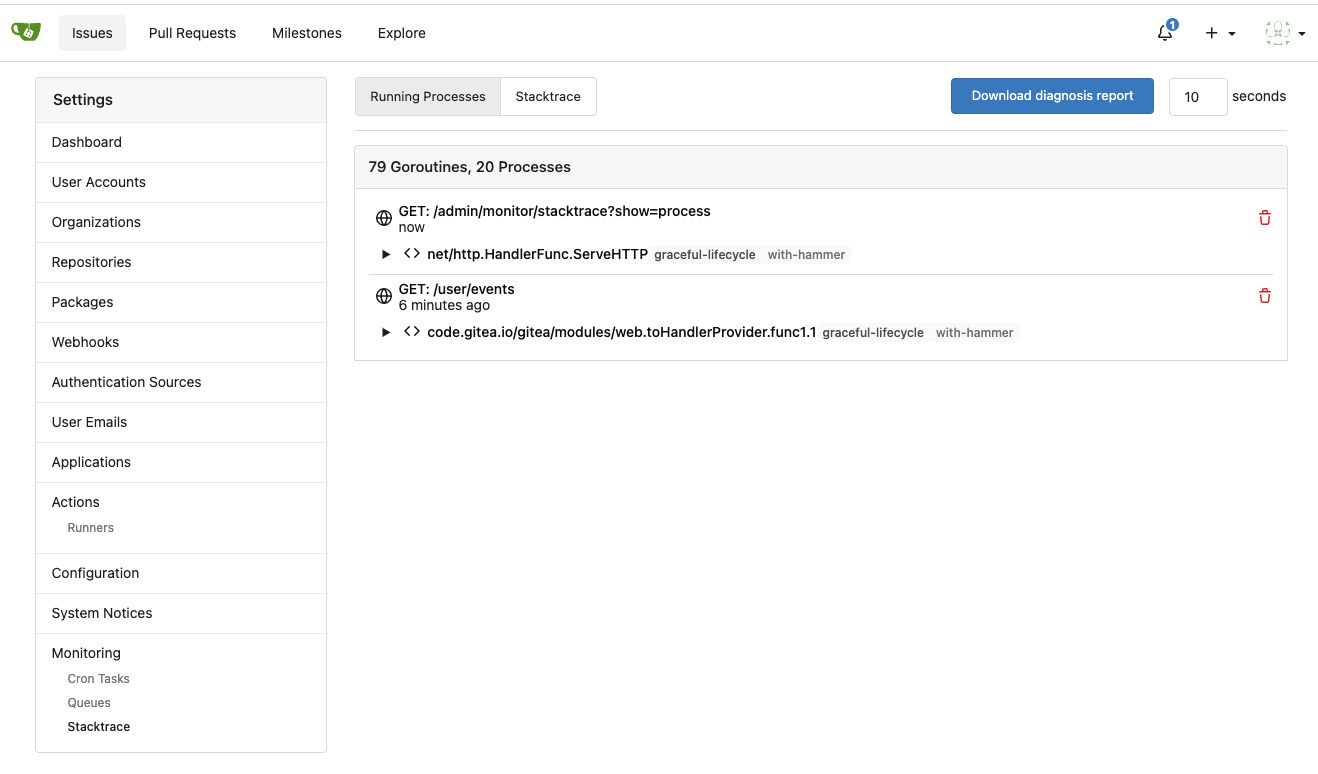
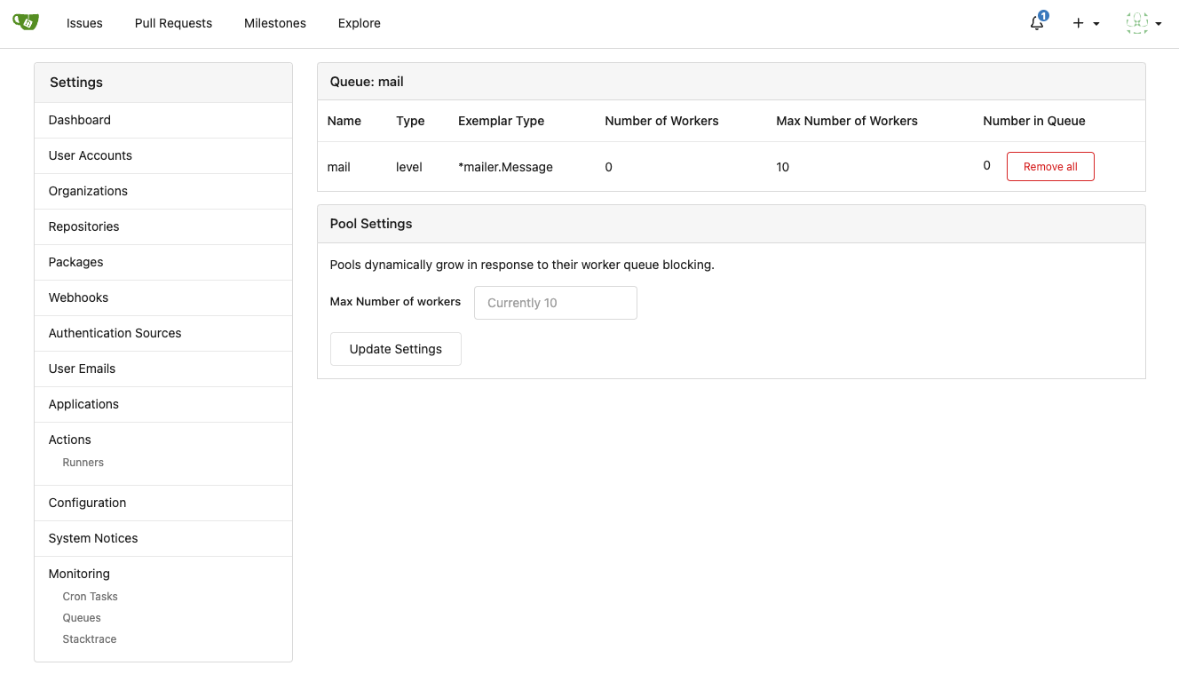
Improve queue & process & stacktrace (#24636)
Although some features are mixed together in this PR, this PR is not
that large, and these features are all related.

Actually there are more than 70 lines are for a toy "test queue", so
this PR is quite simple.

Major features:

1. Allow site admin to clear a queue (remove all items in a queue)
* Because there is no transaction, the "unique queue" could be corrupted
in rare cases, that's unfixable.
* eg: the item is in the "set" but not in the "list", so the item would
never be able to be pushed into the queue.
* Now site admin could simply clear the queue, then everything becomes
correct, the lost items could be re-pushed into queue by future
operations.
3. Split the "admin/monitor" to separate pages
4. Allow to download diagnosis report
* In history, there were many users reporting that Gitea queue gets
stuck, or Gitea's CPU is 100%
    * With diagnosis report, maintainers could know what happens clearly

The diagnosis report sample:
[gitea-diagnosis-20230510-192913.zip](https://github.com/go-gitea/gitea/files/11441346/gitea-diagnosis-20230510-192913.zip)
, use "go tool pprof profile.dat" to view the report.


Screenshots:

![image](https://github.com/go-gitea/gitea/assets/2114189/320659b4-2eda-4def-8dc0-5ea08d578063)


![image](https://github.com/go-gitea/gitea/assets/2114189/c5c46fae-9dc0-44ca-8cd3-57beedc5035e)


![image](https://github.com/go-gitea/gitea/assets/2114189/6168a811-42a1-4e64-a263-0617a6c8c4fe)

---------

Co-authored-by: Jason Song <i@wolfogre.com>
Co-authored-by: Giteabot <teabot@gitea.io>
2023-05-11 07:45:47 +00:00
silverwind 67db6b6976
RSS icon fixes (#24476)
Fix regression from https://github.com/go-gitea/gitea/pull/24471 where
CSS rules for `.icon.grey` were removed which were in use by the RSS
icons.

Gave them their own class instead, removed a wrapper and also fixed
vertical alignment on them. Additionally, did a few related fixes on the
org header for alignment.

Fixes: https://github.com/go-gitea/gitea/issues/24584

<img width="196" alt="Screenshot 2023-05-01 at 22 39 40"
src="https://user-images.githubusercontent.com/115237/235528228-959e2385-c1d2-4d5c-baec-e3784d459653.png">
<img width="216" alt="Screenshot 2023-05-01 at 22 44 20"
src="https://user-images.githubusercontent.com/115237/235528231-95cbff86-5672-48eb-b214-8bdcefa1612c.png">
<img width="120" alt="Screenshot 2023-05-01 at 22 56 36"
src="https://user-images.githubusercontent.com/115237/235529844-b94ab554-3259-4d0c-b040-82aed7d1a111.png">


<img width="372" alt="Screenshot 2023-05-01 at 22 54 25"
src="https://user-images.githubusercontent.com/115237/235529744-1a9c201b-5692-4122-9765-2f201a322a9e.png">
<img width="477" alt="Screenshot 2023-05-01 at 22 55 28"
src="https://user-images.githubusercontent.com/115237/235529748-62188554-9927-42ef-bc94-7052bce266e2.png">

---------

Co-authored-by: wxiaoguang <wxiaoguang@gmail.com>
2023-05-10 22:27:02 +00:00
silverwind f7ede92f82
Notification list enhancements, fix striped tables on dark theme (#24639)
- Make code block rendering via backticks work
- Remove link color unless hovered
- Remove table stripes and fix stripes rendering on dark theme for other
tables
- Introduce new `button-link` class discussed previously for buttons
that look and act like links and apply it to the two right-side buttons
- Reduce box padding by 8px on each side
- Fix "Mark all read" button margin-right
- brighten `--color-markup-code-block` on arc-green

### Before
<img width="1216" alt="Screenshot 2023-05-10 at 20 00 30"
src="https://github.com/go-gitea/gitea/assets/115237/66da9ec2-dd09-4ef0-8f1d-1822a18b6b43">
<img width="1211" alt="Screenshot 2023-05-10 at 20 00 48"
src="https://github.com/go-gitea/gitea/assets/115237/f48e30a2-9a00-4723-93aa-79b97ca0ba0c">

### After
<img width="1222" alt="Screenshot 2023-05-10 at 20 09 59"
src="https://github.com/go-gitea/gitea/assets/115237/c956e0d0-b3d9-42a4-a3ed-f0431c22bf3f">
<img width="1218" alt="Screenshot 2023-05-10 at 20 05 34"
src="https://github.com/go-gitea/gitea/assets/115237/f72c1628-3961-4c28-9263-07cdf7531316">
2023-05-10 21:59:58 +00:00
wxiaoguang 23ae939ef3
Improve "goto issue by number" button (#24577)
Follow #24479


![image](https://user-images.githubusercontent.com/2114189/236694114-c5cb42ff-456d-465a-bcb9-89ed5959d346.png)


![image](https://user-images.githubusercontent.com/2114189/236694119-052e689c-6264-4468-9ab3-0e5c97521bec.png)


![image](https://user-images.githubusercontent.com/2114189/236694139-f8940765-42ce-462d-b49e-50a416cc6f85.png)


![image](https://user-images.githubusercontent.com/2114189/236694154-6d8a000c-9ef3-4d07-af1c-59b0cf8f4d33.png)


![image](https://user-images.githubusercontent.com/2114189/236694166-3bc3e585-7955-44aa-af34-b33ae91e132f.png)

---------

Co-authored-by: silverwind <me@silverwind.io>
Co-authored-by: Giteabot <teabot@gitea.io>
2023-05-10 15:50:58 +00:00
silverwind ae0fa64ef6
Review fixes and enhancements (#24526)
- Fix regression with icons wrapping from
https://github.com/go-gitea/gitea/pull/24459
- Fix box misalignment on small screen
- Fix avatar misalignment on review comment
- Fix incorrect underline hover effect on review icons
- Move status icon to left side in review box
- Enhance review icon colors, add helper function for it
- Add missing inline avatars in review comments
- Tweak icon sizes because some octicons have inconsistent sizing

### Before
<img width="655" alt="Screenshot 2023-05-04 at 20 50 28"
src="https://user-images.githubusercontent.com/115237/236301230-92325507-6e03-47ac-bfb4-c9ddde310571.png">
<img width="260" alt="Screenshot 2023-05-04 at 20 50 42"
src="https://user-images.githubusercontent.com/115237/236301236-0dfa50e7-b8fc-4179-ae68-d872bc90f1f3.png">

### After
<img width="498" alt="Screenshot 2023-05-04 at 20 55 08"
src="https://user-images.githubusercontent.com/115237/236301810-23862c2c-c0a9-43a4-a3eb-ee611c14a7f4.png">
<img width="219" alt="Screenshot 2023-05-04 at 20 55 16"
src="https://user-images.githubusercontent.com/115237/236301817-d0de02ea-6ab5-43e1-9183-6b3848b72995.png">

---------

Co-authored-by: Giteabot <teabot@gitea.io>
2023-05-10 09:16:44 +00:00
Hester Gong 8bbbf7e6b8
Remove fluid on compare diff page (#24627)
As discuessed in
https://github.com/go-gitea/gitea/pull/24598/files#r1189290462

After:

Diff Page
<img width="1426" alt="Screen Shot 2023-05-10 at 10 44 48"
src="https://github.com/go-gitea/gitea/assets/17645053/bc1a5f78-ec17-4ac2-8390-081a5fc059d1">

New PR Page
<img width="1428" alt="Screen Shot 2023-05-10 at 10 45 17"
src="https://github.com/go-gitea/gitea/assets/17645053/ce94a28e-39d5-4534-9e78-c0edd4c7a339">

<img width="1432" alt="Screen Shot 2023-05-10 at 10 45 27"
src="https://github.com/go-gitea/gitea/assets/17645053/047809e1-abb2-4c16-ae62-63b71094c1c7">
2023-05-10 08:46:17 +00:00
oliverpool 8030614386
fix: release page for empty or non-existing target (#24470)
Fixes #24145

To solve the bug, I added a "computed" `TargetBehind` field to the
`Release` model, which indicates the target branch of a release.
This is particularly useful if the target branch was deleted in the
meantime (or is empty).

I also did a micro-optimization in `calReleaseNumCommitsBehind`. Instead
of checking that a branch exists and then call `GetBranchCommit`, I
immediately call `GetBranchCommit` and handle the `git.ErrNotExist`
error.

This optimization is covered by the added unit test.
2023-05-10 11:43:55 +08:00
Matthew Walowski 5930ab5fdf
Filter get single commit (#24613)
Pretty much the same thing as #24568 but for getting a single commit
instead of getting a list of commits
2023-05-10 09:34:07 +08:00
Yarden Shoham 9a0652f0b2
Attach a tooltip to the action status icon (#24614)
To clearly communicate the current state of the action

![image](https://github.com/go-gitea/gitea/assets/20454870/5d6de6b9-f34f-417d-b08e-fcd1b99b3079)
![image](https://github.com/go-gitea/gitea/assets/20454870/b976676a-4525-43e7-866f-8933be1a5dfd)
![image](https://github.com/go-gitea/gitea/assets/20454870/2e0a55fe-658f-4242-83de-b857a8b55f31)
![image](https://github.com/go-gitea/gitea/assets/20454870/6b42bcd1-c499-41ac-8419-1c4e60085d47)
![image](https://github.com/go-gitea/gitea/assets/20454870/363fcff8-fe61-4363-a04b-2db93cfc4fa3)
![image](https://github.com/go-gitea/gitea/assets/20454870/f8f59b68-93de-4f31-b9b0-24d94990d1d0)

---------

Signed-off-by: Yarden Shoham <git@yardenshoham.com>
2023-05-09 21:39:16 +02:00
来自村里的小螃蟹 cd9a13ebb4
Create a branch directly from commit on the create branch API (#22956)
#### Added
- API: Create a branch directly from commit on the create branch API
- Added `old_ref_name` parameter to allow creating a new branch from a
specific commit, tag, or branch.
- Deprecated `old_branch_name` parameter in favor of the new
`old_ref_name` parameter.

---------

Co-authored-by: silverwind <me@silverwind.io>
Co-authored-by: Lunny Xiao <xiaolunwen@gmail.com>
2023-05-09 18:22:32 +08:00
Nicholas Pease c090f87a8d
Add Gitea Profile Readmes (#23260)
Implements displaying a README.md file present in a users ```.profile```
repository on the users profile page. If no such repository/file is
present, the user's profile page remains unchanged.

Example of user with ```.profile/README.md```

![image](https://user-images.githubusercontent.com/34464552/222757202-5d53ac62-60d9-432f-b9e3-2537ffa91041.png)

Example of user without ```.profile/README.md```

![image](https://user-images.githubusercontent.com/34464552/222759972-576e058b-acd4-47ac-be33-38a7cb58cc81.png)

This pull request closes the feature request in #12233 

Special thanks to @techknowlogick for the help in the Gitea discord!

---------

Co-authored-by: techknowlogick <techknowlogick@gitea.io>
Co-authored-by: Yarden Shoham <hrsi88@gmail.com>
Co-authored-by: Lunny Xiao <xiaolunwen@gmail.com>
Co-authored-by: yp05327 <576951401@qq.com>
Co-authored-by: Yarden Shoham <git@yardenshoham.com>
2023-05-09 05:57:24 +00:00
wxiaoguang b6fc2cdf82
Make diff view full width again (#24598)
Regression of #24459 , [the related
line](https://github.com/go-gitea/gitea/pull/24459/files#diff-f255004de8d715ff40852710390429bf2a06e7e33a4e3f8ad568af636557ac71L8)

The PR file diff view needs to be full-screen width.
2023-05-09 05:21:03 +00:00
yp05327 2ee72d011f
Add permission check for moving issue action in project view page (#24589)
Fix #22954
Only users who have write permission can move issues in the project view page.
2023-05-09 00:50:16 -04:00