8099238618
Change green buttons to primary color ( #27099 )
...
I think it's better if the primary actions have primary color instead of
green which fits better into the overall single-color UI design. This PR
currently replaces every green button with primary:
<img width="141" alt="Screenshot 2023-09-16 at 14 07 59"
src="https://github.com/go-gitea/gitea/assets/115237/843c1e50-4fb2-4ec6-84ba-0efb9472dcbe ">
<img width="161" alt="Screenshot 2023-09-16 at 14 07 51"
src="https://github.com/go-gitea/gitea/assets/115237/9442195a-a3b2-4a42-b262-8377d6f5c0d1 ">
Modal actions now use uncolored/primary instead of previous green/red
colors. I also removed the box-shadow on all basic buttons:
<img width="259" alt="Screenshot 2023-09-16 at 14 16 39"
src="https://github.com/go-gitea/gitea/assets/115237/5beea529-127a-44b0-8d4c-afa7b034a490 ">
<img width="261" alt="Screenshot 2023-09-16 at 14 17 42"
src="https://github.com/go-gitea/gitea/assets/115237/4757f7b2-4d46-49bc-a797-38bb28437b88 ">
The change currently includes the "Merge PR" button, for which we might
want to make an exception to match the icon color there:
<img width="442" alt="Screenshot 2023-09-16 at 14 33 53"
src="https://github.com/go-gitea/gitea/assets/115237/993ac1a5-c94d-4895-b76c-0d872181a70b ">
2023-09-18 22:05:31 +00:00
4744cb32e2
Fix margin on the `new/edit milestone` page ( #25801 )
...
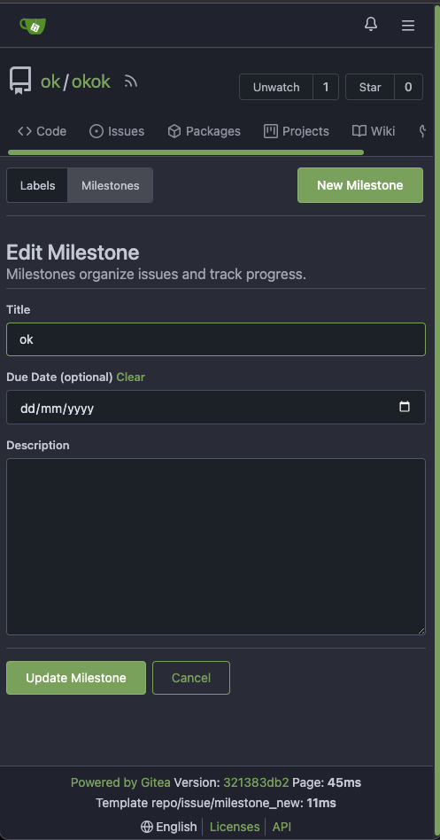
There is some distortion in desktop and mobile ui for new/edit milestone
page.
Fixing the new/edit milestone page for desktop and mobile ui
Design background
https://uxplanet.org/primary-secondary-action-buttons-c16df9b36150
https://balsamiq.com/learn/articles/button-design-best-practices/
<details>
<summary>Screen shots</summary>
Before:


After


</details>
---------
Co-authored-by: Denys Konovalov <privat@denyskon.de>
Co-authored-by: Giteabot <teabot@gitea.io>
2023-07-12 10:36:56 +00:00
64f2d70262
Replace fomantic divider module with our own ( #25539 )
...
Should look exactly like before for normal dividers. "Horizontal" ones
look better because they no longer use image backgrounds.
<img width="917" alt="Screenshot 2023-06-27 at 19 07 56"
src="https://github.com/go-gitea/gitea/assets/115237/d97d8dec-6859-44a8-85ba-e4549b4dd9df ">
<img width="914" alt="Screenshot 2023-06-27 at 19 05 58"
src="https://github.com/go-gitea/gitea/assets/115237/8bf98544-2d82-4ebf-ac68-d6dc237bd6b2 ">
<img width="1246" alt="Screenshot 2023-06-27 at 19 00 42"
src="https://github.com/go-gitea/gitea/assets/115237/36a6bb21-6029-4f53-8bee-535f55c66fed ">
<img width="344" alt="Screenshot 2023-06-27 at 18 58 15"
src="https://github.com/go-gitea/gitea/assets/115237/a9e70aee-8e6b-4ea1-9e93-19c9f96aec6e ">
<img width="823" alt="Screenshot 2023-06-27 at 18 56 22"
src="https://github.com/go-gitea/gitea/assets/115237/e7a497cd-f262-4683-8872-23c3c8cce32f ">
<img width="330" alt="Screenshot 2023-06-27 at 19 21 11"
src="https://github.com/go-gitea/gitea/assets/115237/42f24149-a655-4c7e-bd26-8ab52db6446b ">
2023-06-29 20:24:22 +08:00
15c035775a
Add main landmark to templates and adjust titles ( #22670 )
...
* Add main aria landmark to templates
 * Adjust some titles to improve understanding of location in navigation

Contributed by @Forgejo
2023-02-01 22:56:10 +00:00
d55a0b7238
Refactor `i18n` to `locale` ( #20153 )
...
* Refactor `i18n` to `locale`

- Currently we're using the `i18n` variable naming for the `locale`
struct. This contains locale's specific information and cannot be used
for general i18n purpose, therefore refactoring it to `locale` makes
more sense.
- Ref: https://github.com/go-gitea/gitea/pull/20096#discussion_r906699200

* Update routers/install/install.go
2022-06-27 15:58:46 -05:00
9da3d78e74
Replace blue button and label classes with primary ( #19763 )
...
* make blue really blue

* replace blue button and label classes with primary

* add --color-blue-dark

* add light color variants, tweak a few colors

* fix colors

* add comment

Co-authored-by: wxiaoguang <wxiaoguang@gmail.com>
2022-05-20 00:08:08 +02:00
b1cf7f4df1
Add class to page content to unify top margin ( #13766 )
...
* Add class to page content to unify top margin

Previously pages would individually set this margin but some didn't so
content would stick to the header without any space. Resolve this by
adding a new class that is added on all pages. The only place where we
remove this margin again is on the pages with menu or wrapper in the
header.

* fix admin notices

* fix team pages

* fix loading segment on gitgraph for arc-green

* fix last missing case

Co-authored-by: techknowlogick <techknowlogick@gitea.io>
2020-11-30 23:00:14 -05:00
628ee1d82e
Replace jquery-datetimepicker with native date input ( #11684 )
...
This removes the jQuery plugin as well as the associated config options.
Native input[type=date] does not require a language attribute as it is
localized by default, except for the placeholder attribute for which I
currently piggy-back the repo.issues.due_date_form localization option.

Implementation should pretty much match GH. Of note is that Safari does
not provide a UI for this input type, but I don't think providing one is
neccessary and GH did not bother either.

Co-authored-by: techknowlogick <techknowlogick@gitea.io>
2020-06-10 14:35:27 -04:00
95c3dc856a
Fix max length check and limit in multiple repo forms ( #9148 )
...
* Fix input field max length for release, label and milestone forms

* Add max length for isseu and PR title
2019-11-25 01:06:23 +02:00
eabbddcd98
Restrict permission check on repositories and fix some problems ( #5314 )
...
* fix units permission problems

* fix some bugs and merge LoadUnits to repoAssignment

* refactor permission struct and add some copyright heads

* remove unused codes

* fix routes units check

* improve permission check

* add unit tests for permission

* fix typo

* fix tests

* fix some routes

* fix api permission check

* improve permission check

* fix some permission check

* fix tests

* fix tests

* improve some permission check

* fix some permission check

* refactor AccessLevel

* fix bug

* fix tests

* fix tests

* fix tests

* fix AccessLevel

* rename CanAccess

* fix tests

* fix comment

* fix bug

* add missing unit for test repos

* fix bug

* rename some functions

* fix routes check
2018-11-28 19:26:14 +08:00
a5b0400be7
#1146 finish new access rights for collaborators
2016-03-05 20:45:23 -05:00
da2585c11e
Indent all templates with tabs
...
This commit improves templates readability, since all of them use consistent
indent with all template command blocks indented too.

1. Indents both HTML containers such as <div>, <p> and Go HTML template blocks
   such as {{if}} {{with}}

2. Cleans all trailing white-space

3. Adds trailing last line-break to each file
2015-12-08 00:57:46 +01:00
8a3ee795d2
finish transforming to v2
2015-08-10 00:23:20 +08:00
6d2f25b9f5
clean files
2015-08-05 18:28:05 +08:00
74bd6b939c
milestone: edit
2015-08-05 18:26:18 +08:00
cf90312b8f
clean file
2015-08-05 15:46:35 +08:00
3e4cdccf6b
milestone: create page
2015-08-05 15:24:26 +08:00
86dbda0b42
UI: basci issue list without filters
...
- fix isRead check
- fix paging
2015-07-24 16:42:47 +08:00
75cbb32b1e
UI compatibility
2015-03-21 09:24:59 -04:00
9924e65ca1
In progress of name template name constant
2014-06-22 13:14:03 -04:00