b4e97d6881
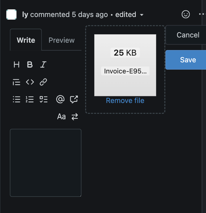
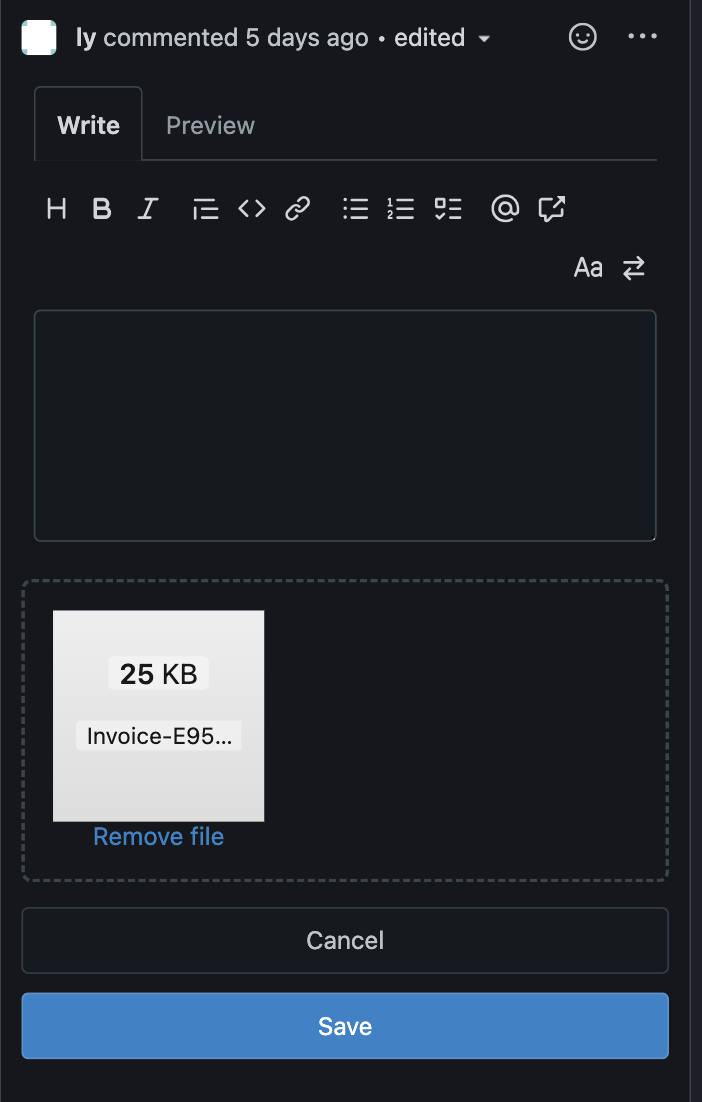
Fix: The interface is broken when modifying code comments under mobile devices ( #30125 )
...
**Fix**: [#30123 ](https://github.com/go-gitea/gitea/issues/30123 )
**Before**

**After**

(cherry picked from commit 4640441a0e23e40bc9ad73ca60f8ade0f29950ee)
2024-03-30 07:17:31 +01:00
eaac4af245
Replace all simple inline styles with tailwind ( #30032 )
...
These should be all simple inline styles that were left in the
templates.

Co-authored-by: Giteabot <teabot@gitea.io>
(cherry picked from commit 0bef9a2775af0e27a0754207fc87537b96c2792e)
2024-03-26 19:04:28 +01:00
b1aabbf174
Preview: set font-size on preview content
...
- When previewing the content in a review, no font size was set. This
resulted in the previewed content being bigger than other text and
therefor creating an noticable inconsistency.
- Set the font size of the previewed content, 14px, this is consistent
with how the content would be rendered.
- `comment-code-cloud` is the class used for the review boxes.
`.ui.tab.markup` means it only applies to the preview tab.
2024-02-14 23:02:40 +01:00
ee3e83eec1
Don't reload timeline page when (un)resolving or replying conversation ( #28654 )
...
Fixes #15981
2024-01-24 03:26:28 +00:00
dca2f9371d
Unify `border-radius` behavior ( #26770 )
...
## Changes
- no more hardcoded `border-radius`es (apart from `0`)
- no more value inconsistencies
- no more guessing what pixel value you should use
- two new variables:
- `--border-radius-medium` (for elements where the normal border radius
does not suffice)
  - `--border-radius-circle` (for displaying circles)

---------

Co-authored-by: silverwind <me@silverwind.io>
2023-08-28 19:43:59 +00:00
d473de0c2d
Make `add line comment` buttons focusable ( #25894 )
...
Use a real button and add an aria-label.
Additionally, show the button whenever it is focused.
See https://codeberg.org/forgejo/forgejo/issues/998 for explanation.

Our handling of this button is now equal to that of GitHub.
Nothing has changed visually.
2023-07-15 11:45:34 +02:00
7fb539677b
Diff page enhancements ( #25398 )
...
Two small tweaks:
1. Vertically center arrow here when editing a PR:
<img width="405" alt="Screenshot 2023-06-20 at 19 48 49"
src="https://github.com/go-gitea/gitea/assets/115237/1d63764d-9fd9-467e-8a8e-9258c06475eb ">
2. Use 2-row layout on diff viewed status and show it again on mobile:
<img width="142" alt="Screenshot 2023-06-20 at 19 51 21"
src="https://github.com/go-gitea/gitea/assets/115237/3046e782-163c-4f87-910c-a22066de8f1b ">
Mobile view:
<img width="370" alt="Screenshot 2023-06-20 at 19 44 40"
src="https://github.com/go-gitea/gitea/assets/115237/9cf56347-7323-4d05-99a5-17ad215ee44d ">
2023-06-22 11:05:22 +00:00
25455bc670
Show outdated comments in files changed tab ( #24936 )
...
If enabled show a clickable label in the comment. A click on the label
opens the Conversation tab with the comment focussed - there you're able
to view the old diff (or original diff the comment was created on).
**Screenshots**


When resolved and outdated:

Option to enable/disable this (stored in user settings - default is
disabled):


fixes #24913
---------
Co-authored-by: silverwind <me@silverwind.io>
2023-06-21 16:08:12 +00:00
3ee8970419
add `stylelint-stylistic` ( #25285 )
...
Add
[stylelint-stylistic](https://github.com/elirasza/stylelint-stylistic ),
autofix all issues with two manual tweaks. This restores all the
stylistic rules removed in Stylelint 15.
2023-06-17 13:20:32 +00:00
6a075589bf
Fix mobile navbar and misc cleanups ( #25134 )
...
- Fix and improve mobile navbar layout
- Apply all cleanups suggested in
https://github.com/go-gitea/gitea/pull/25111
- Make media query breakpoints match Fomantic's exactly
- Clean up whitespace in class on navbar items
Mobile navbar before and after:
<img width="745" alt="Screenshot 2023-06-08 at 08 40 56"
src="https://github.com/go-gitea/gitea/assets/115237/ca84b239-b10f-41db-8c06-dcf2b6dd9d28 ">
<img width="739" alt="Screenshot 2023-06-08 at 08 41 23"
src="https://github.com/go-gitea/gitea/assets/115237/09133c54-eb7e-4110-858c-ead23c3b7521 ">
---------
Co-authored-by: wxiaoguang <wxiaoguang@gmail.com>
Co-authored-by: Giteabot <teabot@gitea.io>
2023-06-09 09:10:51 +00:00
e95b42e187
Improve accessibility when (re-)viewing files ( #24817 )
...
Visually, nothing should have changed.
Changes include
- Convert most `<a [no href]>` to `<button>` when (re-)viewing files:
- `<a [no href]>` are, by HTML definition, not a link and hence cannot
be focused
- `<a class="ui button">` can now be clicked (again?) using
<kbd>Enter</kbd>
- Previously, the installed keypress handler on `.ui.button` elements
disabled it for links somehow
- The `(un)escape file`, the `expand section` and the `expand/collapse
file` buttons can now be focused (and subsequently clicked using only
the keyboard)
- You can now press <kbd>Space</kbd> on a focused `View file` checkbox
to mark the file as viewed.
- previously, this was impossible as this checkbox listened on the wrong
event listener

The `add code comment` button has been left inaccessible for now as it
requires quite a bit of extra logic so that it is unhidden when it is
focused (you can otherwise focus it without seeing it as you are not
hovering on the corresponding line).

---------

Co-authored-by: silverwind <me@silverwind.io>
2023-05-21 20:47:41 +00:00
acde12a8a2
Fix max width and margin of comment box on conversation page ( #24809 )
...
Fix regression from #23937
The changes should only be limited to `.conversation-holder
.comment-code-cloud`, otherwise it will affect the `.comment-code-cloud`
in conversation tab
Before:
<img width="962" alt="Screen Shot 2023-05-19 at 18 22 25"
src="https://github.com/go-gitea/gitea/assets/17645053/0db01d04-2581-48f9-b46c-497836b1f12b ">
After:
<img width="997" alt="Screen Shot 2023-05-19 at 18 35 01"
src="https://github.com/go-gitea/gitea/assets/17645053/5d14b67b-88c1-46c6-b859-fd41752b3ebb ">
---------
Co-authored-by: Giteabot <teabot@gitea.io>
2023-05-19 16:02:34 +00:00
bedad23f9e
Expand/Collapse all changed files ( #23639 )
...
close #23628

Now in `...` dropdown, you can expand or collapse all diff files that
have loaded.

https://user-images.githubusercontent.com/33891828/227749688-2d406916-3347-49f6-93a5-4092a00e8809.mov

Co-authored-by: silverwind <me@silverwind.io>
2023-04-09 21:11:02 +08:00
93eb914438
Improve markdown editor: width, height, preferred ( #23895 )
...
Follow #23876
1. Fine tune the heights of the editors (like before)
* Auto expand the editor (increase/decrease the height) when editing
2. Remember user's last used editor (textarea/easymde) in LocalStorage,
then next time the editor will be switched automatically
* No need to introduce extra config option, it satisfies all users,
including who prefer EasyMDE
3. Also fix the width problem of Review Panel
Screenshot:
<details>


</details>
---------
Co-authored-by: silverwind <me@silverwind.io>
2023-04-07 13:03:29 -04:00
54197b67f9
Scroll collapsed file into view ( #23702 )
2023-04-05 07:51:42 +08:00
d149093ce3
Fix code view (diff) broken layout ( #23096 )
...
Close #22911
I think it's ready for review now, feel free to test it, welcome to help
to improve.
### Before

### After

2023-04-04 19:05:07 +08:00
d0c406a86f
Fix review box viewport overflow issue ( #23800 )
...
Fix regression that came likely from
https://github.com/go-gitea/gitea/pull/23271 :
Long lines of text currently cause the review box's CodeMirror element
to resize which apparently is not recognized by [popper's resize
detection](https://popper.js.org/docs/v2/modifiers/event-listeners/ ) and
which causes the element to go partially out of viewport until a reflow
happens:

Fix this by setting the element to a static width derived from viewport
width and remove the previously clumsy media queries.
2023-04-03 11:11:34 -04:00
5cc0801de9
Introduce GitHub markdown editor, keep EasyMDE as fallback ( #23876 )
...
The first step of the plan
* #23290
Thanks to @silverwind for the first try in #15394 . Close #10729 and a
lot of related issues.
The EasyMDE is not removed, now it works as a fallback, users can switch
between these two editors.
Editor list:
* Issue / PR comment
* Issue / PR comment edit
* Issue / PR comment quote reply
* PR diff view, inline comment
* PR diff view, inline comment edit
* PR diff view, inline comment quote reply
* Release editor
* Wiki editor
Some editors have attached dropzone
Screenshots:
<details>


</details>
---------
Co-authored-by: silverwind <me@silverwind.io>
2023-04-03 18:06:57 +08:00
aa4d1d94f7
Diff improvements ( #23553 )
...
- Avoid flash of wrong tree toggle icon on page load by setting icon
based on sync state
- Avoid "pop-in" of tree on page load by leaving space based on sync
state
- Use the same border/box-shadow combo used on comment `:target` also
for file `:target`.
- Refactor `DiffFileTree.vue` to use `toggleElem` instead of hardcoded
class name.
- Left-align inline comment boxes and make them fit the same amount of
markup content on a line as GitHub.
- Fix height of `diff-file-list`
Fixes: https://github.com/go-gitea/gitea/issues/23593
<img width="1250" alt="Screenshot 2023-03-18 at 00 52 04"
src="https://user-images.githubusercontent.com/115237/226071392-6789a644-aead-4756-a77e-aba3642150a0.png ">
<img width="1246" alt="Screenshot 2023-03-18 at 00 59 43"
src="https://user-images.githubusercontent.com/115237/226071443-8bcba924-458b-48bd-b2f0-0de59cb180ac.png ">
<img width="1250" alt="Screenshot 2023-03-18 at 01 27 14"
src="https://user-images.githubusercontent.com/115237/226073121-ccb99f9a-d3ac-40b7-9589-43580c4a01c9.png ">
<img width="1231" alt="Screenshot 2023-03-19 at 21 44 16"
src="https://user-images.githubusercontent.com/115237/226207951-81bcae1b-6b41-4e39-83a7-0f37951df6be.png ">
(Yes I'm aware the border-radius in bottom corners is suboptimal, but
this would be notorously hard to fix without relying on `overflow:
hidden`).
2023-03-30 20:06:10 +08:00
d0f48187f9
Fix diff detail buttons wrapping, use tippy for review box ( #23271 )
...
Fix visual regression introduced by
https://github.com/go-gitea/gitea/pull/22986 .
Before:
<img width="1277" alt="image"
src="https://user-images.githubusercontent.com/115237/222792814-d70c2173-0c7c-4db2-8839-95be63cdc8ee.png ">
<img width="649" alt="image"
src="https://user-images.githubusercontent.com/115237/222792989-9b1f5e12-becd-40cc-b02c-e9f59a8e72a4.png ">
After:
<img width="1274" alt="image"
src="https://user-images.githubusercontent.com/115237/222792769-e7a9702f-4b6a-46c4-9385-da103ed4dff0.png ">
<img width="565" alt="image"
src="https://user-images.githubusercontent.com/115237/222793084-6de6482b-11dc-4d38-b514-15884d20e140.png ">
2023-03-17 12:24:00 -05:00
202803fc69
Replace Less with CSS ( #23481 )
...
Ran most of the Less files through the Less compiler and Prettier and
then followed up with a round of manual fixes.

The Less compiler had unfortunately stripped all `//` style comments
that I had to restore (It did preserve `/* */` comments). Other fixes
include duplicate selector removal which were revealed after the
transpilation and which weren't caught by stylelint before but now are.

Fixes: https://github.com/go-gitea/gitea/issues/15565
2023-03-14 22:20:19 -04:00