 Tim-Nicas Oelschläger
|
4b494d341f
|
Unify organizations header (#29248)
Unify organizations header
before:

after:

---------
Co-authored-by: silverwind <me@silverwind.io>
(cherry picked from commit 532e422027c88a4a3dc0c2968857f8d5f94d861f)
Conflicts:
routers/web/shared/user/header.go
templates/org/home.tmpl
context
|
2024-02-26 22:30:26 +01:00 |
 puni9869
|
2af30f715e
|
Fix inconsistent user profile layout across tabs (#25625)
Fix ::User Profile Page Project Tab Have Inconsistent Layout and Style
Added the big_avator for consistency in the all header_items tabs.
Fixes: #24871
> ### Description
> in the user profile page the `Packages` and `Projects` tab have small
icons for user but other tabs have bigger profile picture with user
info:
>
> ### Screenshots
> ### **For Packages And Projects:**
>

>
> ### **For Other Tabs:**
>

>
## Before

## After changes
Project View
<img width="1394" alt="image"
src="https://github.com/go-gitea/gitea/assets/80308335/95d181d7-8e61-496d-9899-7b825c91ad56">
Packages View
<img width="1378" alt="image"
src="https://github.com/go-gitea/gitea/assets/80308335/7f5fd60f-6b18-4fa8-8c56-7b0d45d1a610">
## Org view for projects page
<img width="1385" alt="image"
src="https://github.com/go-gitea/gitea/assets/80308335/6400dc89-a5ae-4f0a-831b-5b6efa020d89">
## Org view for packages page
<img width="1387" alt="image"
src="https://github.com/go-gitea/gitea/assets/80308335/4e1e9ffe-1e4b-4334-8657-de11b5fd31d0">
---------
Co-authored-by: wxiaoguang <wxiaoguang@gmail.com>
Co-authored-by: Giteabot <teabot@gitea.io>
Co-authored-by: silverwind <me@silverwind.io>
|
2023-07-06 18:59:24 +00:00 |
 silverwind
|
64f2d70262
|
Replace fomantic divider module with our own (#25539)
Should look exactly like before for normal dividers. "Horizontal" ones
look better because they no longer use image backgrounds.

<img width="917" alt="Screenshot 2023-06-27 at 19 07 56"
src="https://github.com/go-gitea/gitea/assets/115237/d97d8dec-6859-44a8-85ba-e4549b4dd9df">

<img width="914" alt="Screenshot 2023-06-27 at 19 05 58"
src="https://github.com/go-gitea/gitea/assets/115237/8bf98544-2d82-4ebf-ac68-d6dc237bd6b2">

<img width="1246" alt="Screenshot 2023-06-27 at 19 00 42"
src="https://github.com/go-gitea/gitea/assets/115237/36a6bb21-6029-4f53-8bee-535f55c66fed">

<img width="344" alt="Screenshot 2023-06-27 at 18 58 15"
src="https://github.com/go-gitea/gitea/assets/115237/a9e70aee-8e6b-4ea1-9e93-19c9f96aec6e">
<img width="823" alt="Screenshot 2023-06-27 at 18 56 22"
src="https://github.com/go-gitea/gitea/assets/115237/e7a497cd-f262-4683-8872-23c3c8cce32f">

<img width="330" alt="Screenshot 2023-06-27 at 19 21 11"
src="https://github.com/go-gitea/gitea/assets/115237/42f24149-a655-4c7e-bd26-8ab52db6446b">
|
2023-06-29 20:24:22 +08:00 |
 Felipe Leopoldo Sologuren Gutiérrez
|
15c035775a
|
Add main landmark to templates and adjust titles (#22670)
* Add main aria landmark to templates
 * Adjust some titles to improve understanding of location in navigation

Contributed by @Forgejo
|
2023-02-01 22:56:10 +00:00 |
 Yarden Shoham
|
c4f7c96903
|
Run `make fmt` (#21437)
The only change is what `make fmt` did, I am merely a vessel for its
glorious function

Signed-off-by: Yarden Shoham <hrsi88@gmail.com>
|
2022-10-13 21:33:54 -04:00 |
 Lauris BH
|
b59b0cad0a
|
Add user/organization code search (#19977)
Fixes #19925
Screenshots:
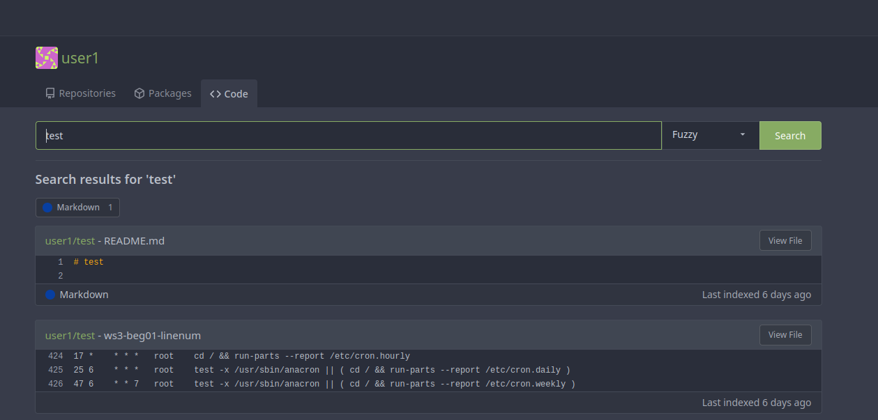
|
2022-10-11 00:12:03 +01:00 |