90b3b3dbf8
Fix tags header and pretty format numbers ( #25624 )
...
This caused by #23465
2023-07-05 04:11:42 +00:00
00dbba7f42
Several fixes for mobile UI ( #25634 )
...
Resolves #25622
<details>
<summary>Screenshots</summary>


</details>
---------
Co-authored-by: wxiaoguang <wxiaoguang@gmail.com>
Co-authored-by: silverwind <me@silverwind.io>
2023-07-04 17:45:45 +00:00
0006169f38
Actions list enhancements ( #25601 )
...
Various small enhancements to the actions list. Before and after:
<img width="1264" alt="Screenshot 2023-06-30 at 00 11 40"
src="https://github.com/go-gitea/gitea/assets/115237/bb4162ee-cdcf-4a73-b05e-f9521562edbb ">
<img width="1264" alt="Screenshot 2023-06-30 at 00 09 51"
src="https://github.com/go-gitea/gitea/assets/115237/52a70ea9-4bb3-406e-904b-0fdaafde9582 ">
---------
Co-authored-by: Giteabot <teabot@gitea.io>
2023-07-04 09:59:47 +00:00
7735da1c66
Display branch commit status ( #25608 )
...
Fix #10388
This PR adds a status icon for every branch which has a status check for
the latest commit on branch list page.
<img width="1313" alt="图片"
src="https://github.com/go-gitea/gitea/assets/81045/727cd540-d03a-40c6-a7dd-e87c118af0ac ">
2023-07-03 03:32:21 +00:00
36f1fa7792
Support displaying diff stats in PR tab bar ( #25387 )
...
Fix #25326

---------

Co-authored-by: silverwind <me@silverwind.io>
2023-07-03 01:00:28 +00:00
4583cbd615
Adding branch-name copy to clipboard branches screen. ( #25596 )
...
Adding branch-name copy to clipboard and button in branches screen
Replaces #25569
Fixes #25120
New mocks:
<img width="876" alt="Screenshot 2023-06-30 at 12 01 41 AM"
src="https://github.com/go-gitea/gitea/assets/80308335/a34ab00f-5625-4529-ba17-f2bf7af58e2a ">
<img width="822" alt="Screenshot 2023-06-30 at 12 03 59 AM"
src="https://github.com/go-gitea/gitea/assets/80308335/3a32dffc-52cd-49e1-a437-6d11d58d0939 ">
<img width="476" alt="image"
src="https://github.com/go-gitea/gitea/assets/80308335/85e8f361-5cb7-45d4-aced-ad2523d54ab0 ">
2023-06-30 18:16:17 +00:00
ed8a8af99f
Use AfterCommitId to get commit for Viewed functionality ( #25529 )
...
the PullHeadCommitID is not always available when the PR is merged.

Not sure if this is the best solution but in my simple tests it looks
like this fixes the problem - happy to get any feedback.

hopefully fixes https://github.com/go-gitea/gitea/issues/24813
2023-07-01 00:08:18 +08:00
9fd63aaad1
read-only checkboxes don't appear and don't entirely act the way one might expect ( #25573 )
...
This pull request fades read-only checkboxes and checkmark, and it makes
the checkboxes act more read-only/disabled by not changing the
border-color when clicked.
Examples using light mode:
| Before | After |
| - | - |
| 
| 
|
| 
| 
|
| | read-only checkboxes and checkmark are faded<br>and the checkboxes
act more read-only/disabled |
Fixes/Closes/Resolves #25076
---------
Co-authored-by: silverwind <me@silverwind.io>
Co-authored-by: wxiaoguang <wxiaoguang@gmail.com>
2023-06-30 00:16:53 +02:00
64f2d70262
Replace fomantic divider module with our own ( #25539 )
...
Should look exactly like before for normal dividers. "Horizontal" ones
look better because they no longer use image backgrounds.
<img width="917" alt="Screenshot 2023-06-27 at 19 07 56"
src="https://github.com/go-gitea/gitea/assets/115237/d97d8dec-6859-44a8-85ba-e4549b4dd9df ">
<img width="914" alt="Screenshot 2023-06-27 at 19 05 58"
src="https://github.com/go-gitea/gitea/assets/115237/8bf98544-2d82-4ebf-ac68-d6dc237bd6b2 ">
<img width="1246" alt="Screenshot 2023-06-27 at 19 00 42"
src="https://github.com/go-gitea/gitea/assets/115237/36a6bb21-6029-4f53-8bee-535f55c66fed ">
<img width="344" alt="Screenshot 2023-06-27 at 18 58 15"
src="https://github.com/go-gitea/gitea/assets/115237/a9e70aee-8e6b-4ea1-9e93-19c9f96aec6e ">
<img width="823" alt="Screenshot 2023-06-27 at 18 56 22"
src="https://github.com/go-gitea/gitea/assets/115237/e7a497cd-f262-4683-8872-23c3c8cce32f ">
<img width="330" alt="Screenshot 2023-06-27 at 19 21 11"
src="https://github.com/go-gitea/gitea/assets/115237/42f24149-a655-4c7e-bd26-8ab52db6446b ">
2023-06-29 20:24:22 +08:00
6e19484f4d
Sync branches into databases ( #22743 )
...
Related #14180
Related #25233
Related #22639
Close #19786
Related #12763

This PR will change all the branches retrieve method from reading git
data to read database to reduce git read operations.

- [x] Sync git branches information into database when push git data
- [x] Create a new table `Branch`, merge some columns of `DeletedBranch`
into `Branch` table and drop the table `DeletedBranch`.
- [x] Read `Branch` table when visit `code` -> `branch` page
- [x] Read `Branch` table when list branch names in `code` page dropdown
- [x] Read `Branch` table when list git ref compare page
- [x] Provide a button in admin page to manually sync all branches.
- [x] Sync branches if repository is not empty but database branches are
empty when visiting pages with branches list
- [x] Use `commit_time desc` as the default FindBranch order by to keep
consistent as before and deleted branches will be always at the end.

---------

Co-authored-by: Jason Song <i@wolfogre.com>
2023-06-29 10:03:20 +00:00
5a871932f0
Fix milestones deletion ( #25583 )
...
Close #25557
Fix regression from #25315

`data-id` is still needed for deleting milestone.
2023-06-29 10:17:18 +02:00
c6f1fb1c6d
Use fetch form action for lock/unlock/pin/unpin on sidebar ( #25380 )
...
Before:
<img width="364" alt="Screen Shot 2023-06-20 at 11 59 11"
src="https://github.com/go-gitea/gitea/assets/17645053/ad284b7e-8d21-43be-b178-bbcfd37cb5bd ">
Might trigger many posts when keep clicking the buttons above.
<img width="448" alt="Screen Shot 2023-06-20 at 11 52 28"
src="https://github.com/go-gitea/gitea/assets/17645053/a60aa6ac-af74-45e4-b13a-512b436b81b0 ">
<img width="678" alt="Screen Shot 2023-06-20 at 11 52 37"
src="https://github.com/go-gitea/gitea/assets/17645053/d6662700-3643-4cc7-a2ec-64e1c0f5fbdb ">
After (PR sidebar, Same for issue):
https://github.com/go-gitea/gitea/assets/17645053/9df3ad1f-e29c-439b-8bde-e6b917d63cc6
For delete, it is using `base/modal_actions_confirm` subtemplate, and we
might need another general solution for this (maybe add another
attribute to the subtemplate or something)
---------
Co-authored-by: silverwind <me@silverwind.io>
Co-authored-by: Giteabot <teabot@gitea.io>
Co-authored-by: wxiaoguang <wxiaoguang@gmail.com>
2023-06-29 04:16:04 +00:00
f0b773e0ce
Support downloading raw task logs ( #24451 )
...
Hi!
This pull request adds support for downloading raw task logs for Gitea
Actions, similar to Github Actions
It looks like the following:

2023-06-29 10:58:56 +08:00
4aba8a6a5f
Split lfs size from repository size ( #22900 )
...
releated to #21820
- Split `Size` in repository table as two new colunms, one is `GitSize`
for git size, the other is `LFSSize` for lfs data. still store full size
in `Size` colunm.
- Show full size on ui, but show each of them by a `title`; example:

- Return full size in api response.
---------
Signed-off-by: a1012112796 <1012112796@qq.com>
Co-authored-by: Lunny Xiao <xiaolunwen@gmail.com>
Co-authored-by: silverwind <me@silverwind.io>
Co-authored-by: DmitryFrolovTri <23313323+DmitryFrolovTri@users.noreply.github.com>
Co-authored-by: Giteabot <teabot@gitea.io>
2023-06-28 22:41:02 +00:00
da6df0d063
Fix migrate page layout on mobile ( #25507 )
...
Fixes: https://github.com/go-gitea/gitea/issues/25462
On supporting browsers, text in description is [wrapped
equally](https://caniuse.com/css-text-wrap-balance ).
<img width="488" alt="Screenshot 2023-06-26 at 00 17 21"
src="https://github.com/go-gitea/gitea/assets/115237/cb8e3a50-6225-4a8c-a6c0-f35a17d2af76 ">
<img width="1254" alt="Screenshot 2023-06-26 at 00 14 51"
src="https://github.com/go-gitea/gitea/assets/115237/0885404e-973e-45ce-b41e-5cb265a4cd1e ">
2023-06-26 09:57:36 +00:00
7609f2f27e
Link to existing PR when trying to open a new PR on the same branches ( #25494 )
...
when trying to create a PR for an existing PRs branch combination link
to the PR directly and not just to the repo.
Before:

After:

2023-06-25 10:03:36 +00:00
323c6cba20
Fine tune "dropdown button" icon ( #25442 )
...

----

2023-06-25 02:40:41 +00:00
77e449f0be
Highlight viewed files differently in the PR filetree ( #24956 )
...

fixes #24566
---------
Co-authored-by: wxiaoguang <wxiaoguang@gmail.com>
2023-06-25 08:46:30 +08:00
083818cb85
Improve loadprojects for issue list ( #25468 )
2023-06-24 15:31:28 +00:00
62ab55bacc
Improve wiki sidebar and TOC ( #25460 )
...
Close #20976
Close #20975

1. Fix the bug: the TOC in footer was incorrectly rendered as main
content's TOC
2. Fix the layout: on mobile, the TOC is put above the main content,
while the sidebar is put below the main content
3. Auto collapse the TOC on mobile

ps: many styles of "wiki.css" are moved from old css files, so leave
nits to following PRs.
2023-06-23 15:51:43 -04:00
b0215c40cd
Store and use seconds for timeline time comments ( #25392 )
...
this will allow us to fully localize it later

PS: we can not migrate back as the old value was a one-way conversion


prepare for  #25213

---
*Sponsored by Kithara Software GmbH*
2023-06-23 12:12:39 +00:00
17965c8e79
Make "dismiss" content shown correctly ( #25461 )
...
Close #25127

Co-authored-by: Giteabot <teabot@gitea.io>
2023-06-23 12:33:20 +02:00
7fb539677b
Diff page enhancements ( #25398 )
...
Two small tweaks:
1. Vertically center arrow here when editing a PR:
<img width="405" alt="Screenshot 2023-06-20 at 19 48 49"
src="https://github.com/go-gitea/gitea/assets/115237/1d63764d-9fd9-467e-8a8e-9258c06475eb ">
2. Use 2-row layout on diff viewed status and show it again on mobile:
<img width="142" alt="Screenshot 2023-06-20 at 19 51 21"
src="https://github.com/go-gitea/gitea/assets/115237/3046e782-163c-4f87-910c-a22066de8f1b ">
Mobile view:
<img width="370" alt="Screenshot 2023-06-20 at 19 44 40"
src="https://github.com/go-gitea/gitea/assets/115237/9cf56347-7323-4d05-99a5-17ad215ee44d ">
2023-06-22 11:05:22 +00:00
af094fbb6c
Introduce shared template for search inputs ( #25338 )
...
- Set
[type=search](https://developer.mozilla.org/en-US/docs/Web/HTML/Element/input/search )
- Disable spellcheck
- Set maxLength 255 that I found in `templates/repo/issue/search.tmpl`
- Remove unnecessary `max-width`, it does nothing
---------
Co-authored-by: delvh <dev.lh@web.de>
Co-authored-by: Giteabot <teabot@gitea.io>
2023-06-22 10:27:35 +00:00
656d3cc719
Various UI fixes ( #25264 )
...
Numerous small UI fixes:

- Fix double border in collaborator list
- Fix system notice table background
- Mute links in repo and org lists
- Downsize projects edit buttons
- Improve milestones and project list rendering
- Condense milestone list entry to a single line of "metas"
- Mute ".." button in repo files list
2023-06-21 21:59:49 -04:00
25455bc670
Show outdated comments in files changed tab ( #24936 )
...
If enabled show a clickable label in the comment. A click on the label
opens the Conversation tab with the comment focussed - there you're able
to view the old diff (or original diff the comment was created on).
**Screenshots**


When resolved and outdated:

Option to enable/disable this (stored in user settings - default is
disabled):


fixes #24913
---------
Co-authored-by: silverwind <me@silverwind.io>
2023-06-21 16:08:12 +00:00
1454f9dafc
Add actor and status dropdowns to run list ( #25118 )
...
Part of #25042
1. Added actor and status dropdowns first in case something is offtrack
and PR is too large.
2. Also added "No results matched." and "The workflow has no runs yet.",
and "No results matched." will show if there is no filter results and
there is no workflows (with [reference to github
action](https://github.com/go-gitea/gitea/actions/workflows/files-changed.yml?query=actor%3AGiteaBot ))
Demo:
https://github.com/go-gitea/gitea/assets/17645053/6e76292c-4c1f-450d-8b48-99944cfc920c
TODOs:
- [x] Get available status (same as those in `aggregateJobStatus`)
instead of getting from database
- [x] Use `JOIN` to get actors, actors order by name
- [x] Make self on top
2023-06-21 04:25:14 +00:00
831db53c21
Fix dropdown icon layout on diff page ( #25397 )
...
Address
https://github.com/go-gitea/gitea/pull/25163#issuecomment-1599207916
Remove the unused "icon-button".
And fix the layout:
Without the dropdown icon:
```
{{svg "gitea-whitespace"}}
```

With the dropdown icon:
```
{{svg "gitea-whitespace" 16 "gt-mr-3"}}
{{svg "octicon-triangle-down" 14 "dropdown icon"}}
```

2023-06-20 23:22:48 +00:00
35a653d7ed
Support configuration variables on Gitea Actions ( #24724 )
...
Co-Author: @silverwind @wxiaoguang
Replace: #24404
See:
- [defining configuration variables for multiple
workflows](https://docs.github.com/en/actions/learn-github-actions/variables#defining-configuration-variables-for-multiple-workflows )
- [vars
context](https://docs.github.com/en/actions/learn-github-actions/contexts#vars-context )
Related to:
- [x] protocol: https://gitea.com/gitea/actions-proto-def/pulls/7
- [x] act_runner: https://gitea.com/gitea/act_runner/pulls/157
- [x] act: https://gitea.com/gitea/act/pulls/43
#### Screenshoot
Create Variable:


Workflow:
```yaml
test_vars:
runs-on: ubuntu-latest
steps:
- name: Print Custom Variables
run: echo "${{ vars.test_key }}"
- name: Try to print a non-exist var
run: echo "${{ vars.NON_EXIST_VAR }}"
```
Actions Log:

---
This PR just implement the org / user (depends on the owner of the
current repository) and repo level variables, The Environment level
variables have not been implemented.
Because
[Environment](https://docs.github.com/en/actions/deployment/targeting-different-environments/using-environments-for-deployment#about-environments )
is a module separate from `Actions`. Maybe it would be better to create
a new PR to do it.
---------
Co-authored-by: silverwind <me@silverwind.io>
Co-authored-by: wxiaoguang <wxiaoguang@gmail.com>
Co-authored-by: Giteabot <teabot@gitea.io>
2023-06-20 22:54:15 +00:00
7f38cf71fe
Fix issue filters on mobile view ( #25368 )
...
Fix #24846 applying the solution proposed by @silverwind
<details>
<summary>Screenshots</summary>


</details>
Replaces #25335
2023-06-19 17:12:15 +00:00
749802c922
Refactor: TotalTimest return seconds ( #25370 )
...
so template/browser can deal with string format

---
*Sponsored by Kithara Software GmbH*
2023-06-19 18:40:06 +02:00
a1c5057fe8
Batch delete issue and improve tippy opts ( #25253 )
...
1. Add "batch delete" button for selected issues, close #22273
2. Address the review in
https://github.com/go-gitea/gitea/pull/25219#discussion_r1229266083
2023-06-19 15:46:50 +08:00
bfab129fb9
Fix label list divider ( #25312 )
...
We only needs 2 lines to hide the dividers.
```
$dropdownLabelFilter.dropdown('setting', {'hideDividers': 'empty'});
$dropdownLabelFilter.dropdown('refreshItems');
```
Other code blocks are refactored by the way.


2023-06-18 17:33:12 +00:00
9e74063498
Fix UI on mobile view ( #25315 )
...
Various fixes to pages or elements which were looking ugly on mobile.
<details>
<summary>Screenshots</summary>


</details>
Co-authored by @silverwind
---------
Co-authored-by: silverwind <me@silverwind.io>
2023-06-18 10:31:42 +00:00
57120d9969
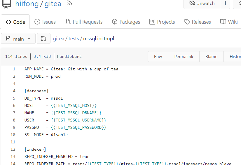
When viewing a file, hide the add button ( #25320 )
...
Fix #25281
When viewing a file, hide the add button

2023-06-18 09:21:50 +00:00
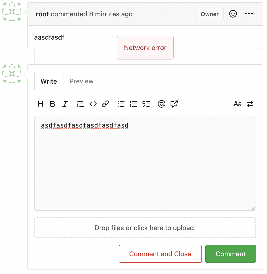
b71cb7acdc
Use fetch to send requests to create issues/comments ( #25258 )
...
Follow #23290
Network error won't make content lost. And this is a much better
approach than "loading-button".
The UI is not perfect and there are still some TODOs, they can be done
in following PRs, not a must in this PR's scope.
<details>
</details>
2023-06-16 06:32:43 +00:00
a305c37e62
Show if File is Executable ( #25287 )
...
This simply shows if a File has the executable Permission

---------
Co-authored-by: silverwind <me@silverwind.io>
Co-authored-by: Giteabot <teabot@gitea.io>
2023-06-16 07:46:12 +02:00
6db66d8ca4
Fix some UI alignments ( #25277 )
...
Fixes: https://github.com/go-gitea/gitea/issues/25282

Fix the problems:

1. The `repo-button-row` had various patches before, this PR makes it
consistent
2. The "Add File" has wrong CSS class "icon", remove it
3. The "Add File" padding was overridden by "!important", fix it by
`.repo-button-row .button.dropdown` with comment
4. The selector `.ui.segments ~ .ui.top.attached.header` is incorrect,
it should use `+`
2023-06-15 15:12:08 +00:00
5440d37c70
Fix variable in template ( #25267 )
...
Fix regression from https://github.com/go-gitea/gitea/pull/25212 .
2023-06-14 20:42:52 +00:00
e24f651c86
Add template linting via djlint ( #25212 )
...
So I found this [linter](https://github.com/Riverside-Healthcare/djlint )
which features a mode for go templates, so I gave it a try and it did
find a number of valid issue, like unbalanced tags etc. It also has a
number of bugs, I had to disable/workaround many issues.
Given that this linter is written in python, this does add a dependency
on `python` >= 3.8 and `poetry` to the development environment to be
able to run this linter locally.
- `e.g.` prefixes on placeholders are removed because the linter had a
false-positive on `placeholder="e.g. cn=Search"` for the `attr=value`
syntax and it's not ideal anyways to write `e.g.` into a placeholder
because a placeholder is meant to hold a sample value.
- In `templates/repo/settings/options.tmpl` I simplified the logic to
not conditionally create opening tags without closing tags because this
stuff confuses the linter (and possibly the reader as well).
2023-06-14 18:17:58 +00:00
46c17c8029
Use flex to align SVG and text ( #25163 )
...
The code can be as simple as:
```html
<div class="flex-text-block">{{svg "octicon-alert"}} {{svg "octicon-x"}} text (block)</div>
<div><div class="flex-text-inline">{{svg "octicon-alert"}} {{svg "octicon-x"}} text</div> (inline)</div>
<div><button class="ui red button">{{svg "octicon-alert" 24}} {{svg "octicon-x" 24}} text</button></div>
```

---------
Co-authored-by: Giteabot <teabot@gitea.io>
2023-06-14 16:40:15 +00:00
a43ea22479
Change form actions to fetch for submit review box ( #25219 )
...
Co-author: @wxiaoguang
Close #25096
The way to fix it in this PR is to change form submit to fetch using
formData, and add flags to avoid post repeatedly.
Should be able to apply to more forms that have the same issue after
this PR.
In the demo below, 'approve' is clicked several times, and then
'comment' is clicked several time after 'request changes' clicked.
After:
https://github.com/go-gitea/gitea/assets/17645053/beabeb1d-fe66-4b76-b048-4f022b4e83a0
Update: screenshots from /devtest
>

>
>

>
>

---------
Co-authored-by: wxiaoguang <wxiaoguang@gmail.com>
2023-06-14 16:01:37 +08:00
6bbccdd177
Improve AJAX link and modal confirm dialog ( #25210 )
...
Clarify the "link-action" behavior:

>  // A "link-action" can post AJAX request to its "data-url"
> // Then the browser is redirect to: the "redirect" in response, or
"data-redirect" attribute, or current URL by reloading.

And enhance the "link-action" to support showing a modal dialog for
confirm. A similar general approach could also help PRs like
https://github.com/go-gitea/gitea/pull/22344#discussion_r1062883436

> // If the "link-action" has "data-modal-confirm(-html)" attribute, a
confirm modal dialog will be shown before taking action.


And a lot of duplicate code can be removed now. A good framework design
can help to avoid code copying&pasting.

---------

Co-authored-by: silverwind <me@silverwind.io>
2023-06-13 12:10:10 +00:00
2ad2d5a6ce
Disable `Create column` button while the column name is empty ( #25192 )
...
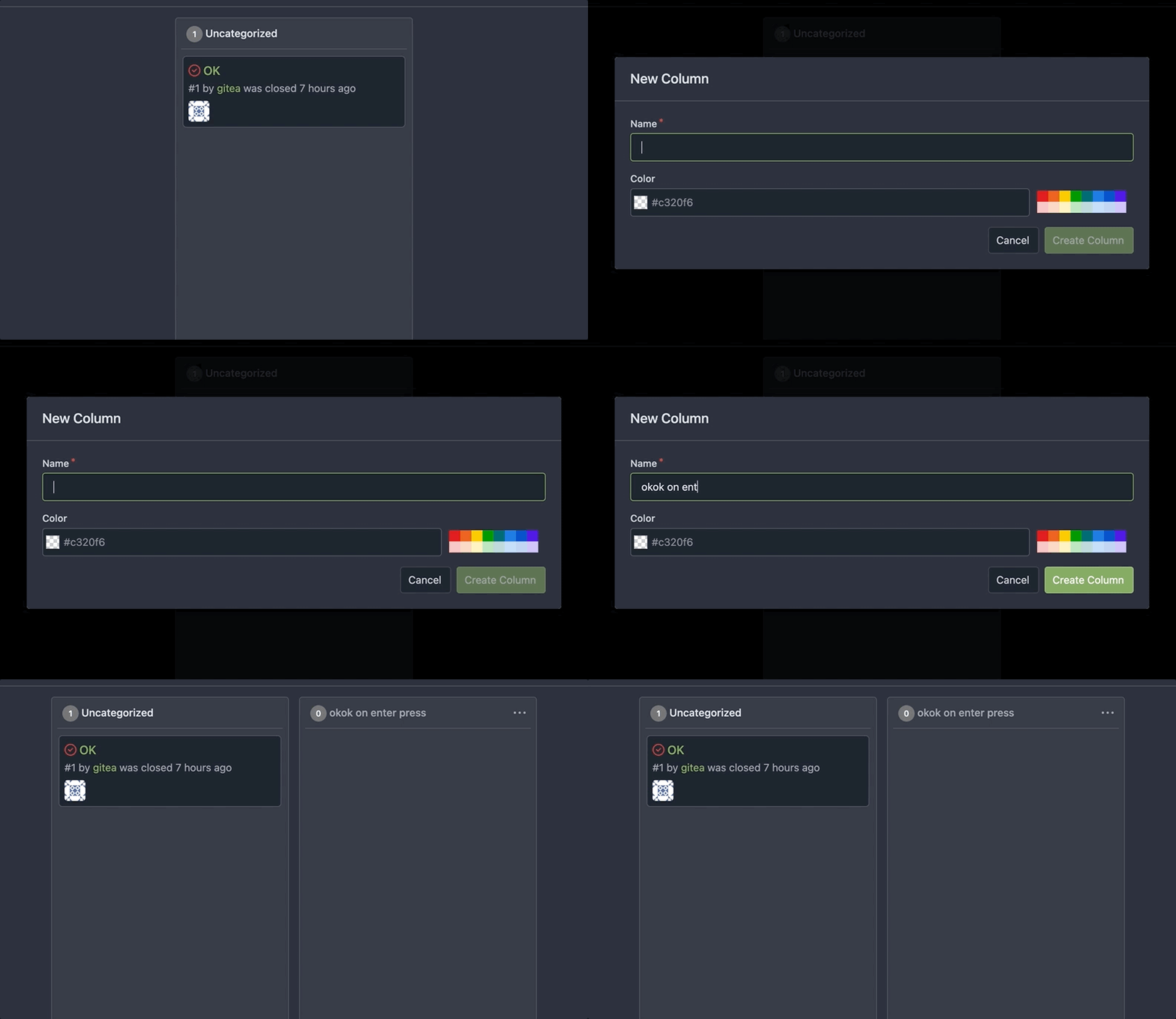
Fixes #25116
2023-06-13 09:57:03 +00:00
06557a75db
Adjust style for action run list (align icons, adjust padding) ( #25170 )
...
Main changes:
- Moved the icon into `action-item-main`, and make it `position:
absolute` to allow add margin it to align with `issue-item-top-row`.
- Adjusted padding and color of texts.
# Before
<img width="721" alt="Screen Shot 2023-06-09 at 17 04 38"
src="https://github.com/go-gitea/gitea/assets/17645053/3fc00e94-bcd4-4e06-b1d8-93be0576dbc3 ">
# After
<img width="1421" alt="Screen Shot 2023-06-09 at 18 32 47"
src="https://github.com/go-gitea/gitea/assets/17645053/c2a0f9df-cac4-4197-9cbd-6c16dfef215b ">
On hover:
<img width="1431" alt="Screen Shot 2023-06-09 at 18 32 54"
src="https://github.com/go-gitea/gitea/assets/17645053/d0ab6fde-9722-4d76-831b-163fd6a1f560 ">
2023-06-12 09:36:08 +00:00
81211db077
Fix #25133 ( #25162 )
...
Fix #25133

Thanks @wxiaoguang @silverwind.
I'm sorry I made a mistake, it will be fixed in this PR.

---------

Co-authored-by: Giteabot <teabot@gitea.io>
Co-authored-by: silverwind <me@silverwind.io>
2023-06-09 10:27:10 +00:00
6a075589bf
Fix mobile navbar and misc cleanups ( #25134 )
...
- Fix and improve mobile navbar layout
- Apply all cleanups suggested in
https://github.com/go-gitea/gitea/pull/25111
- Make media query breakpoints match Fomantic's exactly
- Clean up whitespace in class on navbar items
Mobile navbar before and after:
<img width="745" alt="Screenshot 2023-06-08 at 08 40 56"
src="https://github.com/go-gitea/gitea/assets/115237/ca84b239-b10f-41db-8c06-dcf2b6dd9d28 ">
<img width="739" alt="Screenshot 2023-06-08 at 08 41 23"
src="https://github.com/go-gitea/gitea/assets/115237/09133c54-eb7e-4110-858c-ead23c3b7521 ">
---------
Co-authored-by: wxiaoguang <wxiaoguang@gmail.com>
Co-authored-by: Giteabot <teabot@gitea.io>
2023-06-09 09:10:51 +00:00
623b3b590e
Button and color enhancements ( #24989 )
...
- Various corrections to button styles, especially secondary
- Remove focus highlight, it's annoying when it stays on button after
press
- Clearly define ghost and link buttons with demos in devtest
- Remove black, grey and tertiary buttons, they should not be used
- Make `arc-green` slightly darker
<img width="1226" alt="image"
src="https://github.com/go-gitea/gitea/assets/115237/8d89786a-01ab-40f8-ae5a-e17f40e35084 ">
<img width="1249" alt="image"
src="https://github.com/go-gitea/gitea/assets/115237/83651e6d-3c27-46ff-b8bd-ff344d70e949 ">
---------
Co-authored-by: wxiaoguang <wxiaoguang@gmail.com>
Co-authored-by: Giteabot <teabot@gitea.io>
2023-06-09 08:37:47 +00:00
b5a2bb9ab3
Fix strange UI behavior of cancelling dismiss review modal ( #25133 )
...
Fixes https://github.com/go-gitea/gitea/issues/25130

The old code uses `$(this).next()` to get `dismiss-review-modal`.
At first, it will get `$(#dismiss-review-modal)`, but the next time it
will get `$(#dismiss-review-modal).next();`
and then `$(#dismiss-review-modal).next().next();`.
Because div `dismiss-review-modal` will be removed when
`dismiss-review-btn` clicked.

Maybe the right usage is adding `show-modal` class and `data-modal`
attribute.
2023-06-08 08:52:35 +00:00
58536093b3
Add details summary for vertical menus in settings to allow toggling ( #25098 )
...
Close #25051
[referenced
answer](https://stackoverflow.com/questions/10813581/can-i-replace-the-expand-icon-of-the-details-element/69722686#69722686 )
for marker overwrite. One limitation is that fomantic does not have
hover and active effects for the vertical submenu
([reference](https://fomantic-ui.com/collections/menu.html#sub-menu )).
And we might need to overwrite some styles if hover and active effects
are needed.
Update:
Used `data:image/svg` instead of `marker` content. And adjusted styles
for hover effect.
Take admin settings as an example:
https://github.com/go-gitea/gitea/assets/17645053/63f69823-ef43-47d5-a518-544b5ea35ba6
---------
Co-authored-by: silverwind <me@silverwind.io>
2023-06-07 10:49:48 +08:00
8d7893e817
Don't display `select all issues` checkbox when no issues are available ( #25086 )
...
Before:
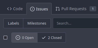
After:

2023-06-06 08:19:24 +08:00
395a6fabf3
fix "Remove stars when repo goes private #19904" ( #25084 )
...
https://github.com/go-gitea/gitea/pull/19904#discussion_r1218111682
2023-06-05 15:23:09 +00:00
62ac3251fa
Remove stars when repo goes private ( #19904 )
...
Fixes #18600
2023-06-05 13:25:43 +00:00
7d192cb674
Add Progressbar to Milestone Page ( #25050 )
...
This is adds the progress bar, which is already on the Milestone List,
also to the Page of a Single Milestone.

---------
Co-authored-by: silverwind <me@silverwind.io>
2023-06-05 14:25:46 +08:00
4486dd39e7
Remove cancel button from branch protection form ( #25063 )
...
It caused bugs. To cancel, just navigate away.
- Follows #21381 and #21872
- Resolves #25038
## Before

## After

Signed-off-by: Yarden Shoham <git@yardenshoham.com>
2023-06-03 20:06:09 +08:00
72eedfb915
Show file tree by default ( #25052 )
...
Feel free to close this if there isn't interest.
The tree view looks amazing, and all of our users are really enjoying it
(major kudos to developers!), but only IF I tell them it exists!
Essentially, the file tree view as it is effectively undiscoverable.
This PR changes the default state for the tree view to open, which
should significantly help with discoverability.
An alternative could be to reserve more horizontal space, as a typical
accordion panel would look (eg. VS Code), eg.

2023-06-02 23:39:01 +08:00
c5ede35124
Add button on diff header to copy file name, misc diff header tweaks ( #24986 )
...
1. Add this button:
<img width="232" alt="Screenshot 2023-05-29 at 15 21 47"
src="https://github.com/go-gitea/gitea/assets/115237/5eaf6bd1-83db-4ffc-9503-eda0c59807d2 ">
<img width="297" alt="Screenshot 2023-05-29 at 15 20 22"
src="https://github.com/go-gitea/gitea/assets/115237/708a344f-f6d7-4229-bfda-76e1571b42c8 ">
2. Correct `button-link` styles to not have a background hover effect.
3. Tweak `.ui.container` padding to be the same for fluid and non-fluid.
4. Misc enhancements to diff header:
Before:
<img width="984" alt="Screenshot 2023-05-29 at 15 38 53"
src="https://github.com/go-gitea/gitea/assets/115237/c7926f6a-bd0a-4b05-97ad-c91fc25c62d5 ">
After:
<img width="987" alt="Screenshot 2023-05-29 at 15 43 10"
src="https://github.com/go-gitea/gitea/assets/115237/0149f545-45f8-42cf-b443-e1c76bd5cdeb ">
2023-06-01 10:47:28 +00:00
bf27fc3596
Merge `new project` templates into one ( #24985 )
...
Additionally simplify the `new project` template slightly.
Review hint: Disable whitespace changes.
<details><summary>Before</summary>
## New repo project

## Edit repo project

## New user/org project

## Edit user/org project

</details>
<details><summary>After</summary>
## New repo project
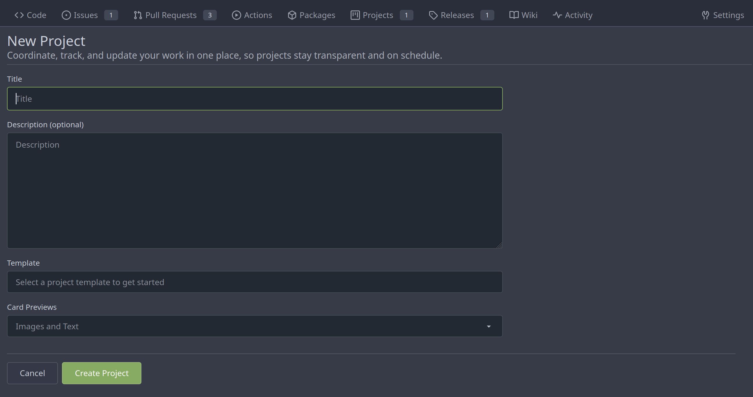
## Edit repo project
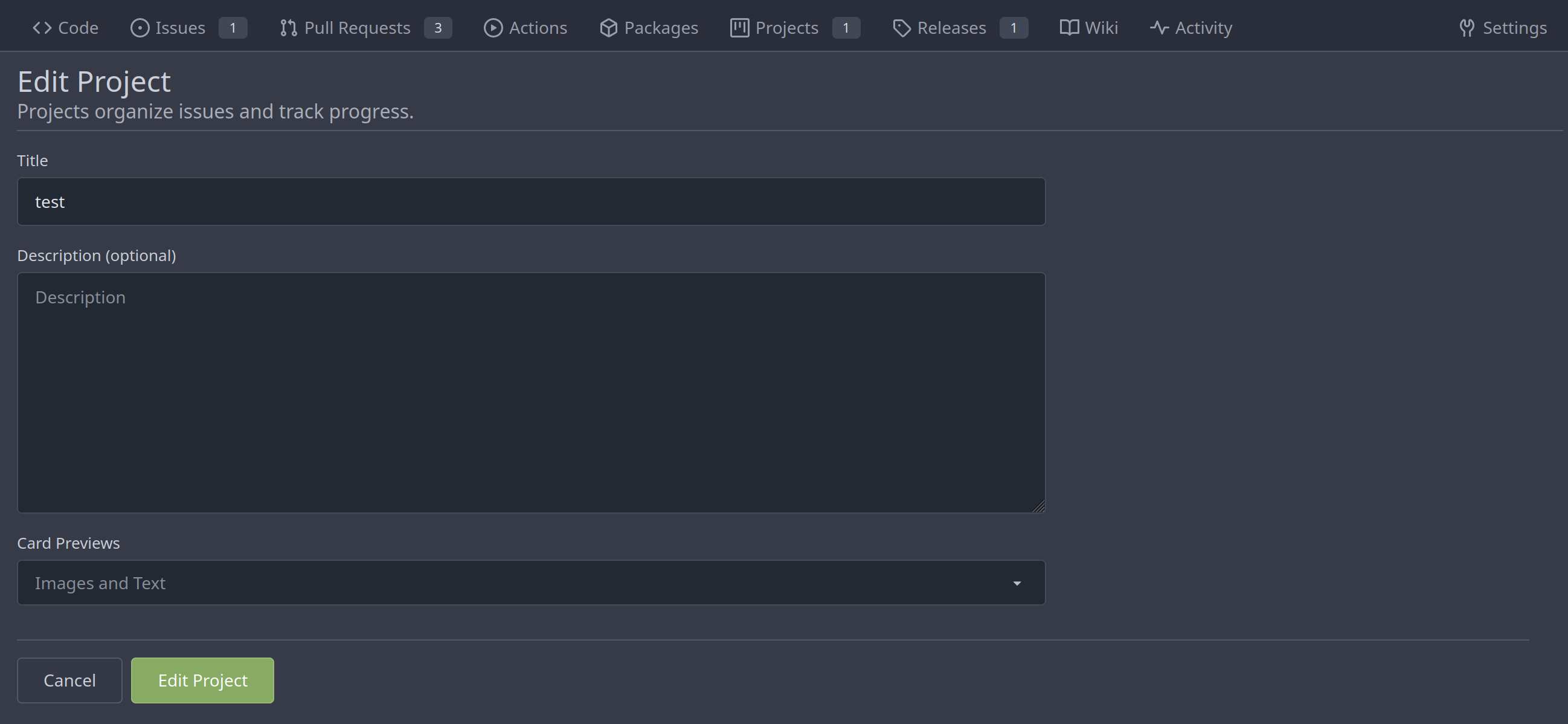
## New user/org project

## Edit user/org project
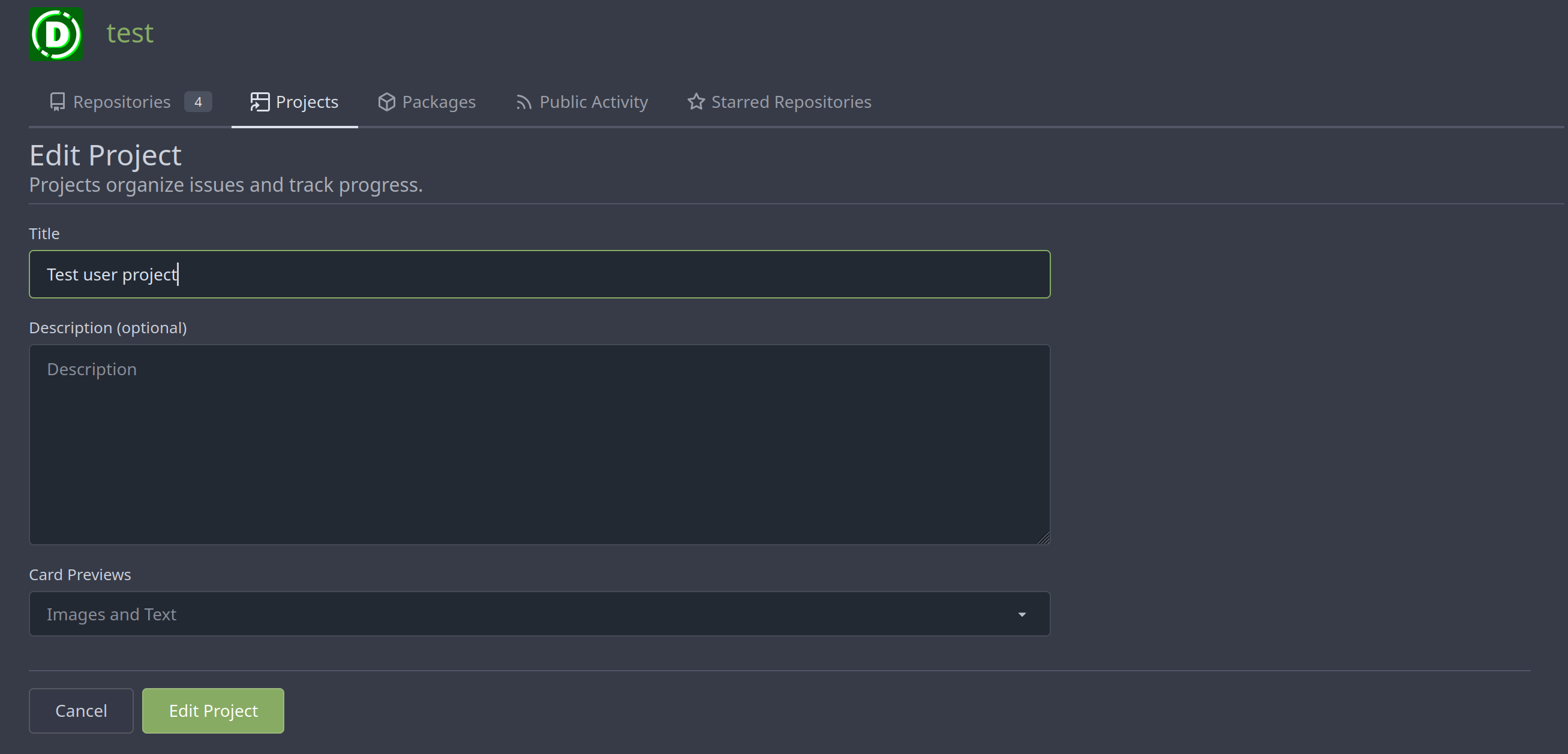
</details>
---------
Co-authored-by: Giteabot <teabot@gitea.io>
2023-05-31 08:50:18 +02:00
0c79a655d4
various style fixes ( #25008 )
...
- fixing various style issues (border color/radius, margin)
- added indent at some radio input blocks
---
### Before:


### After:


---------
Co-authored-by: silverwind <me@silverwind.io>
2023-05-30 22:28:25 +00:00
1ea5c8b0ff
Add show timestamp/seconds and fullscreen options to action page ( #24876 )
...
Part of #24728
- The timestamp shows local time and is parsed by `date.toLocaleString`;
- "show seconds" and "show timestamps" are mutually exclusive, and they
can be both hidden.
https://github.com/go-gitea/gitea/assets/17645053/89531e54-37b7-4400-a6a0-bb3cc69eb6f5
Update for timestamp format:
<img width="306" alt="Screen Shot 2023-05-25 at 09 07 47"
src="https://github.com/go-gitea/gitea/assets/17645053/2d99768d-d39c-4c9e-81a2-7bc7470399dd ">
---------
Co-authored-by: silverwind <me@silverwind.io>
Co-authored-by: wxiaoguang <wxiaoguang@gmail.com>
2023-05-30 20:38:55 +00:00
1b115296d3
Followup to pinned Issues ( #24945 )
...
This addressees some things from #24406 that came up after the PR was
merged. Mostly from @delvh.

---------

Co-authored-by: silverwind <me@silverwind.io>
Co-authored-by: delvh <dev.lh@web.de>
2023-05-30 15:26:51 +00:00
ee99cf6313
Refactor diffFileInfo / DiffTreeStore ( #24998 )
...
Follow #21012 , #22399
Replace #24983 , fix #24938
Help #24956
Now, the `window.config.pageData.diffFileInfo` itself is a reactive
store, so it's quite easy to sync values/states by it, no need to do
"doLoadMoreFiles" or "callback".
Screenshot: these two buttons both work. After complete loading, the UI
is also right.
<details>


</details>
2023-05-30 18:53:15 +08:00
a36c620583
Display file mode for new file and file mode changes ( #24966 )
...
This MR introduces the addition of file mode display support for both
new file creation and file mode changes, following a similar approach as
GitLab.
GitLab:

Gitea:
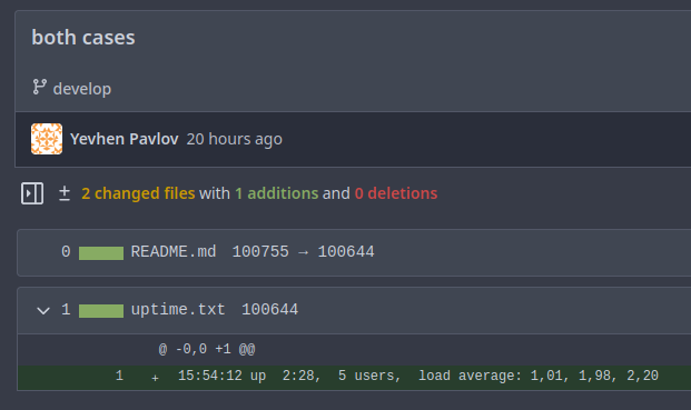
Replaces: https://github.com/go-gitea/gitea/pull/23159
Closes: https://github.com/go-gitea/gitea/issues/23021
---------
Co-authored-by: silverwind <me@silverwind.io>
Co-authored-by: delvh <dev.lh@web.de>
Co-authored-by: Giteabot <teabot@gitea.io>
2023-05-29 19:56:08 +02:00
085a8857f9
Fix repo level project - edit column ( #24982 )
...
Right now edit column of repo level project is not working, because edit
button does not have the `edit-column-button` class, which is used in
the [js
selector](28077e66c0/web_src/js/features/repo-projects.js (L106)https://github.com/go-gitea/gitea/assets/17645053/e1fba190-477d-4814-87f2-0fd979376840
Co-authored-by: Giteabot <teabot@gitea.io>
2023-05-29 16:32:15 +00:00
73b57c2992
Improve dropdown menus, remove inline styles ( #24954 )
...
Before:
<img width="190" alt="Screenshot 2023-05-27 at 10 46 43"
src="https://github.com/go-gitea/gitea/assets/115237/b9331fcd-db1d-476e-87f0-f79bae48b1a5 ">
After:
<img width="154" alt="Screenshot 2023-05-28 at 19 29 03"
src="https://github.com/go-gitea/gitea/assets/115237/8b7f99a2-01a8-4665-9342-a6201b51d30f ">
---------
Co-authored-by: Giteabot <teabot@gitea.io>
2023-05-29 14:10:06 +00:00
79a4c80f8d
Rework button coloring, add focus and active colors ( #24507 )
...
We were missing overrides for `:focus` and `:active` styles which I've
added here along with two new color variants `dark-1` and `dark-2` for
them. Fomantic UI has 4 different colors but I think 3 are sufficient. I
also changed it on arc-green so button goes darker when pressed.
<img width="129" alt="Screenshot 2023-05-04 at 01 21 43"
src="https://user-images.githubusercontent.com/115237/236072060-7389276a-275b-4d3e-aa52-20b37c6e6d92.png ">
<img width="130" alt="Screenshot 2023-05-04 at 01 17 59"
src="https://user-images.githubusercontent.com/115237/236071818-0e46414a-33db-4bb2-a3bd-35b514a8a2d0.png ">
<img width="129" alt="Screenshot 2023-05-04 at 01 18 07"
src="https://user-images.githubusercontent.com/115237/236071819-562b1e38-541f-432b-b3b6-48e6d7594d00.png ">
<img width="131" alt="Screenshot 2023-05-04 at 01 18 13"
src="https://user-images.githubusercontent.com/115237/236071820-89b7dba9-ce6c-48e5-a075-9053063e6ad3.png ">
<img width="133" alt="Screenshot 2023-05-04 at 01 18 30"
src="https://user-images.githubusercontent.com/115237/236071823-b6fe2df4-b3f0-4dc8-97a8-f90ba6d19bec.png ">
<img width="133" alt="Screenshot 2023-05-04 at 01 18 40"
src="https://user-images.githubusercontent.com/115237/236071824-b02ce61a-2367-4c29-8a25-45f231f5e5ee.png ">
One misc change includes some fixes to editor and slightly darker
selection.
<img width="1245" alt="Screenshot 2023-05-28 at 19 16 19"
src="https://github.com/go-gitea/gitea/assets/115237/1ea4a4b6-26ba-45af-9cbc-5b8c476c2338 ">
2023-05-29 12:45:22 +00:00
e4e98979ff
Add PDF rendering via PDFObject ( #24086 )
...
Use [PDFObject](https://pdfobject.com/ ) to embed PDFs, replacing our
outdated PDF.js copy we vendor (the last non-webpack vendoring).
[Commit
1](673e0263da9336f5769dhttps://github.com/go-gitea/gitea/assets/115237/169ce50c-bd1d-4bb0-86e5-1710bd0400a9 ">
<img width="1257" alt="Screenshot 2023-05-27 at 10 12 50"
src="https://github.com/go-gitea/gitea/assets/115237/318f7ee9-fb11-4093-83e7-17475aa70629 ">
Fallback for unsupporting browsers (most mobile ones, except Firefox
Mobile):
<img width="358" alt="Screenshot 2023-05-27 at 09 43 34"
src="https://github.com/go-gitea/gitea/assets/115237/8c12d7ba-57d6-4228-89a0-5fef9fad0cbb ">
---------
Co-authored-by: Giteabot <teabot@gitea.io>
2023-05-29 12:10:00 +00:00
35ce7ca25b
Hide 'Mirror Settings' when unneeded, improve hints ( #24433 )
...
Co-authored-by: silverwind <me@silverwind.io>
Co-authored-by: Giteabot <teabot@gitea.io>
2023-05-29 11:32:52 +00:00
a70d853d06
Consolidate the two review boxes into one ( #24738 )
...
View diff:
https://github.com/go-gitea/gitea/pull/24738/files?diff=unified&w=1
Improve layout and functionality in review area:
<img width="439" alt="Screenshot 2023-05-15 at 20 10 01"
src="https://github.com/go-gitea/gitea/assets/115237/be10452b-5829-4927-8801-7b26a57b3dbd ">
Remove the "Reviewers" timeline box that appears before the merge box.
it's a duplicate of the top-right review area and all functionality of
it has been moved to the other box:
<img width="868" alt="Screenshot 2023-05-15 at 19 39 31"
src="https://github.com/go-gitea/gitea/assets/115237/35489445-e54b-40d3-b3cf-38d029478f96 ">
Increase timeline item vertical padding from 12px to 16px:
<img width="449" alt="Screenshot 2023-05-15 at 19 43 50"
src="https://github.com/go-gitea/gitea/assets/115237/919c4f9d-a485-4f51-b08c-2c0fc714a413 ">
---------
Co-authored-by: Giteabot <teabot@gitea.io>
2023-05-29 12:44:03 +02:00
595e8abd68
Improve and fix bugs surrounding reactions ( #24760 )
...
- Slightly decrease size of reaction buttons
- Remove tooltip inside menu, it's obvious by the picture alone
- Fix top menu triangle
- Use `display: grid` to align icons in menu
- Use regular tooltip for reaction users
- Fix bug that deleted the reaction bar on clicking already reacted
reaction in dropdown
<img width="490" alt="Screenshot 2023-05-17 at 00 03 42"
src="https://github.com/go-gitea/gitea/assets/115237/61588b37-facb-4829-b75b-e1cb5dda8ca4 ">
<img width="67" alt="Screenshot 2023-05-17 at 00 11 14"
src="https://github.com/go-gitea/gitea/assets/115237/29605589-3b5f-40c6-8ad4-09923094bb8e ">
<img width="211" alt="Screenshot 2023-05-17 at 00 29 30"
src="https://github.com/go-gitea/gitea/assets/115237/7d2725da-6a3d-4e42-a351-53647f79f762 ">
<img width="210" alt="Screenshot 2023-05-17 at 00 29 54"
src="https://github.com/go-gitea/gitea/assets/115237/b50f8364-033c-4445-ba25-61a814bb2d92 ">
<img width="892" alt="Screenshot 2023-05-17 at 00 12 20"
src="https://github.com/go-gitea/gitea/assets/115237/30a46424-406a-46e5-b4de-47172eb8679d ">
---------
Co-authored-by: wxiaoguang <wxiaoguang@gmail.com>
Co-authored-by: Giteabot <teabot@gitea.io>
2023-05-28 01:34:18 +00:00
85fa954a38
Improve some Forms ( #24878 )
...
Don't really know a better name for this. I've gone through some Forms
and added missing HTML attributes (mostly `maxlength`). I tried to fill
the Forms with dummy Data and see if Gitea throws a Error (e.g. maximum
length). If yes, I added the missing HTML attribute.

While working on this, I discovered that the Form to add OAuth2 Apps
just silently fails when filled with invalid data, so I fixed that too.
2023-05-26 09:42:54 +00:00
aaa1094663
Add the ability to pin Issues ( #24406 )
...
This adds the ability to pin important Issues and Pull Requests. You can
also move pinned Issues around to change their Position. Resolves #2175 .
## Screenshots


The Design was mostly copied from the Projects Board.
## Implementation
This uses a new `pin_order` Column in the `issue` table. If the value is
set to 0, the Issue is not pinned. If it's set to a bigger value, the
value is the Position. 1 means it's the first pinned Issue, 2 means it's
the second one etc. This is dived into Issues and Pull requests for each
Repo.
## TODO
- [x] You can currently pin as many Issues as you want. Maybe we should
add a Limit, which is configurable. GitHub uses 3, but I prefer 6, as
this is better for bigger Projects, but I'm open for suggestions.
- [x] Pin and Unpin events need to be added to the Issue history.
- [x] Tests
- [x] Migration
**The feature itself is currently fully working, so tester who may find
weird edge cases are very welcome!**
---------
Co-authored-by: silverwind <me@silverwind.io>
Co-authored-by: Giteabot <teabot@gitea.io>
2023-05-25 15:17:19 +02:00
79087bdb26
Use `shared/issueicon` template in projects ( #24922 )
...
We can reuse the recently created subtemplate here. I also checked the
whole templates for similar constructs, these appear to be the only one.

Co-authored-by: Giteabot <teabot@gitea.io>
2023-05-25 14:25:31 +02:00
27c221aa5d
Rework notifications list ( #24812 )
...
- Replace `<table>` with flexbox
- Add issue modification time and issue number
- Remove big title
- Replace tabs with menu items
- Add clicked item deletion on back button cache restoration

---------

Co-authored-by: wxiaoguang <wxiaoguang@gmail.com>
2023-05-25 02:31:26 +00:00
309354c70e
New webhook trigger for receiving Pull Request review requests ( #24481 )
...
close https://github.com/go-gitea/gitea/issues/16321

Provided a webhook trigger for requesting someone to review the Pull
Request.

Some modifications have been made to the returned `PullRequestPayload`
based on the GitHub webhook settings, including:
- add a description of the current reviewer object as
`RequestedReviewer` .
- setting the action to either **review_requested** or
**review_request_removed** based on the operation.
- adding the `RequestedReviewers` field to the issues_model.PullRequest.
This field will be loaded into the PullRequest through
`LoadRequestedReviewers()` when `ToAPIPullRequest` is called.

After the Pull Request is merged, I will supplement the relevant
documentation.
2023-05-24 22:06:27 -04:00
1bfa37ada2
Create pull request for base after editing file, if not enabled on fork ( #24841 )
...
Currently if pull requests are disabled on a fork but enabled on a base
repo, creating/editing/deleting files does not offer the option to
create a pull request. This change enables creating a pull request for
the base repo in that case.

---------

Co-authored-by: wxiaoguang <wxiaoguang@gmail.com>
Co-authored-by: Giteabot <teabot@gitea.io>
2023-05-24 21:36:02 +00:00
fd1967c3a4
Fix can’t move anymore items in repo project boards ( #24892 )
...
Fix #24879
Related to #24589
In #24589 , I changed the css, but didn't reflect the changes in
repo-level projects template.
2023-05-24 14:05:50 +08:00
5c0745c034
Add validations.required check to dropdown field ( #24849 )
...
If dropdown is marked as required, we should not provide the `remove`
button.
This will cause user may post empty value which seems like a bug.
Definition:
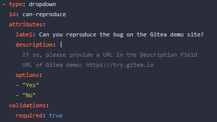
Post request form:

Result:

2023-05-22 21:26:48 +00:00
f4ef7eed00
Fix missing yes/no in delete time log modal ( #24851 )
...
Before:

After:

Co-authored-by: Giteabot <teabot@gitea.io>
2023-05-22 09:46:50 +00:00
32ec2540cc
Show new pull request button also on subdirectories and files ( #24842 )
...
Instead of only on the repository home page. Saves a click and makes
this functionality a bit easier to find when editing files in a
subdirectory.
2023-05-22 07:57:00 +00:00
da461b5a08
Improvements for action detail page ( #24718 )
...
Close #24625
Main changes:
1. For the left panel, show rerun icon only on hover, and add style when
the job is selected, and removed icon on the "rerun all" button and
modify the text on the button
https://github.com/go-gitea/gitea/assets/17645053/cc437a17-d2e9-4f1b-a8cf-f56e53962767
2. Adjust fonts, and add on hover effects to the log lines. And add
loading effect when the job is done and the job step log is expanded for
the first time. (With reference to github)
https://github.com/go-gitea/gitea/assets/17645053/2808d77d-f402-4fb0-8819-7aa0a018cf0c
3. Add `gt-ellipsis` to `step-summary-msg` and `job-brief-name`
<img width="898" alt="ellipsis"
src="https://github.com/go-gitea/gitea/assets/17645053/e2fb7049-3125-4252-970d-15b0751febc7 ">
4. Fixed
https://github.com/go-gitea/gitea/issues/24625#issuecomment-1541380010
by adding explicit conditions to `ActionRunStatus.vue` and `status.tmpl`
5. Adjust some css styles
---------
Co-authored-by: silverwind <me@silverwind.io>
2023-05-22 12:17:24 +08:00
19993d8814
Change `--font-weight-bold` to `--font-weight-semibold` and 600 value, introduce new font weight variables ( #24827 )
...
There was some recent discussion about this in Discord `ui-design`
channel and the conclusion was that
https://github.com/go-gitea/gitea/issues/24305 should have fixed their
OS font installation to have semibold weights.

I have now tested this 601 weight on a Windows 10 machine on Firefox
myself, and I immediately noticed that bold was excessivly bold and
rendering as 700 because browsers are biased towards bolder fonts. So
revert this back to the previous value.
2023-05-21 23:37:32 +00:00
e95b42e187
Improve accessibility when (re-)viewing files ( #24817 )
...
Visually, nothing should have changed.
Changes include
- Convert most `<a [no href]>` to `<button>` when (re-)viewing files:
- `<a [no href]>` are, by HTML definition, not a link and hence cannot
be focused
- `<a class="ui button">` can now be clicked (again?) using
<kbd>Enter</kbd>
- Previously, the installed keypress handler on `.ui.button` elements
disabled it for links somehow
- The `(un)escape file`, the `expand section` and the `expand/collapse
file` buttons can now be focused (and subsequently clicked using only
the keyboard)
- You can now press <kbd>Space</kbd> on a focused `View file` checkbox
to mark the file as viewed.
- previously, this was impossible as this checkbox listened on the wrong
event listener

The `add code comment` button has been left inaccessible for now as it
requires quite a bit of extra logic so that it is unhidden when it is
focused (you can otherwise focus it without seeing it as you are not
hovering on the corresponding line).

---------

Co-authored-by: silverwind <me@silverwind.io>
2023-05-21 20:47:41 +00:00
c757765a9e
Implement actions artifacts ( #22738 )
...
Implement action artifacts server api.
This change is used for supporting
https://github.com/actions/upload-artifact and
https://github.com/actions/download-artifact in gitea actions. It can
run sample workflow from doc
https://docs.github.com/en/actions/using-workflows/storing-workflow-data-as-artifacts .
The api design is inspired by
https://github.com/nektos/act/blob/master/pkg/artifacts/server.go and
includes some changes from gitea internal structs and methods.
Actions artifacts contains two parts:
- Gitea server api and storage (this pr implement basic design without
some complex cases supports)
- Runner communicate with gitea server api (in comming)
Old pr https://github.com/go-gitea/gitea/pull/22345 is outdated after
actions merged. I create new pr from main branch.

Add artifacts list in actions workflow page.
2023-05-19 21:37:57 +08:00
b807d2f620
Support no label/assignee filter and batch clearing labels/assignees ( #24707 )
...
Since milestones has been implemented, this PR will fix #3407

---------

Co-authored-by: Jason Song <i@wolfogre.com>
2023-05-17 17:21:35 +08:00
e7c2231dee
Support for status check pattern ( #24633 )
...
This PR is to allow users to specify status checks by patterns. Users
can enter patterns in the "Status Check Pattern" `textarea` to match
status checks and each line specifies a pattern. If "Status Check" is
enabled, patterns cannot be empty and user must enter at least one
pattern.
Users will no longer be able to choose status checks from the table. But
a __*`Matched`*__ mark will be added to the matched checks to help users
enter patterns.
Benefits:
- Even if no status checks have been completed, users can specify
necessary status checks in advance.
- More flexible. Users can specify a series of status checks by one
pattern.
Before:

After:

---------
Co-authored-by: silverwind <me@silverwind.io>
2023-05-17 16:11:13 +08:00
a7e18b9fb7
Rework Oauth login buttons, swap github logo to monocolor ( #24740 )
...
Diff without whitespace:
https://github.com/go-gitea/gitea/pull/24740/files?diff=unified&w=1
- Use SVGs for GitHub and GitLab oauth providers
- Replace section wrapping with a divider
- Rework icon rendering, increase size from 32px to 40px
Before:
<img width="853" alt="Screenshot 2023-05-15 at 21 54 23"
src="https://github.com/go-gitea/gitea/assets/115237/6ab5cfb4-46ff-469a-bd1f-06780d4a6a0b ">
After (more providers):
<img width="849" alt="Screenshot 2023-05-15 at 21 51 21"
src="https://github.com/go-gitea/gitea/assets/115237/fa84f92f-98e0-4aed-9357-5d62ddd98195 ">
<img width="856" alt="Screenshot 2023-05-15 at 21 56 45"
src="https://github.com/go-gitea/gitea/assets/115237/d3edd7ed-dadd-4302-aca7-08f20adc220e ">
Ref: https://codeberg.org/Codeberg/Community/issues/1023
---------
Co-authored-by: Giteabot <teabot@gitea.io>
2023-05-15 22:46:51 +00:00
99283415bc
Refactor Pull Mirror and fix out-of-sync bugs ( #24732 )
...
The "mirror" table and "repository" table might be out-of-sync in some
cases.
It means that "IsMirror=true" but "Mirror=nil"
This PR removes unnecessary "Mirror" field, rename "Mirror" to
"PullMirror" and fix nil panic bug.
Screenshot of changed templates:


2023-05-15 19:02:10 +00:00
6d2c63f6ff
Don't filter action runs based on state ( #24711 )
...
We should just show all runs. This removes the filtering altogether.
- Replaces https://github.com/go-gitea/gitea/pull/24553
# Before


# After

---------
Signed-off-by: Yarden Shoham <git@yardenshoham.com>
2023-05-14 16:04:24 +00:00
b92c142c97
Clean up various avatar dimensions ( #24701 )
...
Clean up a few cases where avatar dimensions were overwritten via CSS,
which were no longer needed or were possible to set via HTML width.
Also included are two small fixes:
- Fix one more case of incorrect avatar offset on review timeline
- Vertically center avatars in review sidebar
There is more to be done here, but some of the work depends on Fomantic
`comment` module removal, or in the case of org member lists, a refactor
of the `avatarlink` template to accept a size.
<img width="371" alt="image"
src="https://github.com/go-gitea/gitea/assets/115237/9c5902fb-2b89-4a7d-a152-60e74c3b2c56 ">
<img width="306" alt="image"
src="https://github.com/go-gitea/gitea/assets/115237/c8d92e2a-91c9-4f4a-a7de-6ae1a6bc0479 ">
---------
Co-authored-by: Giteabot <teabot@gitea.io>
2023-05-14 14:15:59 +00:00
8a8b753647
Improve button-ghost, remove tertiary button ( #24692 )
...
<img width="474" alt="image"
src="https://github.com/go-gitea/gitea/assets/2114189/7fd231f9-71c3-4769-ba96-37a5b77cf224 ">
<img width="557" alt="image"
src="https://github.com/go-gitea/gitea/assets/2114189/c9945f61-39b4-4711-aea8-c34ef1d714c5 ">
<img width="641" alt="image"
src="https://github.com/go-gitea/gitea/assets/2114189/691be76e-74fd-420d-9b9e-ba1f3b08e0b4 ">
And a page to test buttons:
<details>
<img width="451" alt="image"
src="https://github.com/go-gitea/gitea/assets/2114189/5f61da24-2f36-40ad-a9bb-2205da5f5f04 ">
</details>
---------
Co-authored-by: Giteabot <teabot@gitea.io>
Co-authored-by: silverwind <me@silverwind.io>
2023-05-13 20:38:22 +00:00
b5c26fa825
Add markdown preview to Submit Review Textarea ( #24672 )
...
Before:

After:

---------
Co-authored-by: wxiaoguang <wxiaoguang@gmail.com>
Co-authored-by: Giteabot <teabot@gitea.io>
2023-05-12 10:53:41 +00:00
a96c73f979
Remove svg.svg class, restore .rss-icon ( #24667 )
...
Fix regression from https://github.com/go-gitea/gitea/pull/24476 where
the `svg.svg` class misaligns SVG icons across the site and streched
buttons unintentionally in vertical height.
Before (button 30.3px):
<img width="157" alt="Screenshot 2023-05-11 at 22 09 42"
src="https://github.com/go-gitea/gitea/assets/115237/0fd137ab-ab52-4cf8-afca-c45776d526d0 ">
After (button 30px):
<img width="160" alt="Screenshot 2023-05-11 at 22 09 59"
src="https://github.com/go-gitea/gitea/assets/115237/4b741f4b-0fd2-4fae-9bee-16a7deb098e8 ">
[vertical-align:
middle](https://developer.mozilla.org/en-US/docs/Web/CSS/vertical-align )
is not suitable to align icons to text because
> Aligns the middle of the element with the baseline plus half the
x-height of the parent.
Example of `vertical-align: middle` from MDN:
<img width="232" alt="Screenshot 2023-05-11 at 22 29 28"
src="https://github.com/go-gitea/gitea/assets/115237/179fb756-85a1-4cab-8219-1a4958f333e2 ">
So I think the
[existing](365bb77a54/web_src/css/svg.css (L3)https://github.com/go-gitea/gitea/assets/115237/0cd6edf5-12c0-4bdb-8771-a900f5ba2d35 ">
Co-authored-by: Giteabot <teabot@gitea.io>
2023-05-12 10:23:53 +00:00
bc719f549e
Update pin and add pin-slash ( #24669 )
...
Continue #23531
Thanks for the update in https://github.com/primer/octicons/issues/940 ,
@CameronFoxly
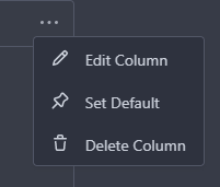
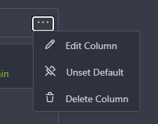
2023-05-12 14:38:59 +08:00
365bb77a54
Fix issues list page multiple selection update milestones ( #24660 )
...
Fix #24651
2023-05-11 21:19:42 +08:00
f6e029e6c7
Make repo migration cancelable and fix various bugs ( #24605 )
...
Replace #12917
Close #24601
Close #12845


---------
Co-authored-by: Yarden Shoham <git@yardenshoham.com>
Co-authored-by: silverwind <me@silverwind.io>
Co-authored-by: Giteabot <teabot@gitea.io>
2023-05-11 08:25:46 +00:00
67db6b6976
RSS icon fixes ( #24476 )
...
Fix regression from https://github.com/go-gitea/gitea/pull/24471 where
CSS rules for `.icon.grey` were removed which were in use by the RSS
icons.
Gave them their own class instead, removed a wrapper and also fixed
vertical alignment on them. Additionally, did a few related fixes on the
org header for alignment.
Fixes: https://github.com/go-gitea/gitea/issues/24584
<img width="196" alt="Screenshot 2023-05-01 at 22 39 40"
src="https://user-images.githubusercontent.com/115237/235528228-959e2385-c1d2-4d5c-baec-e3784d459653.png ">
<img width="216" alt="Screenshot 2023-05-01 at 22 44 20"
src="https://user-images.githubusercontent.com/115237/235528231-95cbff86-5672-48eb-b214-8bdcefa1612c.png ">
<img width="120" alt="Screenshot 2023-05-01 at 22 56 36"
src="https://user-images.githubusercontent.com/115237/235529844-b94ab554-3259-4d0c-b040-82aed7d1a111.png ">
<img width="372" alt="Screenshot 2023-05-01 at 22 54 25"
src="https://user-images.githubusercontent.com/115237/235529744-1a9c201b-5692-4122-9765-2f201a322a9e.png ">
<img width="477" alt="Screenshot 2023-05-01 at 22 55 28"
src="https://user-images.githubusercontent.com/115237/235529748-62188554-9927-42ef-bc94-7052bce266e2.png ">
---------
Co-authored-by: wxiaoguang <wxiaoguang@gmail.com>
2023-05-10 22:27:02 +00:00
f7ede92f82
Notification list enhancements, fix striped tables on dark theme ( #24639 )
...
- Make code block rendering via backticks work
- Remove link color unless hovered
- Remove table stripes and fix stripes rendering on dark theme for other
tables
- Introduce new `button-link` class discussed previously for buttons
that look and act like links and apply it to the two right-side buttons
- Reduce box padding by 8px on each side
- Fix "Mark all read" button margin-right
- brighten `--color-markup-code-block` on arc-green
### Before
<img width="1216" alt="Screenshot 2023-05-10 at 20 00 30"
src="https://github.com/go-gitea/gitea/assets/115237/66da9ec2-dd09-4ef0-8f1d-1822a18b6b43 ">
<img width="1211" alt="Screenshot 2023-05-10 at 20 00 48"
src="https://github.com/go-gitea/gitea/assets/115237/f48e30a2-9a00-4723-93aa-79b97ca0ba0c ">
### After
<img width="1222" alt="Screenshot 2023-05-10 at 20 09 59"
src="https://github.com/go-gitea/gitea/assets/115237/c956e0d0-b3d9-42a4-a3ed-f0431c22bf3f ">
<img width="1218" alt="Screenshot 2023-05-10 at 20 05 34"
src="https://github.com/go-gitea/gitea/assets/115237/f72c1628-3961-4c28-9263-07cdf7531316 ">
2023-05-10 21:59:58 +00:00
23ae939ef3
Improve "goto issue by number" button ( #24577 )
...
Follow #24479


---------
Co-authored-by: silverwind <me@silverwind.io>
Co-authored-by: Giteabot <teabot@gitea.io>
2023-05-10 15:50:58 +00:00
ae0fa64ef6
Review fixes and enhancements ( #24526 )
...
- Fix regression with icons wrapping from
https://github.com/go-gitea/gitea/pull/24459
- Fix box misalignment on small screen
- Fix avatar misalignment on review comment
- Fix incorrect underline hover effect on review icons
- Move status icon to left side in review box
- Enhance review icon colors, add helper function for it
- Add missing inline avatars in review comments
- Tweak icon sizes because some octicons have inconsistent sizing
### Before
<img width="655" alt="Screenshot 2023-05-04 at 20 50 28"
src="https://user-images.githubusercontent.com/115237/236301230-92325507-6e03-47ac-bfb4-c9ddde310571.png ">
<img width="260" alt="Screenshot 2023-05-04 at 20 50 42"
src="https://user-images.githubusercontent.com/115237/236301236-0dfa50e7-b8fc-4179-ae68-d872bc90f1f3.png ">
### After
<img width="498" alt="Screenshot 2023-05-04 at 20 55 08"
src="https://user-images.githubusercontent.com/115237/236301810-23862c2c-c0a9-43a4-a3eb-ee611c14a7f4.png ">
<img width="219" alt="Screenshot 2023-05-04 at 20 55 16"
src="https://user-images.githubusercontent.com/115237/236301817-d0de02ea-6ab5-43e1-9183-6b3848b72995.png ">
---------
Co-authored-by: Giteabot <teabot@gitea.io>
2023-05-10 09:16:44 +00:00
8bbbf7e6b8
Remove fluid on compare diff page ( #24627 )
...
As discuessed in
https://github.com/go-gitea/gitea/pull/24598/files#r1189290462
After:
Diff Page
<img width="1426" alt="Screen Shot 2023-05-10 at 10 44 48"
src="https://github.com/go-gitea/gitea/assets/17645053/bc1a5f78-ec17-4ac2-8390-081a5fc059d1 ">
New PR Page
<img width="1428" alt="Screen Shot 2023-05-10 at 10 45 17"
src="https://github.com/go-gitea/gitea/assets/17645053/ce94a28e-39d5-4534-9e78-c0edd4c7a339 ">
<img width="1432" alt="Screen Shot 2023-05-10 at 10 45 27"
src="https://github.com/go-gitea/gitea/assets/17645053/047809e1-abb2-4c16-ae62-63b71094c1c7 ">
2023-05-10 08:46:17 +00:00
8030614386
fix: release page for empty or non-existing target ( #24470 )
...
Fixes #24145

To solve the bug, I added a "computed" `TargetBehind` field to the
`Release` model, which indicates the target branch of a release.
This is particularly useful if the target branch was deleted in the
meantime (or is empty).

I also did a micro-optimization in `calReleaseNumCommitsBehind`. Instead
of checking that a branch exists and then call `GetBranchCommit`, I
immediately call `GetBranchCommit` and handle the `git.ErrNotExist`
error.

This optimization is covered by the added unit test.
2023-05-10 11:43:55 +08:00
9a0652f0b2
Attach a tooltip to the action status icon ( #24614 )
...
To clearly communicate the current state of the action


---------
Signed-off-by: Yarden Shoham <git@yardenshoham.com>
2023-05-09 21:39:16 +02:00
b6fc2cdf82
Make diff view full width again ( #24598 )
...
Regression of #24459 , [the related
line](https://github.com/go-gitea/gitea/pull/24459/files#diff-f255004de8d715ff40852710390429bf2a06e7e33a4e3f8ad568af636557ac71L8 )
The PR file diff view needs to be full-screen width.
2023-05-09 05:21:03 +00:00
46e97986f5
Attach a tooltip to the action control button ( #24595 )
...
The first time I saw the big red X button I thought something failed but
apparently, it was just a "Cancel" button
# Before


# After


---------
Signed-off-by: Yarden Shoham <git@yardenshoham.com>
Co-authored-by: Giteabot <teabot@gitea.io>
Co-authored-by: silverwind <me@silverwind.io>
2023-05-08 23:59:59 +00:00
c4303efc23
Support markdown editor for issue template ( #24400 )
...
Fixes #24398
Task:
- [x] Reusing "textarea" like GitHub seems more friendly to users.
- [x] ^V image pasting and file uploading handling.
<details><summary>screenshots</summary>


Display only one markdown editor:

Support file upload and ^V image pasting

</details>
---------
Co-authored-by: wxiaoguang <wxiaoguang@gmail.com>
Co-authored-by: silverwind <me@silverwind.io>
2023-05-08 22:22:52 +00:00
1144b1d129
Add goto issue id function ( #24479 )
...
for
https://github.com/go-gitea/gitea/issues/4109#issuecomment-1527104992

Supports format:
`#1234`
`Org/Repo#1234`

---------

Co-authored-by: techknowlogick <techknowlogick@gitea.io>
2023-05-07 23:44:16 +08:00
56ae853ca0
Simplify template helper functions ( #24570 )
...
To avoid bloating the template helper functions, some functions could be
provided by type methods.
And the new code `data-line-type="{{.GetHTMLDiffLineType}}"` reads
better than `data-line-type="{{DiffLineTypeToStr .GetType}}"`
After the fix, screenshots (the same as before):
<details>


</details>
2023-05-07 09:49:46 +00:00
46679554d0
Change `add_on` translation to `added_on` and include placeholder for the date ( #24562 )
...
- Very similar to #24550

The correct thing to do is to translate the entire phrase into a single
string. The previous translation assumed all languages have a space
between the "added on" and the date (and that "added on" comes before
the date).

Some languages, like Hebrew, have no space between the "added on" and
the date. For example:
```ini
added_on=נוסף ב-%s
```
("added" becomes נוסף, "on" is ב and when paired with a date we use a
dash to connect ב with the date)

---------

Signed-off-by: Yarden Shoham <git@yardenshoham.com>
Co-authored-by: delvh <dev.lh@web.de>
2023-05-06 21:11:27 +08:00
291c868046
Change `join_on` translation to `joined_on` and include placeholder for the date ( #24550 )
...
The correct thing to do is to translate the entire phrase into a single
string. The previous translation assumed all languages have a space
between the "joined on" and the date (and that "joined on" comes before
the date).

Some languages, like Hebrew, have no space between the "joined on" and
the date. For example:
```ini
joined_on=נרשם ב-%s
```
("joined" becomes נרשם, "on" is ב and when paired with a date we use a
dash to connect ב with the date)
2023-05-06 18:10:30 +08:00
421840486f
Fix form method/class ( #24535 )
...
Fix #24534
2023-05-05 05:14:22 +00:00
81d6007055
Fix typo in rename branch dialog ( #24537 )
...
Fix https://github.com/go-gitea/gitea/pull/24512#discussion_r1185664695
2023-05-05 12:44:59 +08:00
0c657112a3
Display warning when user try to rename default branch ( #24512 )
...
Follow #24380
It's better to warn users when they try to rename the default branch.

---------
Co-authored-by: techknowlogick <matti@mdranta.net>
Co-authored-by: Jason Song <i@wolfogre.com>
Co-authored-by: silverwind <me@silverwind.io>
Co-authored-by: Giteabot <teabot@gitea.io>
2023-05-04 22:54:38 +00:00
7abe958f5b
Fix color for transfer related buttons when having no permission to act ( #24510 )
...
Before:
<img width="1410" alt="Screen Shot 2023-05-04 at 09 28 23"
src="https://user-images.githubusercontent.com/17645053/236100146-2b64d274-2d79-4b4c-827c-3906a2a9dbb7.png ">
<img width="1413" alt="Screen Shot 2023-05-04 at 09 28 30"
src="https://user-images.githubusercontent.com/17645053/236100157-15c12e83-a4f5-4b4e-b26b-73a8ce8bc0db.png ">
After:
With no permission:
<img width="1409" alt="Screen Shot 2023-05-04 at 12 17 12"
src="https://user-images.githubusercontent.com/17645053/236144666-c2bb6ca2-59e1-45ae-93cd-d43545500d06.png ">
<img width="1402" alt="Screen Shot 2023-05-04 at 12 17 17"
src="https://user-images.githubusercontent.com/17645053/236144677-c51a65cf-8aef-4566-b265-14b2ebb46d0b.png ">
With permission:
<img width="1412" alt="Screen Shot 2023-05-04 at 12 16 45"
src="https://user-images.githubusercontent.com/17645053/236144565-9c5aa9a6-1424-49e3-a2b2-a129fecb856c.png ">
<img width="1420" alt="Screen Shot 2023-05-04 at 12 16 51"
src="https://user-images.githubusercontent.com/17645053/236144573-a4064136-80d9-4c41-8f98-f51b4352bdf7.png ">
---------
Co-authored-by: Giteabot <teabot@gitea.io>
2023-05-04 13:21:30 +00:00
b1cee3fa3b
Don't display creating page button in a mirror wiki repository ( #24395 )
...
A mirror repository with wiki is also a mirror. So creating page from UI
should be disabled. This PR hides the button like other places.
2023-05-04 15:27:15 +08:00
dbb3736785
Fix incorrect webhook time and use relative-time to display it ( #24477 )
...
Fixes #24414
After click replay this webhook, it will display `now`

---------
Co-authored-by: wxiaoguang <wxiaoguang@gmail.com>
Co-authored-by: Giteabot <teabot@gitea.io>
2023-05-03 19:53:43 -04:00
4a722c9a45
Make Issue/PR/projects more compact, misc CSS tweaks ( #24459 )
...
- Remove various horizontal dividers on repo pages that didn't provide
visual benefit
- Remove label/milestone pills on single issue/pr page
- Remove issue-related pill buttons on projects page
- Increase contrast of color-secondary on arc-green
- Improve notifications icon, make circle bigger
- Remove some inline styles
- Fix focus in issue/pr title edit and select all text on button click
### Issue and PR before and after
<img width="1249" alt="Screenshot 2023-05-01 at 11 44 22"
src="https://user-images.githubusercontent.com/115237/235436662-a708288e-84fb-4b2e-a5a2-3a1c17d28f6c.png ">
<img width="1248" alt="Screenshot 2023-05-01 at 11 58 51"
src="https://user-images.githubusercontent.com/115237/235437992-f863e483-f3cc-4cc1-8204-fd223647a0c9.png ">
### Projects before and after
<img width="1255" alt="Screenshot 2023-05-01 at 11 41 02"
src="https://user-images.githubusercontent.com/115237/235436433-0deb85d6-4e7d-4e74-847f-254cc70a0cf9.png ">
<img width="1267" alt="Screenshot 2023-05-01 at 11 40 03"
src="https://user-images.githubusercontent.com/115237/235436431-715b13cb-f78c-4d86-b27a-9229f9738c5b.png ">
### Releases before and after
<img width="1243" alt="Screenshot 2023-05-01 at 11 41 12"
src="https://user-images.githubusercontent.com/115237/235436457-b655ee6f-03b8-4595-8d8c-b15ea469e988.png ">
<img width="1240" alt="Screenshot 2023-05-01 at 11 40 10"
src="https://user-images.githubusercontent.com/115237/235436456-05a2a0dd-7cbb-4f26-b0d3-4f667df4bb95.png ">
### Misc
<img width="58" alt="Screenshot 2023-05-01 at 10 49 13"
src="https://user-images.githubusercontent.com/115237/235432494-936ce995-6e22-47bc-ab2d-c9e93d31987d.png ">
<img width="57" alt="Screenshot 2023-05-01 at 18 57 08"
src="https://user-images.githubusercontent.com/115237/235492430-1d32cfe0-0f2c-467c-b2fa-925b27e30e0e.png ">
Issue title edit and wrap:
<img width="1238" alt="Screenshot 2023-05-01 at 12 34 40"
src="https://user-images.githubusercontent.com/115237/235441407-d5067a57-e586-4865-a652-282e5944abb4.png ">
<img width="1232" alt="Screenshot 2023-05-01 at 12 06 24"
src="https://user-images.githubusercontent.com/115237/235438710-1a543dda-220f-4d87-8f93-f1710c0695f0.png ">
---------
Co-authored-by: wxiaoguang <wxiaoguang@gmail.com>
2023-05-03 17:58:59 -04:00
48e3e38ee0
Clean up polluted styles and remove dead CSS code ( #24497 )
...
Follow #24393
The funny history:
* At the beginning, `.ui.message` was polluted by `text-align: center`
* Then people do `<div class="ui ... message text left">`
* But `.ui.left` is polluted by `float: left`
* Then people do `#xxx .ui.message { width: 100% !important;}`
The code just becomes more and more hacky.
After removing the pollution, everything becomes clear and straight.
And, this PR also does:
1. Remove the `package.css`, its styles could be provided by `top
aligned`
2. Remove `#avatar-arrow`, dead code
Screenshot:


Co-authored-by: Giteabot <teabot@gitea.io>
2023-05-03 14:32:10 -04:00
e9b39250b2
Improve pull request merge box when pull request merged and branch deleted. ( #24397 )
...
This PR hide the pull request merge box totally if it's merged and branch deleted.
It's also add a bold for merge base commit id in merged message comment
Before:
<img width="989" alt="图片"
src="https://user-images.githubusercontent.com/81045/235066590-28deb506-e824-4a42-a9a2-791cd136756e.png ">
After:
<img width="1030" alt="图片"
src="https://user-images.githubusercontent.com/81045/235080749-11d5efe8-a06e-4528-a75f-f6c6d191db50.png ">
---------
Co-authored-by: silverwind <me@silverwind.io>
Co-authored-by: wxiaoguang <wxiaoguang@gmail.com>
2023-05-03 21:52:19 +08:00
bcdd3c30af
Fix test delivery button in repo webhook settings page ( #24478 )
...
Caused by
https://github.com/go-gitea/gitea/pull/24246/files#diff-2bfe41d93dbb409583a4f945902e46bb513f60f1c9301649c1689200c4f1466eR1
Class `new` was removed in #24246 , but in function
`initCompWebHookEditor`, it will check `.new.webhook`.
So in repo webhook settings page, `initCompWebHookEditor` will init
nothing, and no response after click the test delivery button.
da65b7ad47/web_src/js/features/comp/WebHookEditor.js (L6-L9)
2023-05-02 21:58:18 +02:00
d6f8238492
Replace `N/A` with `-` everywhere ( #24474 )
...
Followup to https://github.com/go-gitea/gitea/pull/24427 .
Reasoning is that `N/A` is specific to english while `-` is
language-neutral and does not need translation.
Before:
<img width="891" alt="Screenshot 2023-05-01 at 20 58 20"
src="https://user-images.githubusercontent.com/115237/235511592-8a36d0f2-34ff-4dbe-b642-67c0ade644fe.png ">
After:
<img width="901" alt="Screenshot 2023-05-01 at 20 59 59"
src="https://user-images.githubusercontent.com/115237/235511594-d49f6d09-92e8-4e99-be7b-2a37f5d24129.png ">
2023-05-02 05:54:29 -04:00
fa506cd571
Remove `font-awesome` and fomantic `icon` module ( #24471 )
...
Fixes https://github.com/go-gitea/gitea/issues/10410 .
This PR removes around 120kB of CSS.
2023-05-01 13:25:54 -04:00
3e7101dd64
Improve "new-menu" ( #24465 )
...
I am not sure what "new-menu" means, but I think we need to fix these
problems:

1. it shouldn't have "stackable", which makes the items stacked when
width is small. the `new-menu` already has `overflow: auto`
2. `justify-content: center` doesn't work with `overflow: auto` (for
small width), so use `margin: auto`
*
https://bhch.github.io/posts/2021/04/centring-flex-items-and-allowing-overflow-scroll/
3. `runner-new-menu` is dead code (copying & pasting ?)
2023-05-01 12:08:37 -04:00
5adf32b48e
Remove fomantic breadcrumb module ( #24463 )
...
### File path before/after
<img width="522" alt="Screenshot 2023-05-01 at 13 23 33"
src="https://user-images.githubusercontent.com/115237/235445636-57776038-c98e-4cab-8abe-045138a76958.png ">
<img width="522" alt="Screenshot 2023-05-01 at 13 24 08"
src="https://user-images.githubusercontent.com/115237/235445638-70bef62a-1b70-41f8-ba51-728db4d54402.png ">
### File edit before/after
<img width="499" alt="Screenshot 2023-05-01 at 13 24 46"
src="https://user-images.githubusercontent.com/115237/235445676-7b3cc23e-289b-40a6-8d4f-0d7fb2efb55e.png ">
<img width="497" alt="Screenshot 2023-05-01 at 13 24 52"
src="https://user-images.githubusercontent.com/115237/235445677-db9f3974-8456-46de-a32b-9198110c0540.png ">
### Cherry-pick before/after
<img width="590" alt="Screenshot 2023-05-01 at 13 25 30"
src="https://user-images.githubusercontent.com/115237/235445717-99445024-1bb2-46d4-9bd8-8086bad57d34.png ">
<img width="582" alt="Screenshot 2023-05-01 at 13 25 37"
src="https://user-images.githubusercontent.com/115237/235445720-9c1dc497-eb23-4e10-a727-27f4d6df69e6.png ">
2023-05-01 11:40:02 -04:00
1bd2772235
Replace remaining fontawesome dropdown icons with SVG ( #24455 )
...
- Replace leftover dropdown triangles with SVG
- Replace remove icon with SVG and add styling for it:
<img width="817" alt="Screenshot 2023-05-01 at 00 40 05"
src="https://user-images.githubusercontent.com/115237/235379271-4674d4f7-b11e-4d6d-90f9-1478325443ca.png ">
<img width="816" alt="Screenshot 2023-05-01 at 00 46 56"
src="https://user-images.githubusercontent.com/115237/235379451-b515afb3-9773-4f6f-a259-e7048235bcba.png ">
2023-05-01 05:35:02 -04:00
14c142b0bc
Improve issue list filter ( #24425 )
...
Partial regression of #24393 , not only regression, but broken for long
time, 24393 didn't really improve it but used wrong `overflow: scroll`.
Actually, that "ui secondary filter menu labels" shouldn't be set as
scrollable (I missed that at that time), the problem is: if a "ui menu"
has "dropdown" items, then it should not be scrollable. Otherwise the
dropdown menu can't be shown correctly.
And there are more problems:
* The "issue-filters" shouldn't be used anywhere else (copying&pasting
problem again ....)
* There is also an "issue-actions" container, it should also be fixed.
* There are similar problems on the milestone page.
* The old comment in code: "grid column" doesn't work well.
The major changes of this PR are: use "flex: 1" instead of "ui grid
column".
After this PR, not 100% perfect but much better than before.
2023-04-30 11:51:20 -04:00
e8173c2c33
Move `Rename branch` from repo settings page to the page of branches list ( #24380 )
...
Co-Author: @wxiaoguang

It is more convenient that user just need to enter a new branch name after he selects the branch which he want to rename.
So this PR move the function of renaming branch to the page of branches list.

This PR also restyle the button of `new branch`, `download`, `delete`....

https://user-images.githubusercontent.com/33891828/235277997-413060bb-759f-430a-b5c4-df5e40ffcd28.mov

---------

Co-authored-by: wxiaoguang <wxiaoguang@gmail.com>
2023-04-30 23:08:51 +08:00
3f0651d4d6
Improve milestone filter on issues page ( #22423 )
...
Now we have `All milestones`, `No milestones`, `Open milestones` and
`Closed milestones`.
Fix #11924
Fix #22411
<img width="1166" alt="image"
src="https://user-images.githubusercontent.com/81045/212243375-95eea035-a972-44b8-8088-53db614cb07e.png ">
2023-04-30 09:12:49 -04:00
8f4dafcd4e
Rework header bar on issue, pull requests and milestone ( #24420 )
...
- Make search bar dynamic full width via flexbox
- Make all buttons `small` so font size is the same for all elements in
the header
- Remove primary color from search field, add SVG icon like on Code tab
- Fix button vertical padding being enlarged by SVG icons
[View diff without
whitespace](https://github.com/go-gitea/gitea/pull/24420/files?diff=unified&w=1 )
<img width="1226" alt="Screenshot 2023-04-29 at 11 58 53"
src="https://user-images.githubusercontent.com/115237/235296851-74848267-664f-4c1f-b94c-a1b94196ff75.png ">
<img width="1219" alt="Screenshot 2023-04-29 at 11 59 39"
src="https://user-images.githubusercontent.com/115237/235296852-bcfde5ed-8658-43c2-b7e5-3ad84611e76f.png ">
Mobile:
<img width="437" alt="Screenshot 2023-04-29 at 11 59 52"
src="https://user-images.githubusercontent.com/115237/235296860-99263373-7b27-4540-868c-a93e70f281ca.png ">
<img width="433" alt="Screenshot 2023-04-29 at 12 00 00"
src="https://user-images.githubusercontent.com/115237/235296862-6cf64317-a864-405a-a00f-b5ab620349f5.png ">
2023-04-29 23:33:25 -04:00
a18919bba6
Fix user-cards format ( #24428 )
...
Fixes #24418
2023-04-29 15:43:01 -04:00
241b74f6c5
Improve template helper ( #24417 )
...
It seems that we really need the "context function" soon. So we should
clean up the helper functions first.
Major changes:
* Improve StringUtils and add JsonUtils
* Remove one-time-use helper functions like CompareLink
* Move other code (no change) to util_avatar/util_render/util_misc (no
need to propose changes for them)
I have tested the changed templates:


---------
Co-authored-by: Giteabot <teabot@gitea.io>
2023-04-29 08:02:29 -04:00
5a5ab8ef5a
Start cleaning the messy ".ui.left / .ui.right", improve label list page, fix stackable menu ( #24393 )
...
Since 2015/2016, there is a global pollution: ".ui.left" / ".ui.right".
Fomantic UI doesn't work this way, it just conflicts with many Fomantic
definitions.
This PR starts the cleaning work of such techinical debts.
And, the "label list" page has been quite messy for long time, for
example, why "li" appears in "div" ......
And fix #24296
<details>


</details>
2023-04-29 07:35:59 -04:00
72e956b79a
Improve protected branch setting page ( #24379 )
...
Main changes:
1. Change html structure of protected branch page, use [`grouped
fields`](https://fomantic-ui.com/collections/form.html#grouped-fields )
instead of `fields` for better margin, and wrap `grouped fields` around
related `field`s, remove unnecessary `<div id="protection_box"
class="fields">` outer div
2. Changed some order of field to make them more categorized, used `ui
dividing header` for categorization and fine tune css.
Before:
<img width="1907" alt="Screen Shot 2023-04-27 at 14 56 19"
src="https://user-images.githubusercontent.com/17645053/234783731-bce8a7ce-dfc9-4d47-a3a8-b962ebea9467.png ">
<img width="1849" alt="Screen Shot 2023-04-27 at 14 56 30"
src="https://user-images.githubusercontent.com/17645053/234783740-c47d314e-5e2d-4854-98fd-c88f85ef3584.png ">
<img width="1872" alt="Screen Shot 2023-04-27 at 14 56 36"
src="https://user-images.githubusercontent.com/17645053/234783745-18e35a75-07e8-451d-b001-f9bcf16fcab5.png ">
After:
https://user-images.githubusercontent.com/17645053/235114568-da010aad-7654-4410-ab8c-5d0fce7edadb.mov
3. Changed "Enable Merge Whitelist" to radio checkbox, and added "Enable
Merge" radio checkbox, which are exclusive
Before:
<img width="926" alt="Screen Shot 2023-04-28 at 13 08 29"
src="https://user-images.githubusercontent.com/17645053/235059233-75790f7a-e5ea-4e1c-82c6-509fef8b84b3.png ">
After:
<img width="942" alt="Screen Shot 2023-04-28 at 13 09 28"
src="https://user-images.githubusercontent.com/17645053/235059367-852d1f61-8407-4126-8c79-315b9c1ffada.png ">
4. Add a link to set default branch on branch list page (with reference
to github)
https://user-images.githubusercontent.com/17645053/234787404-61c1c7b6-aabf-429f-a109-5b690e4e0b5a.mov
5. Removed dead codes.
---------
Co-authored-by: wxiaoguang <wxiaoguang@gmail.com>
Co-authored-by: silverwind <me@silverwind.io>
Co-authored-by: Giteabot <teabot@gitea.io>
2023-04-29 06:44:52 -04:00
bc4e06109d
Make repo size style matches others (commits/branches/tags) ( #24408 )
...
The "unit" part shouldn't have bold style.
2023-04-28 17:23:19 -04:00
5bc9f7fcf9
Improve commit date in commit graph ( #24399 )
...
The commit date time is based on server's time zone not user's local
time zone.
Before:

After:

2023-04-28 14:58:59 -04:00
83022013c8
Fix layouts of admin table / adapt repo / email test ( #24370 )
...
Ref:
https://github.com/go-gitea/gitea/pull/24315#pullrequestreview-1403034993
And fix the incorrect layout for "dasbboard", the "form" shouldn't
follow `<h4 class="ui top attached header">`, so move it to inner.
Diff with ignoring spaces:
https://github.com/go-gitea/gitea/pull/24370/files?diff=unified&w=1
A known bug: the adapt/delete button doesn't work due to a historical
messy logic, will fix it in next PR (#24374 )


2023-04-28 09:48:41 +08:00
63a401ac40
Move secrets and runners settings to actions settings ( #24200 )
...
This PR moves the secrets and runners settings to actions settings on
all settings(repo,org,user,admin) levels.
After this PR, if
[ENABLED](5e7543fcf4/custom/conf/app.example.ini (L2604)https://user-images.githubusercontent.com/17645053/234489731-15822d21-38e1-4560-8bbe-69f122376abc.png ">
2. User Level
"Secrets Management"
<img width="1427" alt="Screen Shot 2023-04-26 at 14 34 30"
src="https://user-images.githubusercontent.com/17645053/234489795-68c9c0cb-24f8-4f09-95c6-458ab914c313.png ">
3. Repo and Organization Levels
"Runners Management" and "Secrets Management"
Org:
<img width="1437" alt="Screen Shot 2023-04-26 at 14 35 07"
src="https://user-images.githubusercontent.com/17645053/234489996-f3af5ebb-d354-46ca-9087-a0b586845281.png ">
<img width="1433" alt="Screen Shot 2023-04-26 at 14 35 14"
src="https://user-images.githubusercontent.com/17645053/234490004-3abf8fed-81fd-4ce2-837a-935dade1793d.png ">
Repo:
<img width="1419" alt="Screen Shot 2023-04-26 at 14 34 50"
src="https://user-images.githubusercontent.com/17645053/234489904-80c11038-4b58-462c-9d0b-8b7cf70bc2b3.png ">
<img width="1430" alt="Screen Shot 2023-04-26 at 14 34 57"
src="https://user-images.githubusercontent.com/17645053/234489918-4e8d1fe2-9bcd-4d8a-96c1-238a8088d92e.png ">
It also finished these tasks :
- [x] rename routers function "runners" to "actions", and refactor
related file names
- [x] check and modify part of the runners related functions to match
their name
- [x] Fix backend check caused by fmt check
---------
Co-authored-by: wxiaoguang <wxiaoguang@gmail.com>
2023-04-27 20:08:47 -04:00
f1a4330306
Modify width of ui container, fine tune css for settings pages and org header ( #24315 )
...
Close #24302
Part of #24229 , Follows #24246
This PR focused on CSS style fine-tune, main changes:
1. Give `.ui.ui.ui.container` a width of `1280px` with a max-width of
`calc(100vw - 64px)`, so the main contents looks better on large
devices.
2. Share styles for table elements in all levels settings pages to fix
overflow of runners table on mobile and for consistency (The headers on
mobile can be further improved, but haven't found a proper way yet).
3. Use [stackable
grid](https://fomantic-ui.com/collections/grid.html#stackable ) and
[device column width](https://fomantic-ui.com/examples/responsive.html )
for responsiveness for some pages (repo/org collaborators settings
pages, org teams related page)
4. Fixed #24302 by sharing label related CSS in reporg.css
5. Fine tune repo tags settings page
---------
Co-authored-by: wxiaoguang <wxiaoguang@gmail.com>
2023-04-26 11:59:08 -04:00
c41bc4f127
Display when a repo was archived ( #22664 )
...
This adds the date a repo is archived to Gitea and shows it in the UI
and API. A feature, that GitHub has been [introduced
recently](https://github.blog/changelog/2022-11-23-repository-archive-date-now-shown-in-ui/ ).
I currently don't know how to correctly deal with the Date in the
template, as different languages have different ways of writing a date.

---------
Co-authored-by: silverwind <me@silverwind.io>
Co-authored-by: Lunny Xiao <xiaolunwen@gmail.com>
2023-04-26 10:46:26 -04:00
f2f0fb43e0
Fix broken clone script on an empty archived repo ( #24339 )
...
I made it render the script even if the repo is archived

- Fixes #24324

Signed-off-by: Yarden Shoham <git@yardenshoham.com>
2023-04-25 23:28:37 -04:00
59d060622d
Improve RSS ( #24335 )
...
Follow #22719
### Major changes
1. `ServerError` doesn't do format, so remove the `%s`
2. Simplify `RenderBranchFeed` (slightly)
3. Remove unused `BranchFeedRSS`
4. Make `feed.RenderBranchFeed` respect `EnableFeed` config
5. Make `RepoBranchTagSelector.vue` respect `EnableFeed` setting,
otherwise there is always RSS icon
6. The `(branchURLPrefix + item.url).replace('src', 'rss')` doesn't seem
right for all cases, for example, the string `src` could appear in
`branchURLPrefix`, so we need a separate `rssURLPrefix`
7. The `<a>` in Vue menu needs `@click.stop`, otherwise the menu itself
would be triggered at the same time
8. Change `<a><button></button></a>` to `<a role=button>`
9. Use `{{PathEscapeSegments .TreePath}}` instead of `{{range $i, $v :=
.TreeNames}}/{{$v}}{{end}}`
Screenshot of changed parts:
<details>


</details>
### Other thoughts
Should we remove the RSS icon from the branch dropdown list? It seems
too complex for a list UI, and users already have the chance to get the
RSS feed URL from "branches" page.
---------
Co-authored-by: 6543 <6543@obermui.de>
Co-authored-by: silverwind <me@silverwind.io>
2023-04-25 22:53:44 -04:00
0e8045d8ea
Fix template function DateTime ( #24317 )
...
Before, 500 error

2023-04-25 15:48:30 -04:00
30c1cd9775
Add tags list for repos whose release setting is disabled ( #23465 )
...
Close #23427
Co-Author: @wxiaoguang
If a repo's release setting is enabled, the logic has't changed.
Clicking the "Tags" button will jump to `/{user}/{repo}/tags` and
`templates/repo/release/list.tmpl` template will be used.
<img
src="https://user-images.githubusercontent.com/15528715/224939362-bd8974fd-08b0-4f79-a114-3389d15847ca.png "
width="600px" />
If the release setting is disabled, clicking the "Tags" button will
still jump to `/{user}/{repo}/tags` but a new template
`templates/repo/tag/list.tmpl` will be used.
<img
src="https://user-images.githubusercontent.com/15528715/233834564-74741e49-f4e9-47c8-ac12-e306642798dc.png "
width="600px" />
Since both templates above need to render the tags list, I moved the
tags list to a shared template located in
`templates/repo/tag/table.tmpl`.
---------
Co-authored-by: wxiaoguang <wxiaoguang@gmail.com>
Co-authored-by: Giteabot <teabot@gitea.io>
2023-04-25 18:29:00 +02:00
56d4893b2a
Add RSS Feeds for branches and files ( #22719 )
...
Fix #22228 adding RSS feeds for branches and files.

RSS feeds are accessed through:

* [gitea]/src/branch/{branch}.rss
* [gitea]/src/branch/{branch}/{file_name}.rss

No changes have been made to the UI to expose the feed urls for branches
and files.
2023-04-25 22:08:29 +08:00
d347208114
Improve External Wiki in Repo Header ( #24304 )
...
If you use a External Wiki, with Gitea, it brings currently 2 Problems
in the Header:
1. It always uses the Wiki Icon. When you use e.g. a External Issue
Tracker, it shows the External Link icon to Indicate, that the User will
send to a External Side. This helps preventing fishing.
2. If you use a External Wiki, the Link in the Header still goes to
`{repo}/wiki` which will redirect the user to the External Wiki. That
means, that if the users hovers with the Cursor over the link, it shows
`{repo}/wiki`, so the User does not know, where he will land.
This PR fixes both.

2023-04-24 12:28:37 -04:00
61d0af0a21
Wrap too long push mirror addresses ( #21120 )
...
I noticed that it is possible to break the push mirror list by entering
a too long URL. This should fix it.
| Before | After |
|--------------|-----------|
|||
2023-04-24 10:29:16 -04:00
75c62054a6
Improve some modal action buttons ( #24289 )
...
Follow #24097 and #24285
And add a devtest page for modal action button testing.
http://localhost:3000/devtest/fomantic-modal
Now the `modal_actions_confirm.tmpl` could support: green / blue /
yellow positive buttons, the negative button is "secondary".
ps: this PR is only a small improvement, there are still a lot of
buttons not having proper colors. In the future these buttons could be
improved by this approach.
These buttons could also be improved according to the conclusion of
#24285 in the future.

And add GitHub-like single danger button (context:
https://github.com/go-gitea/gitea/issues/24285#issuecomment-1519100312 )

---------
Co-authored-by: silverwind <me@silverwind.io>
2023-04-24 07:08:59 -04:00
9c33cbd344
Fix no edit/close/delete button in org repo project view page ( #24301 )
...
Part of #23318 .
2023-04-24 04:51:44 -04:00
a319da0688
Replace whitespace inside template parens during make fmt ( #24293 )
...
Remove space/tab after `(` and before `)` in templates. Only two
violations it seems.
2023-04-24 02:48:43 -04:00
b2248d2553
Add comments for Manually Merged feature ( #24291 )
...
In case I would forget it again one day .....
2023-04-23 15:48:51 -04:00